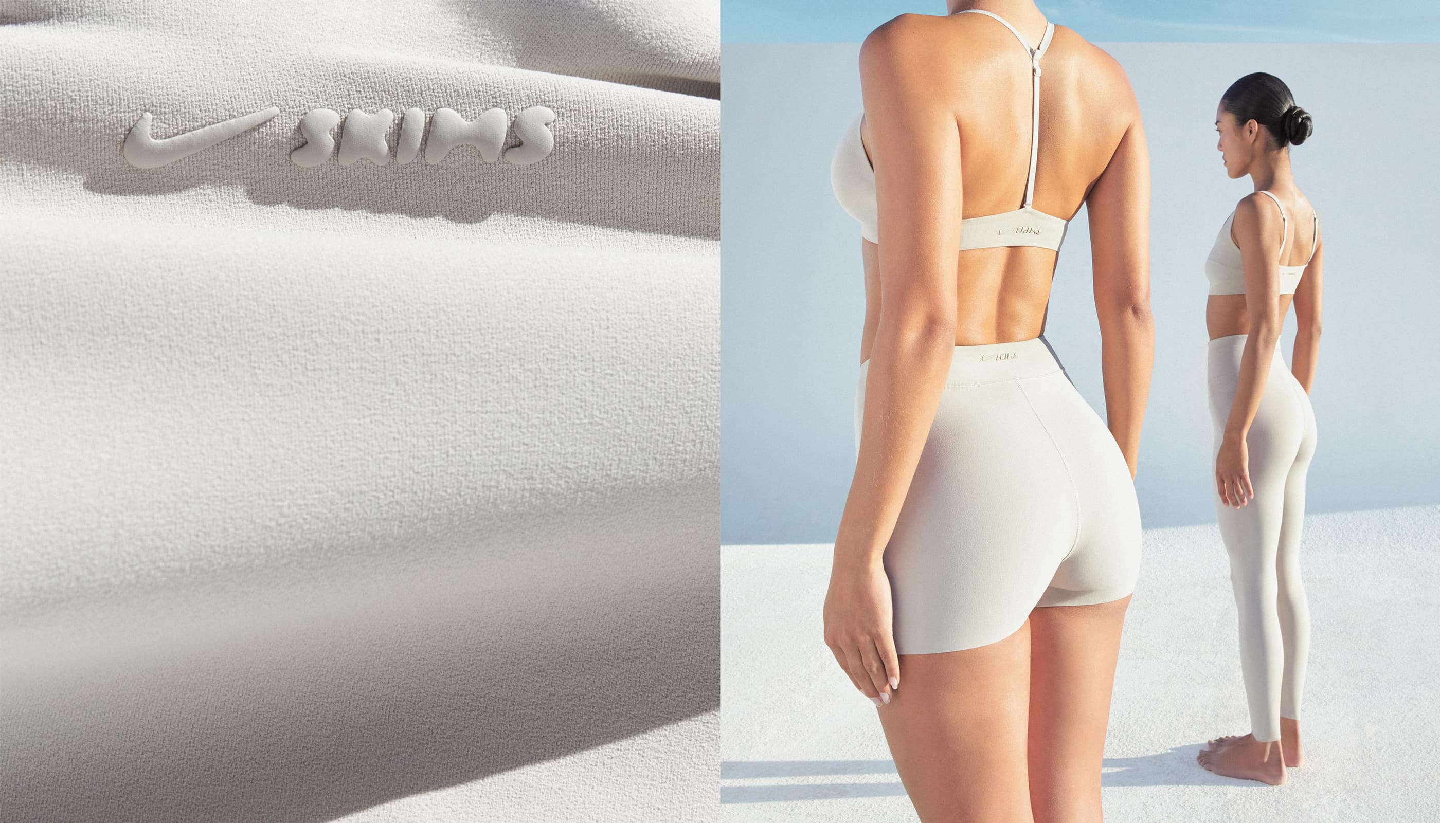
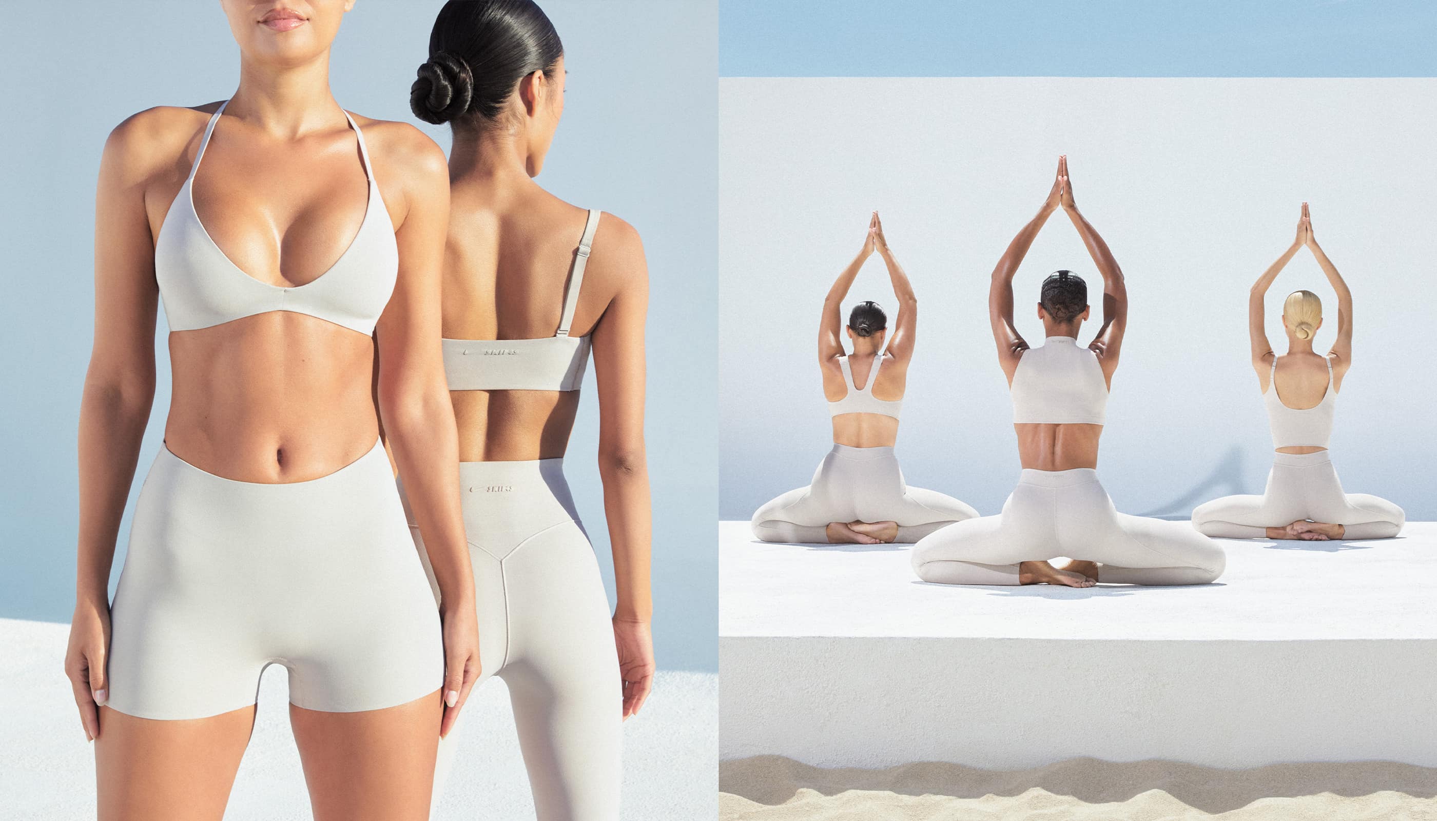
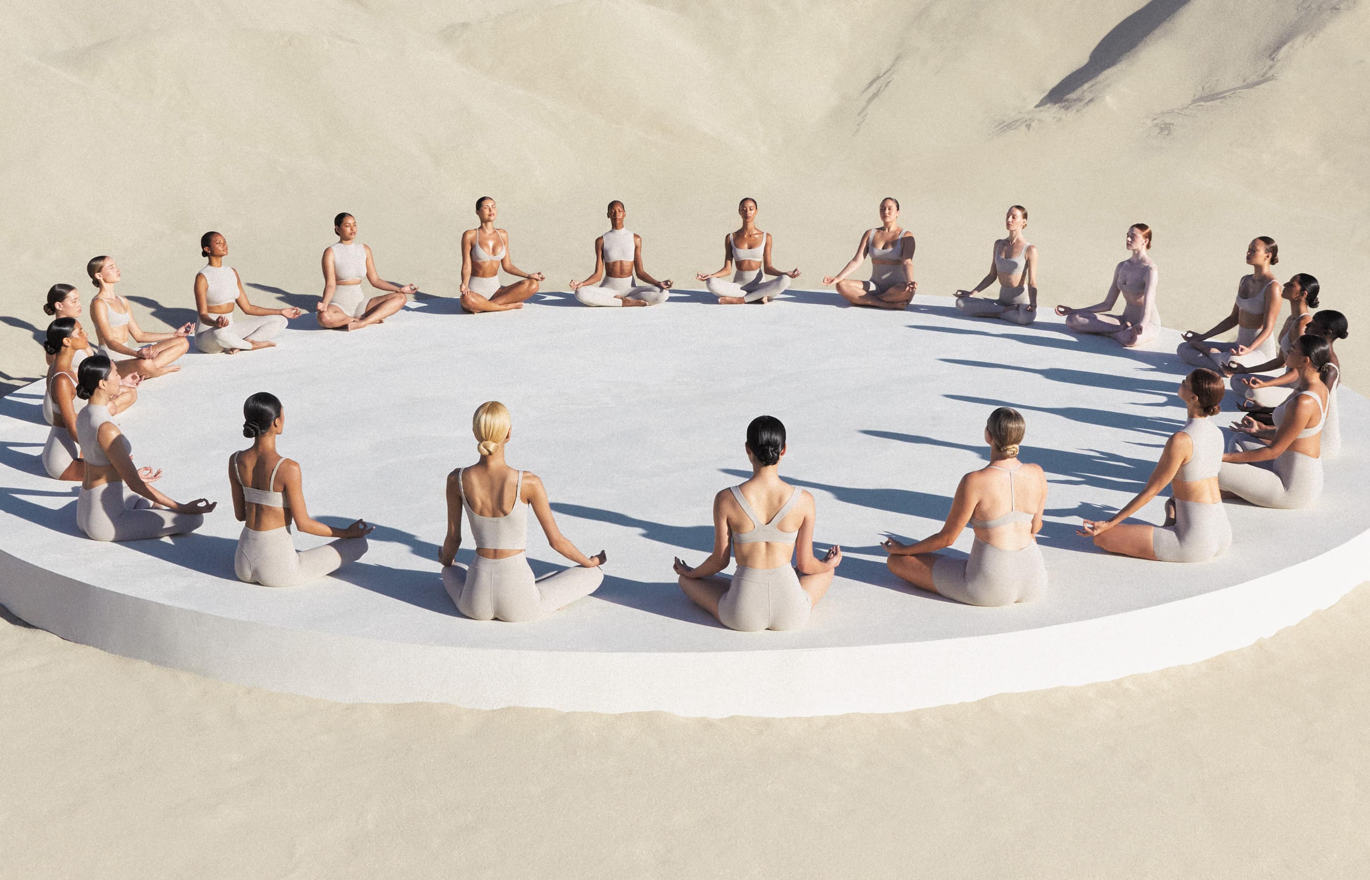
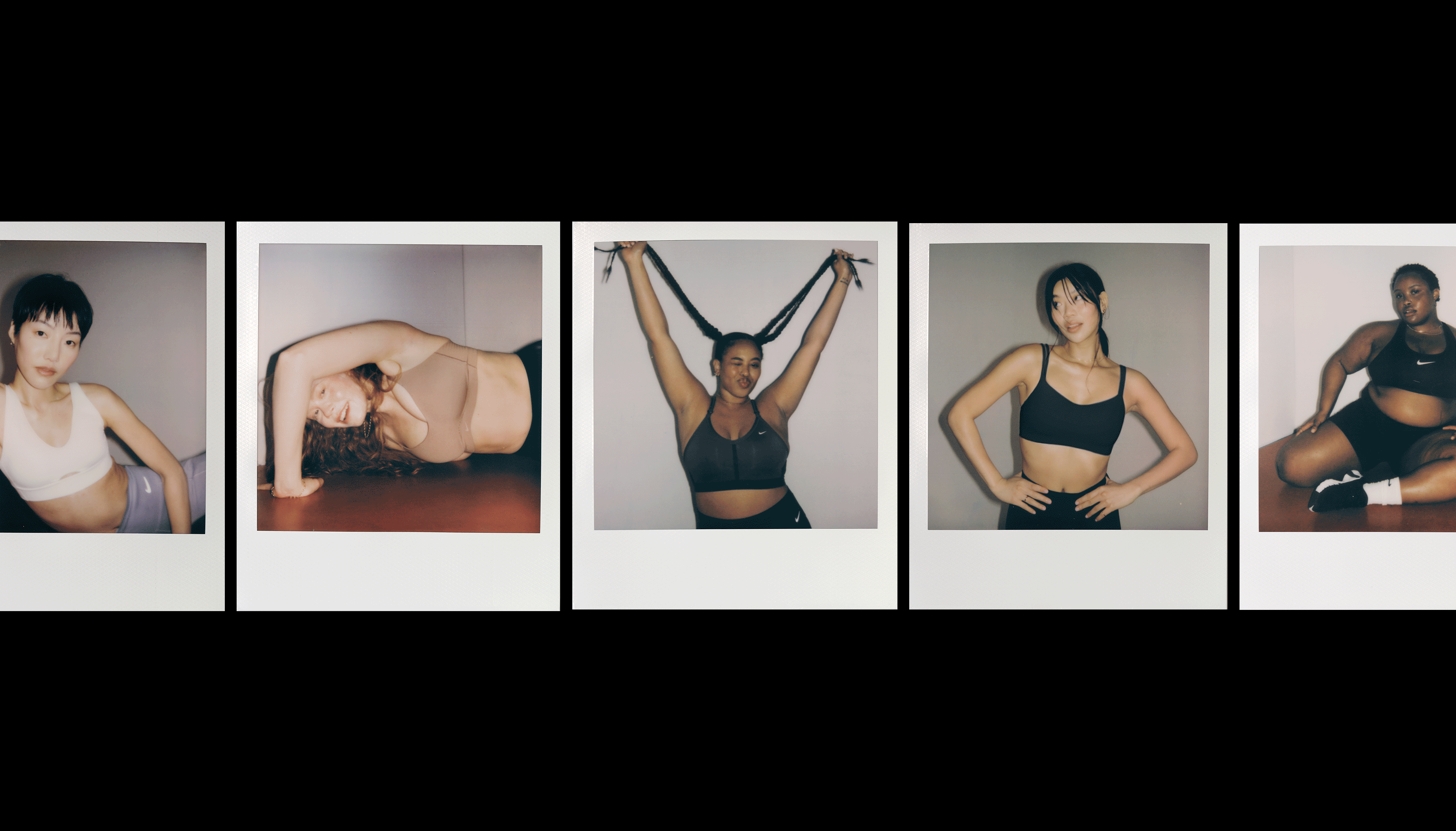
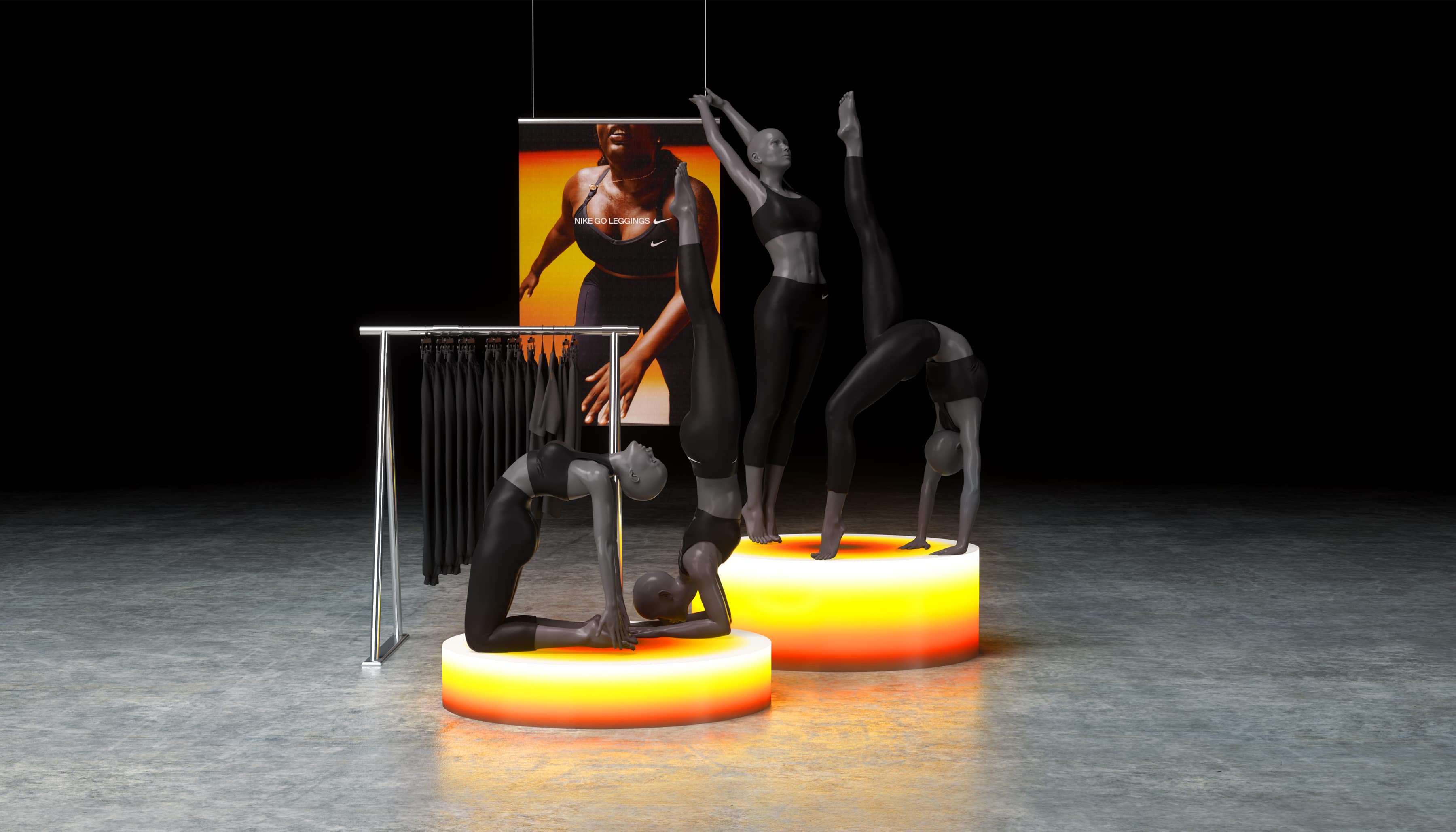
NikeSKIMS Studio Stretch
- Hero Photography: Annemarie Kuss
- Director: Mitch Ryan
- DP: Nicolai Niermann
- Hair: Dylan Chavles
- Makeup: Esther Foster
- Set Design: Brittany Porter
- Movement Direction: Krissy Jones
- Music & Sound: Concret Form
- Editing: Cabin Edit
- Production: COUNSEL
- Organic Capture: Maya Spangler & Anna Jonska
- Creative Direction: Kelly Letourneau & Schraub
- Art Direction: Allison Kerst, Claire Pedersen, Danya Dargham & Perry Bitzer
- Narrative Direction: Sabrina Hunt
- Year: 2026
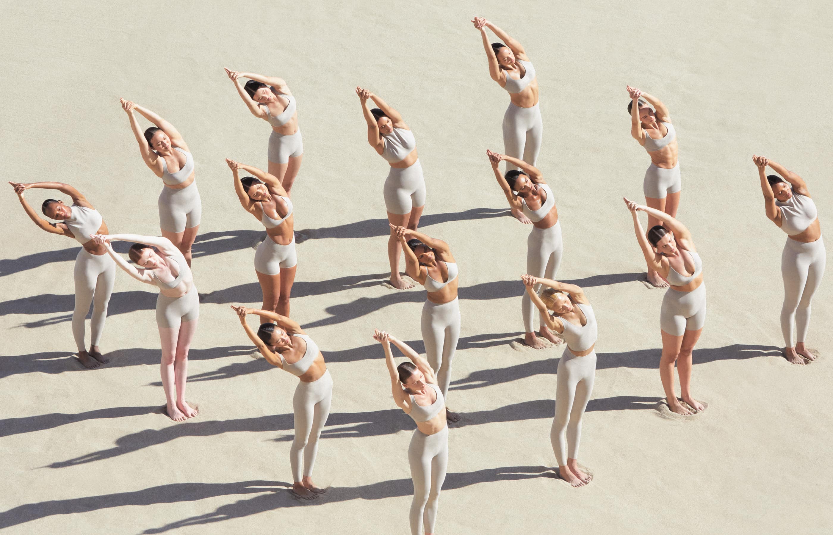
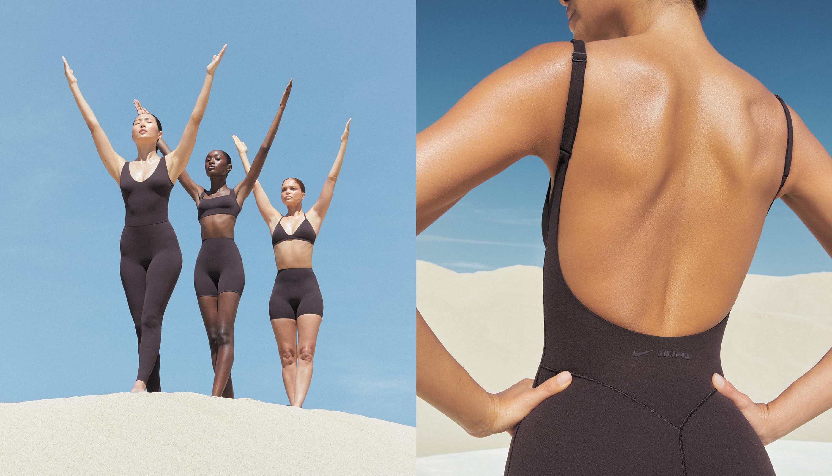
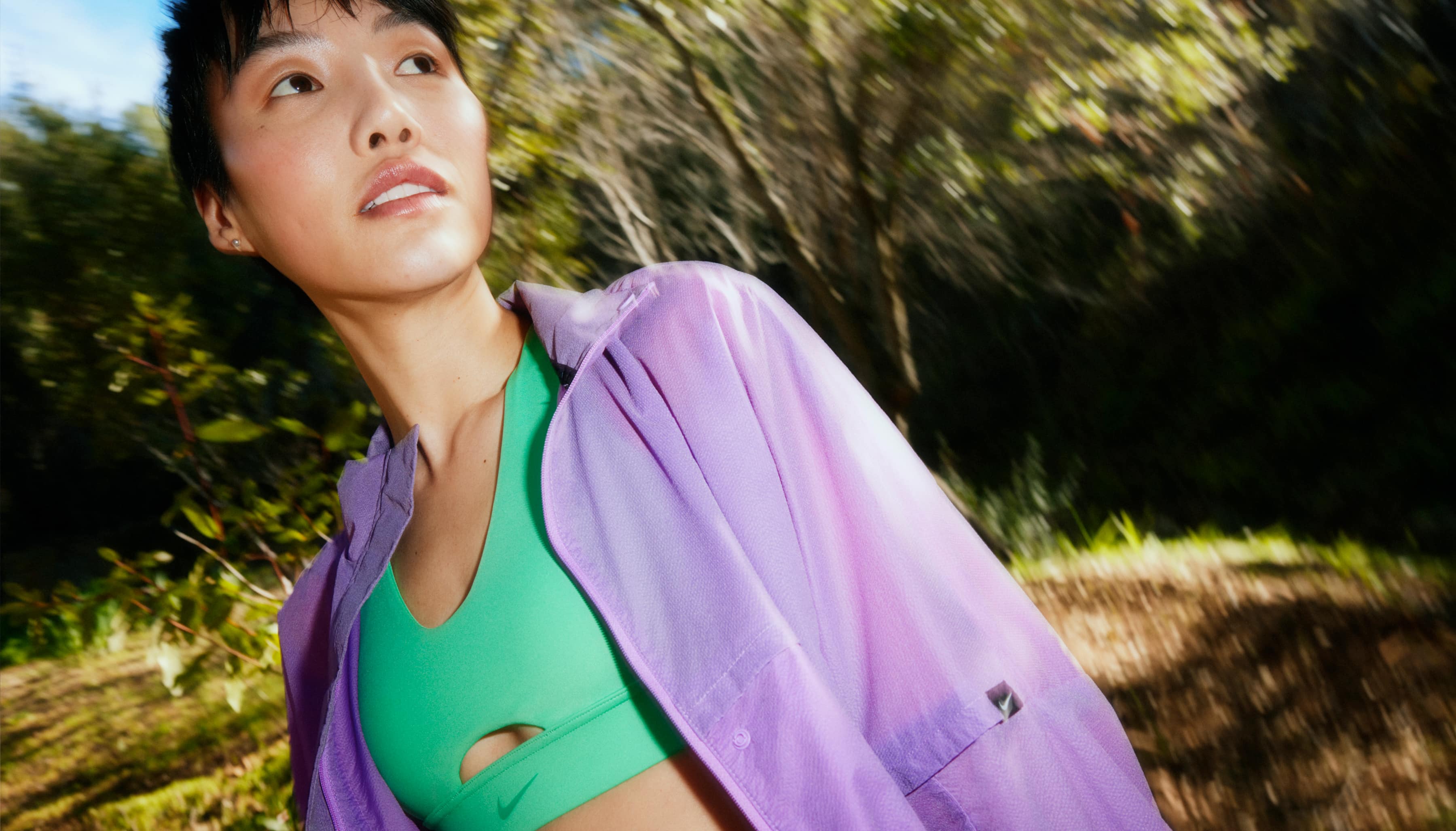
Art Direction and campaign development for the NikeSKIMS Summer 2026 Studio Stretch launch campaign. Created a surreal, movement-driven world centered on softness, breathability, and performance innovation, using large-scale collective choreography within an otherworldly desert environment to introduce the new premium bras and leggings collection. The campaign brought the feeling of Studio Stretch to life through immersive visuals blending sport, fashion, and movement.
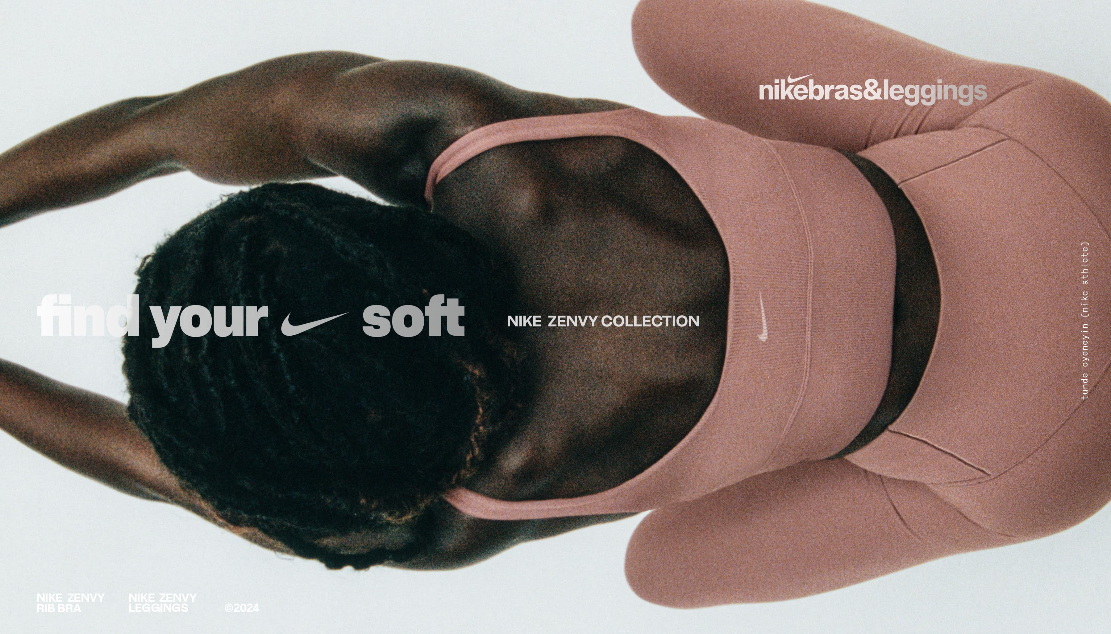
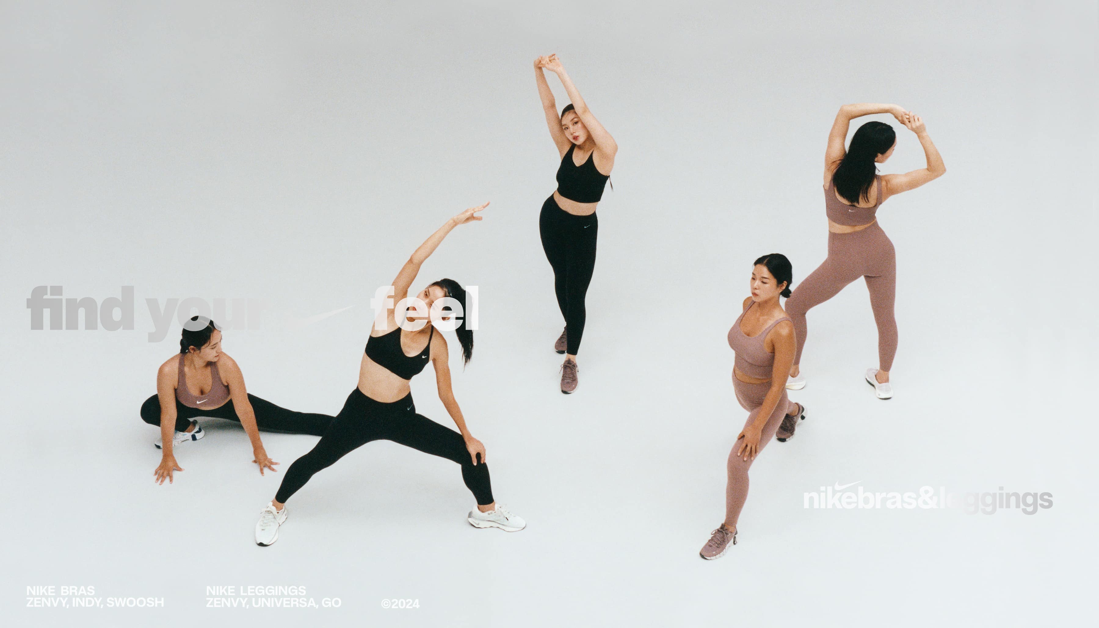
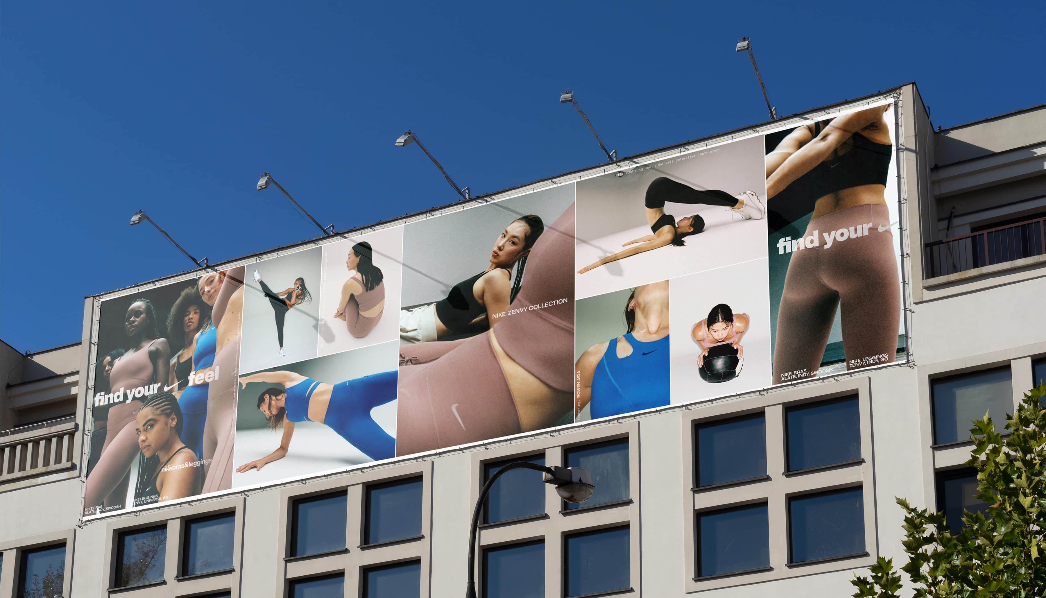
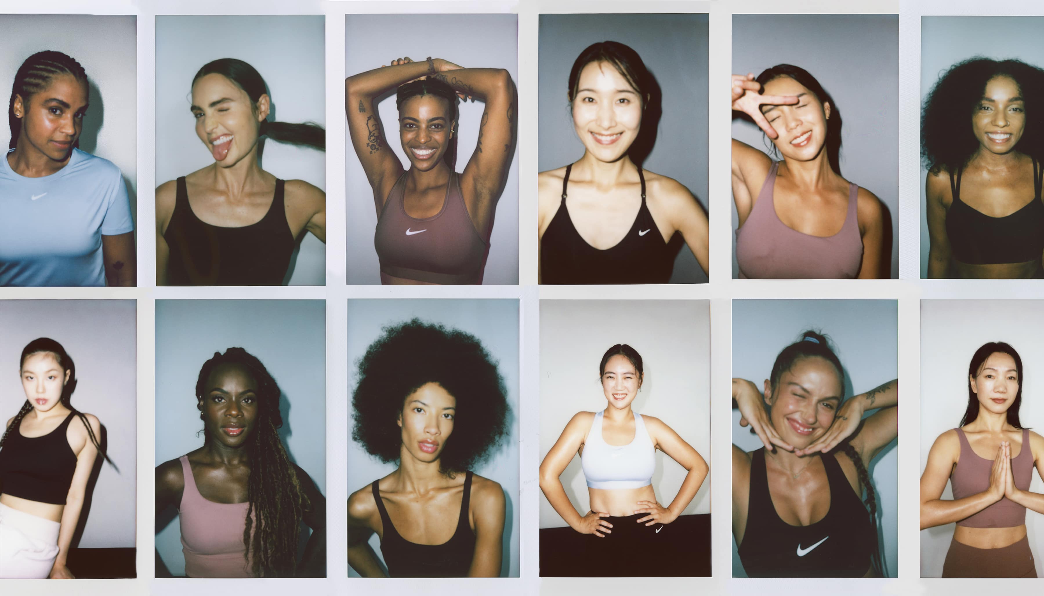
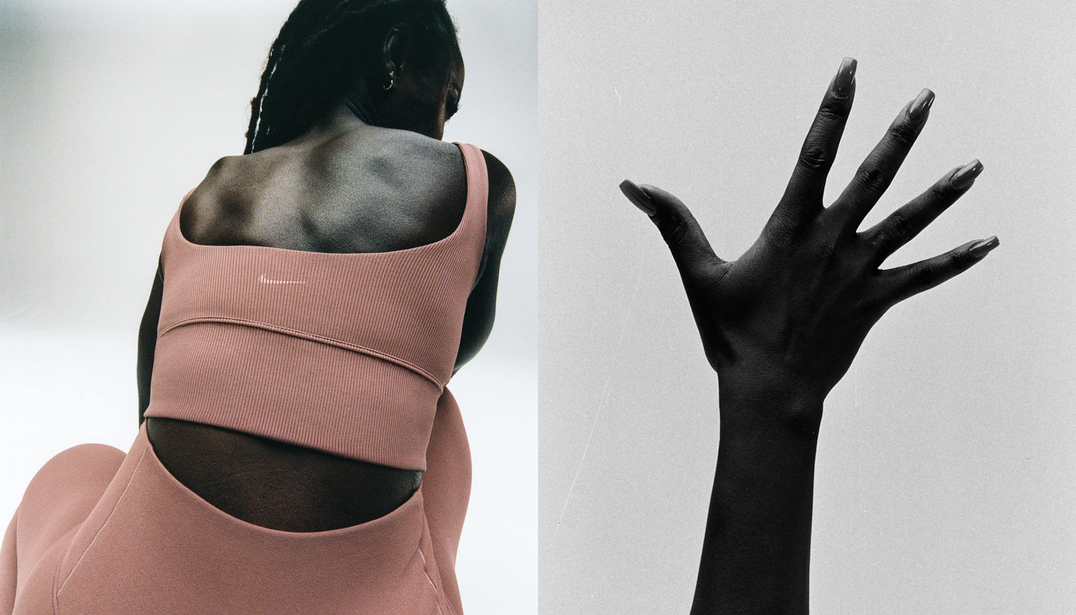
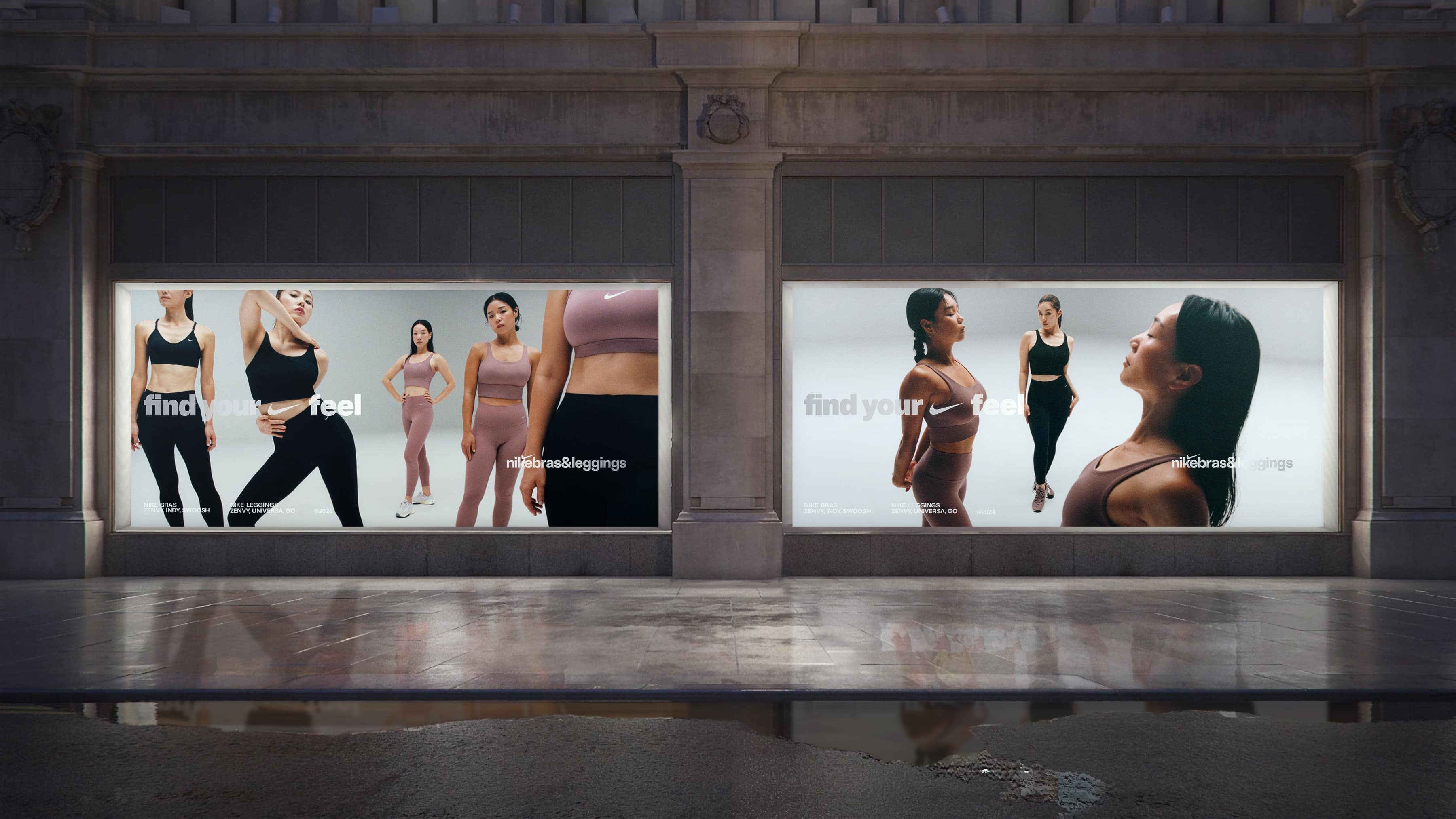
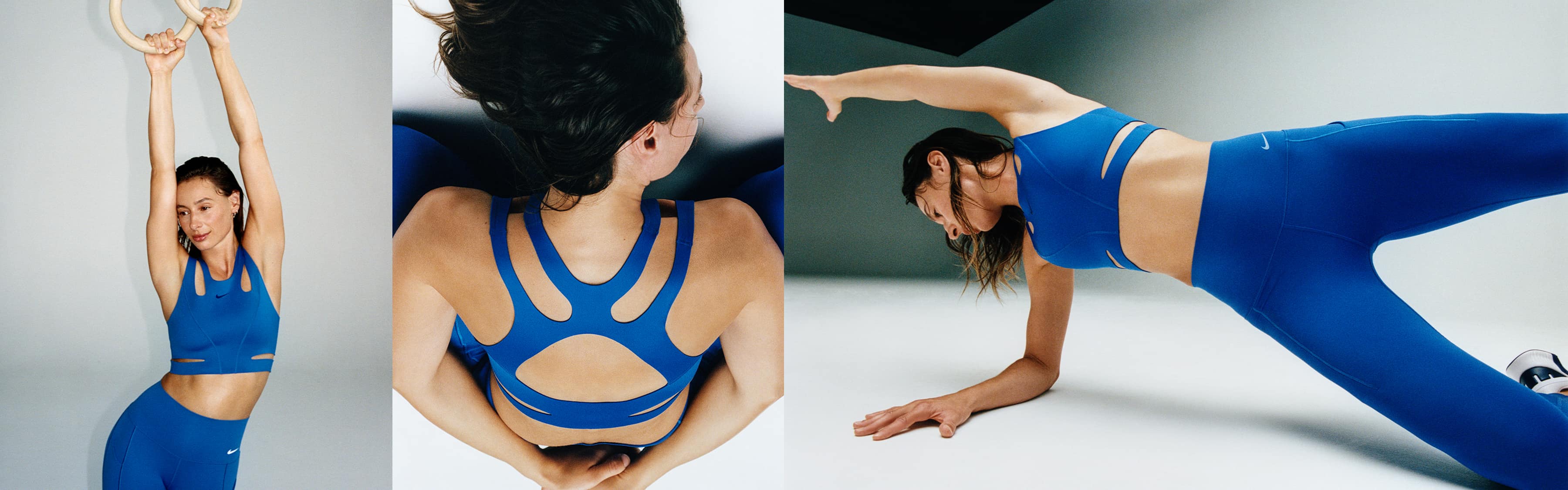
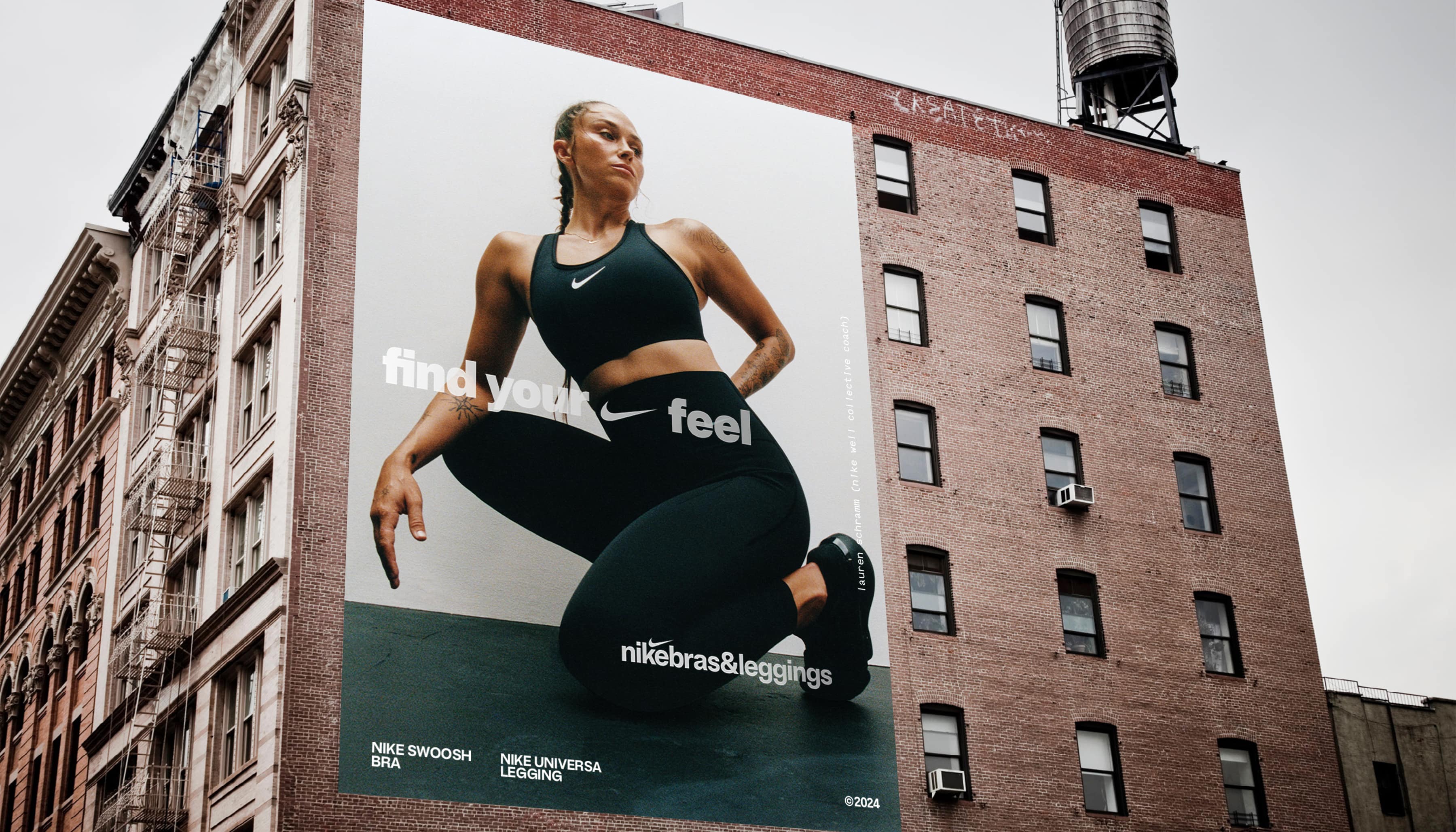
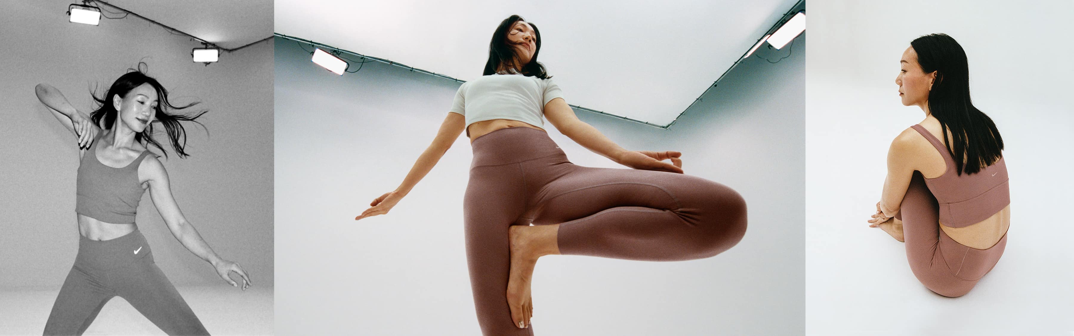
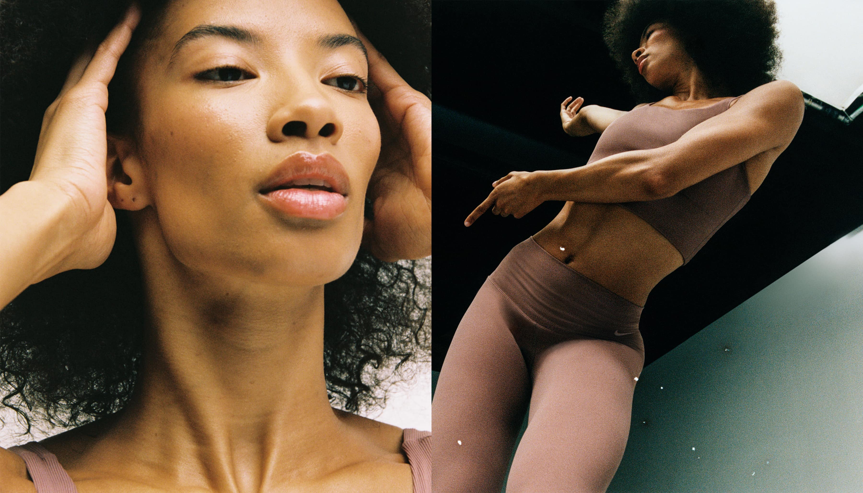
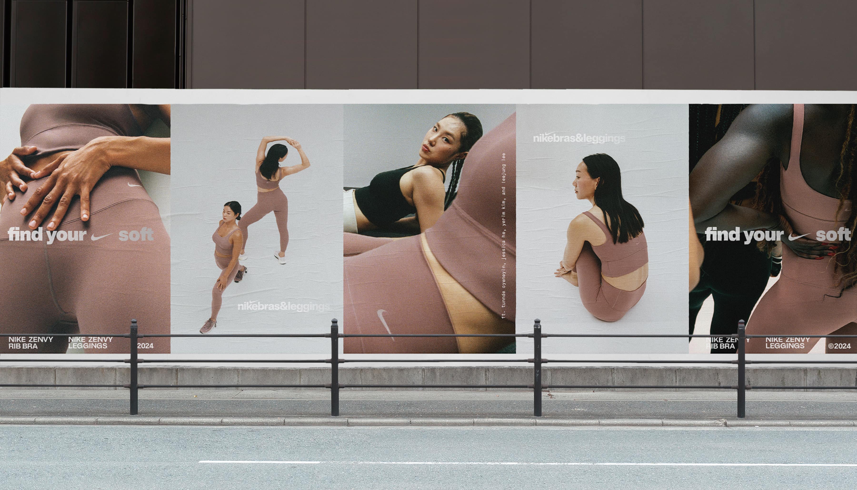
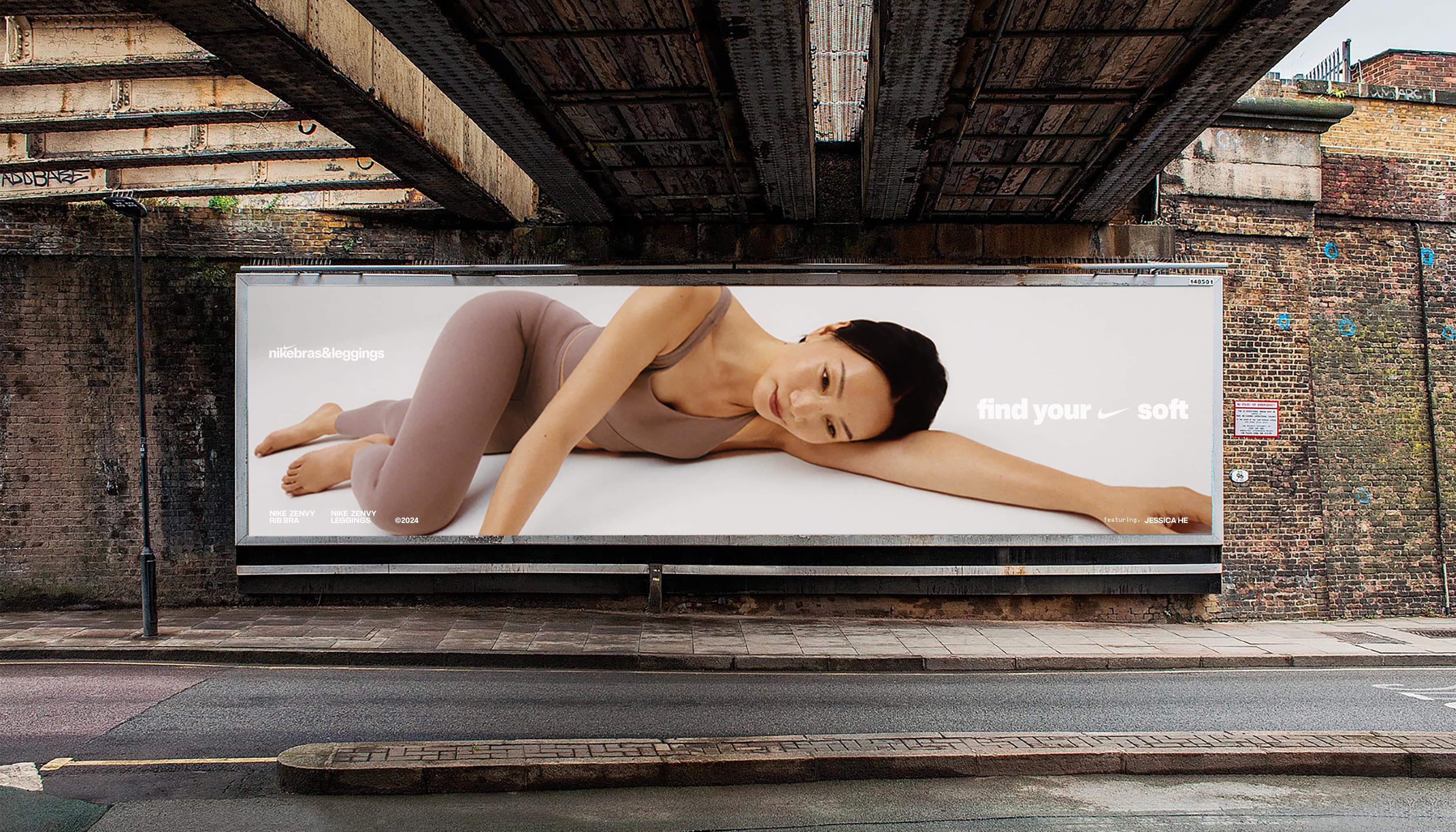
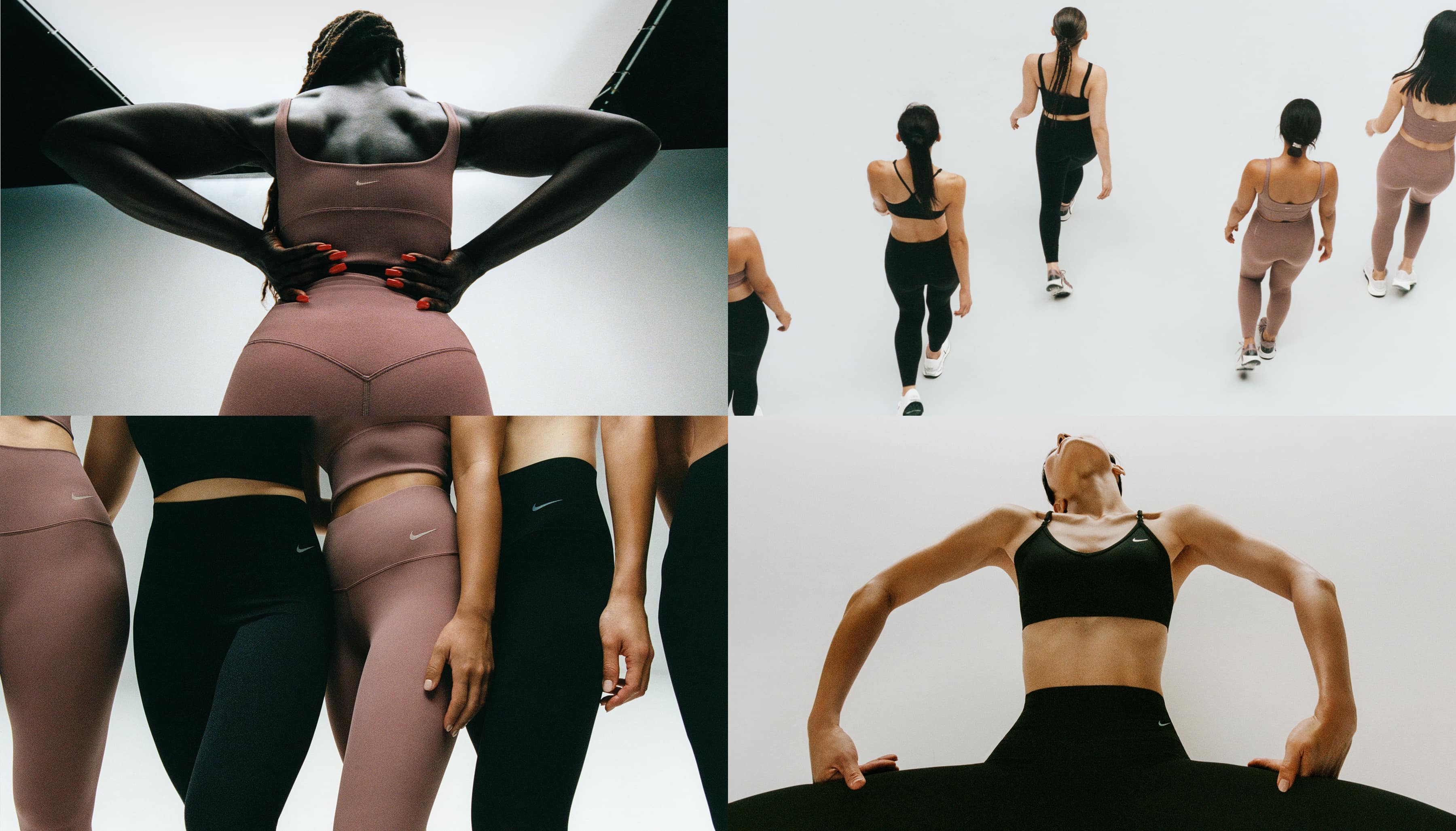
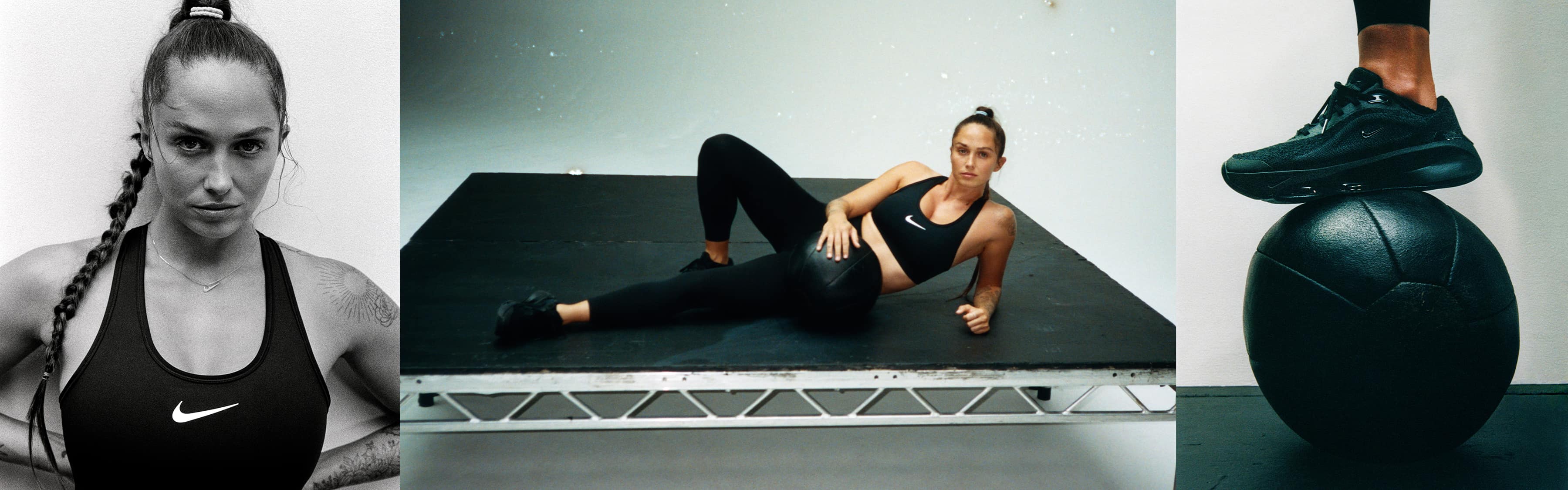
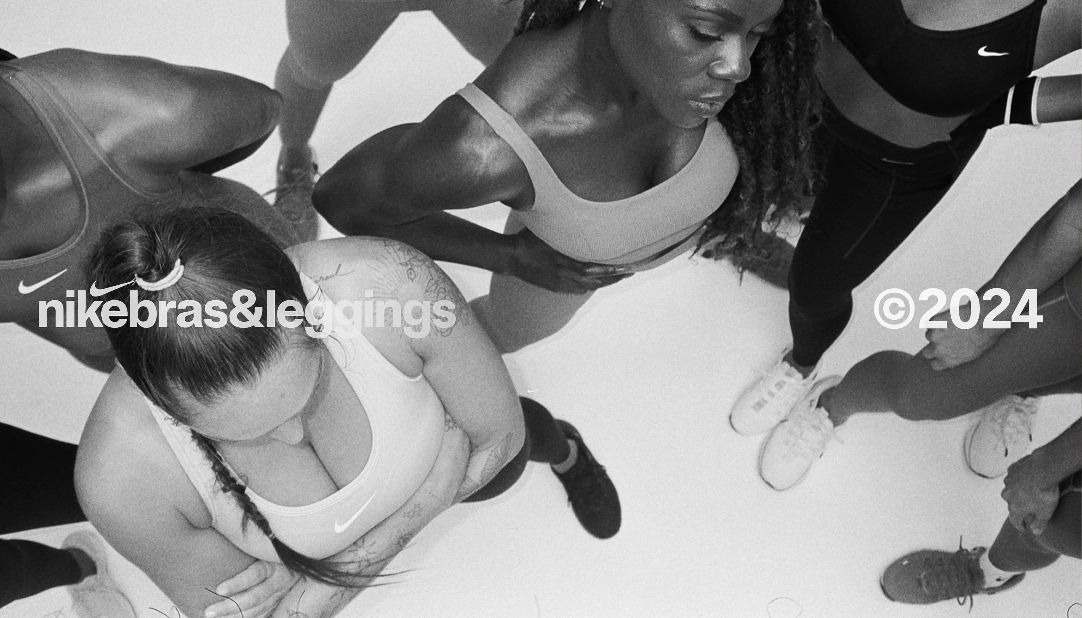
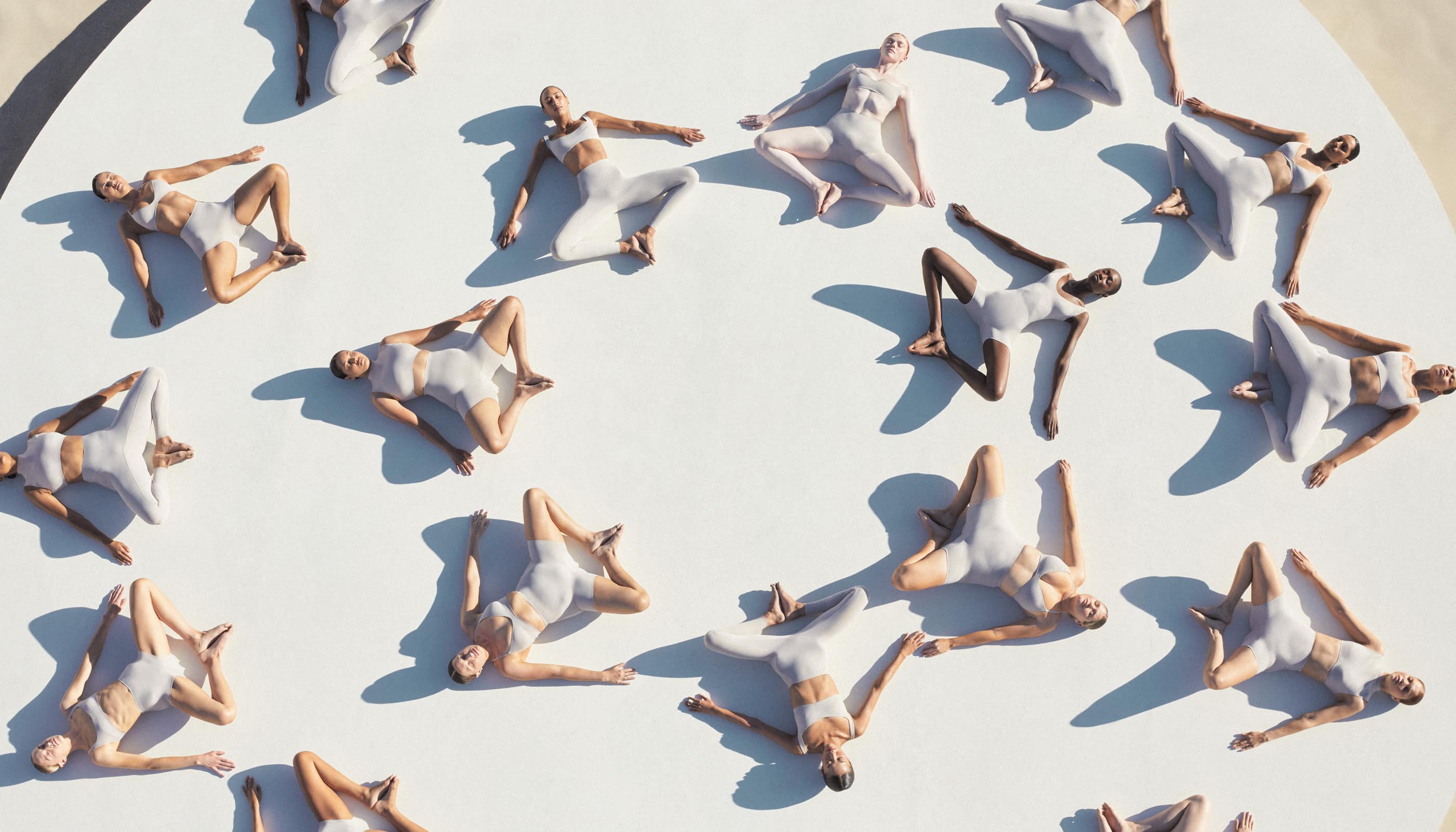
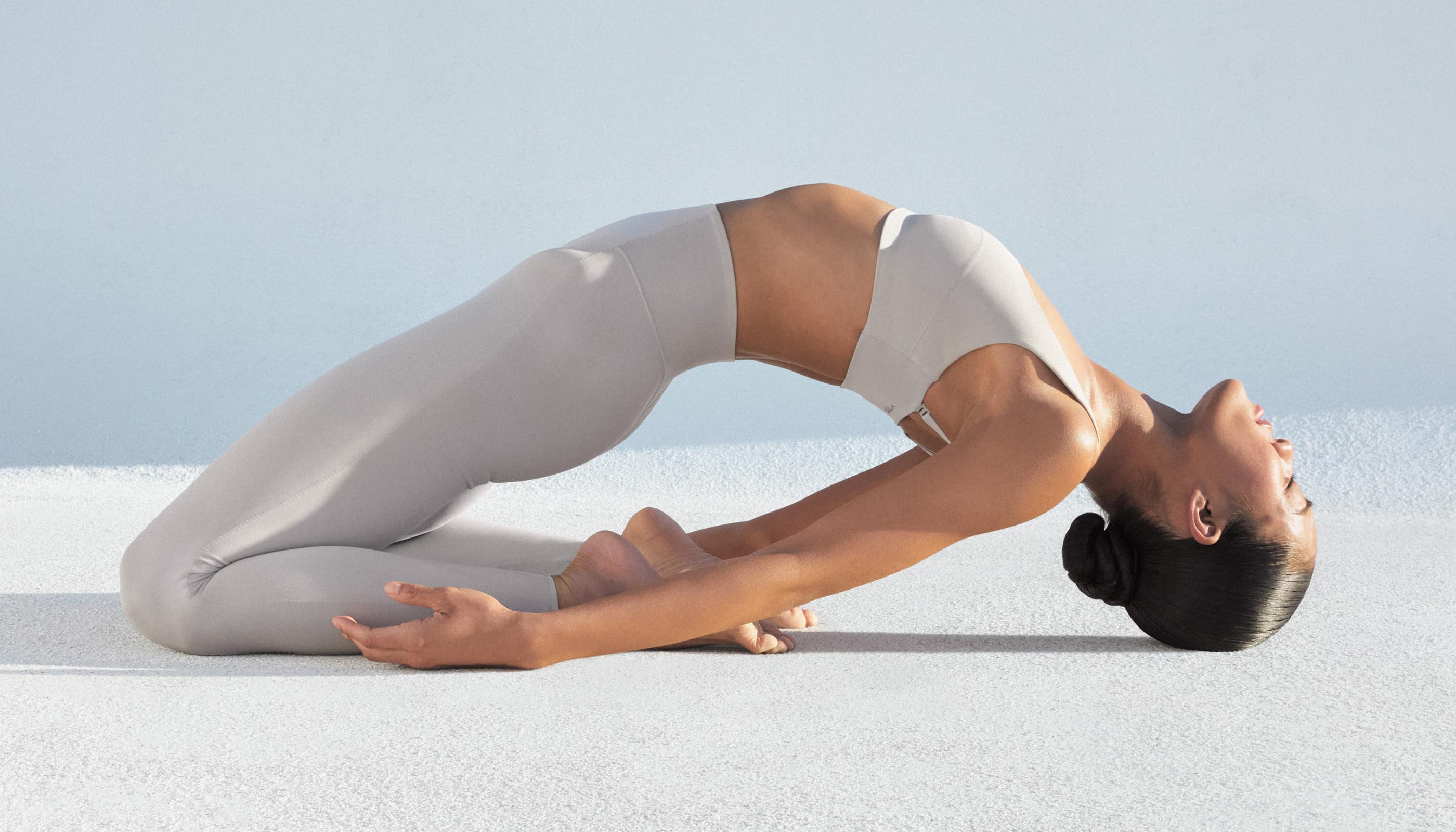
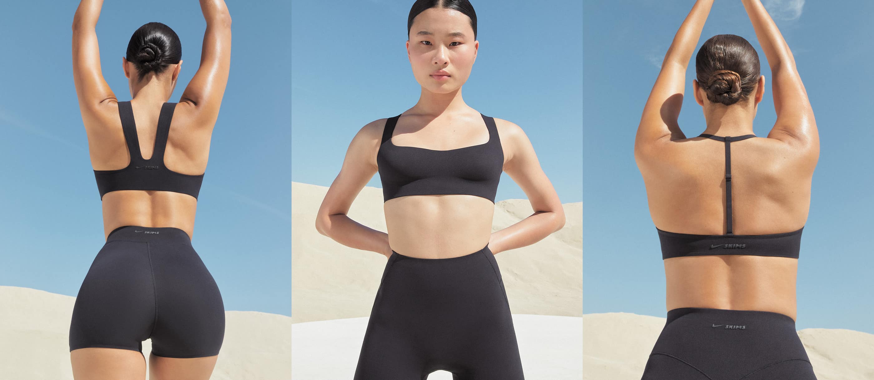
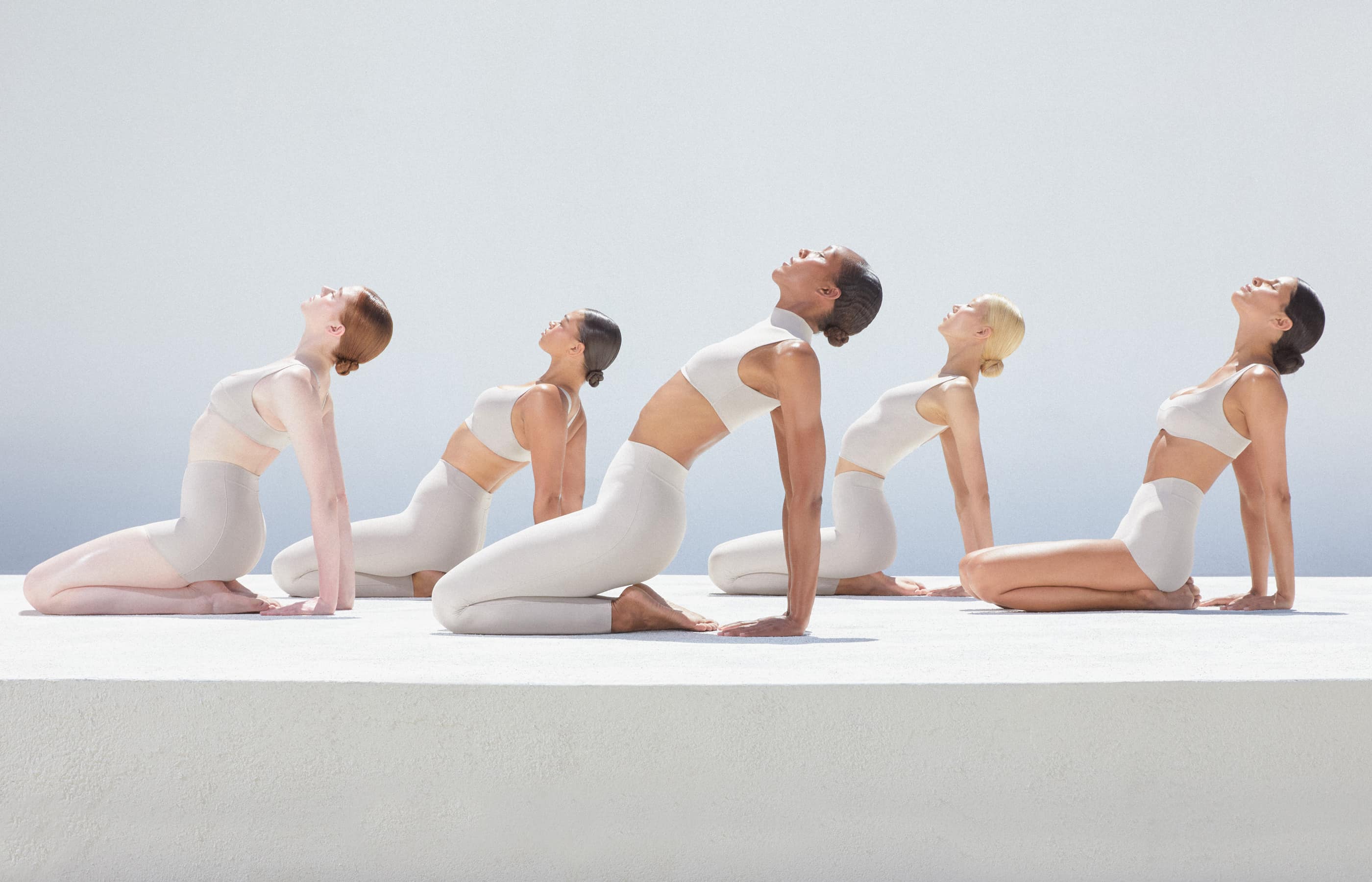
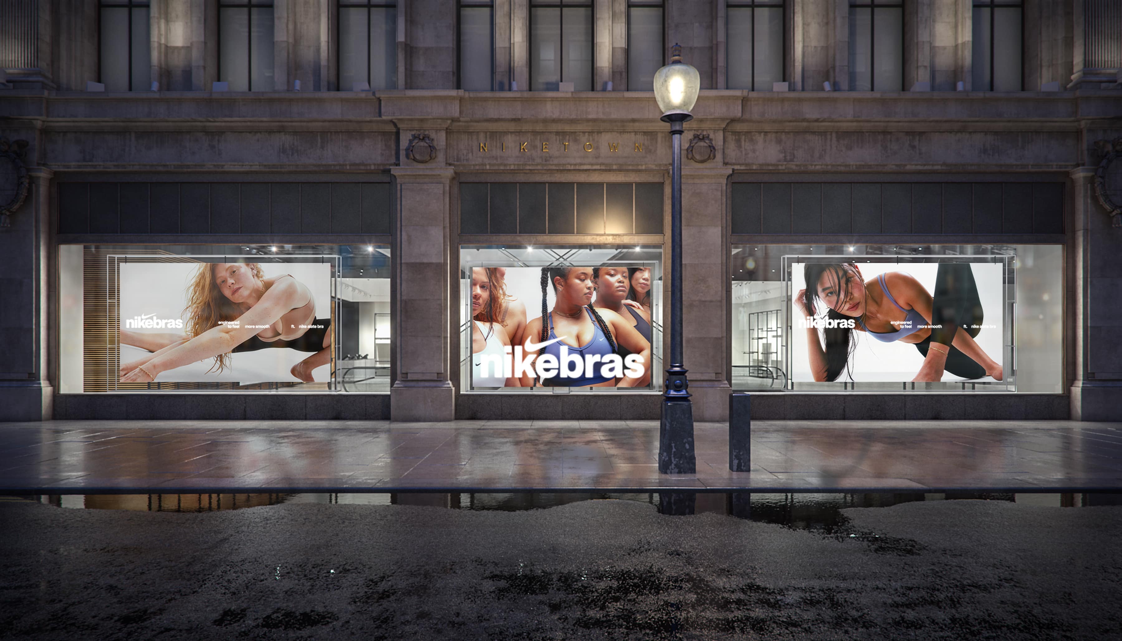
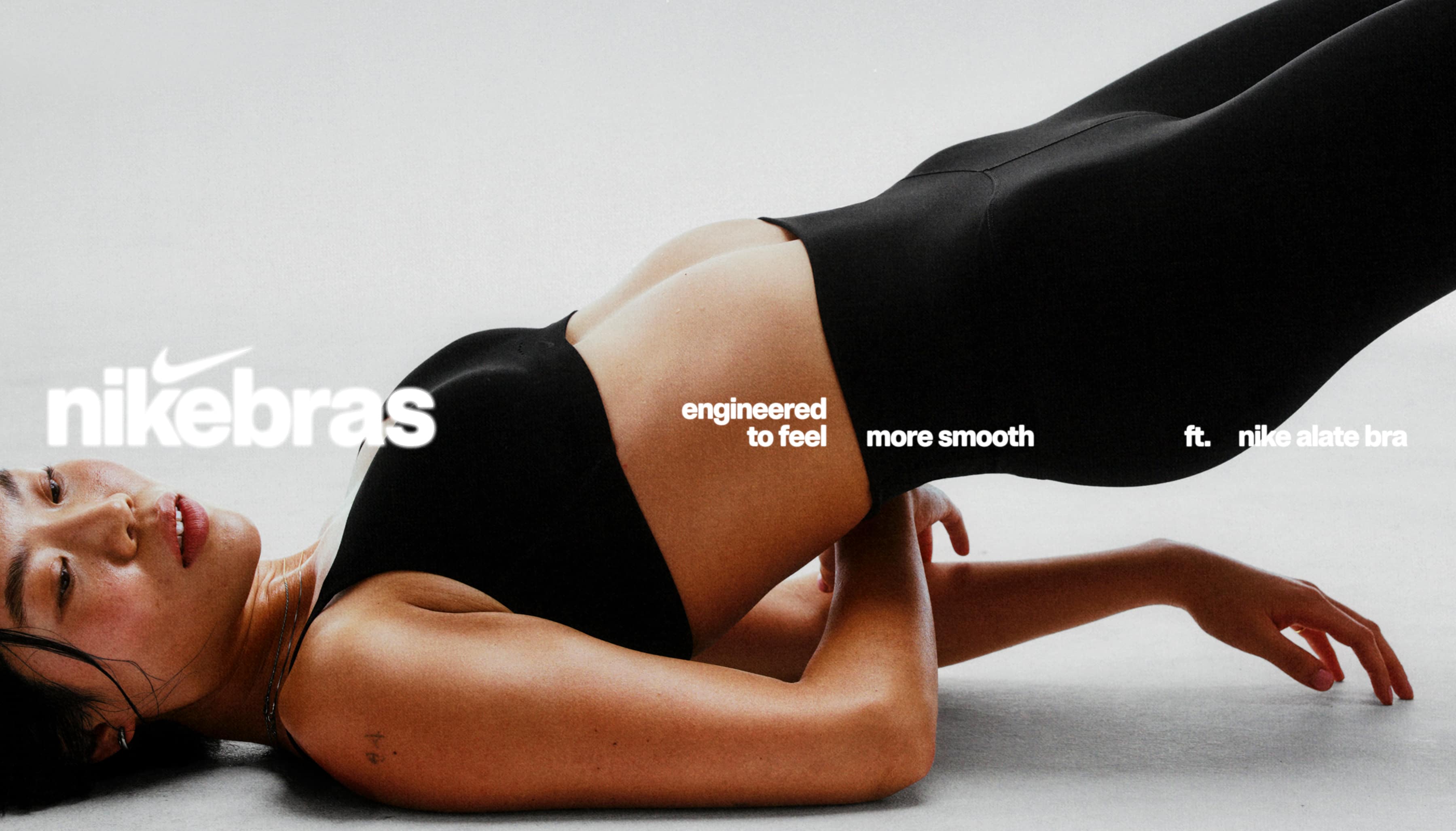
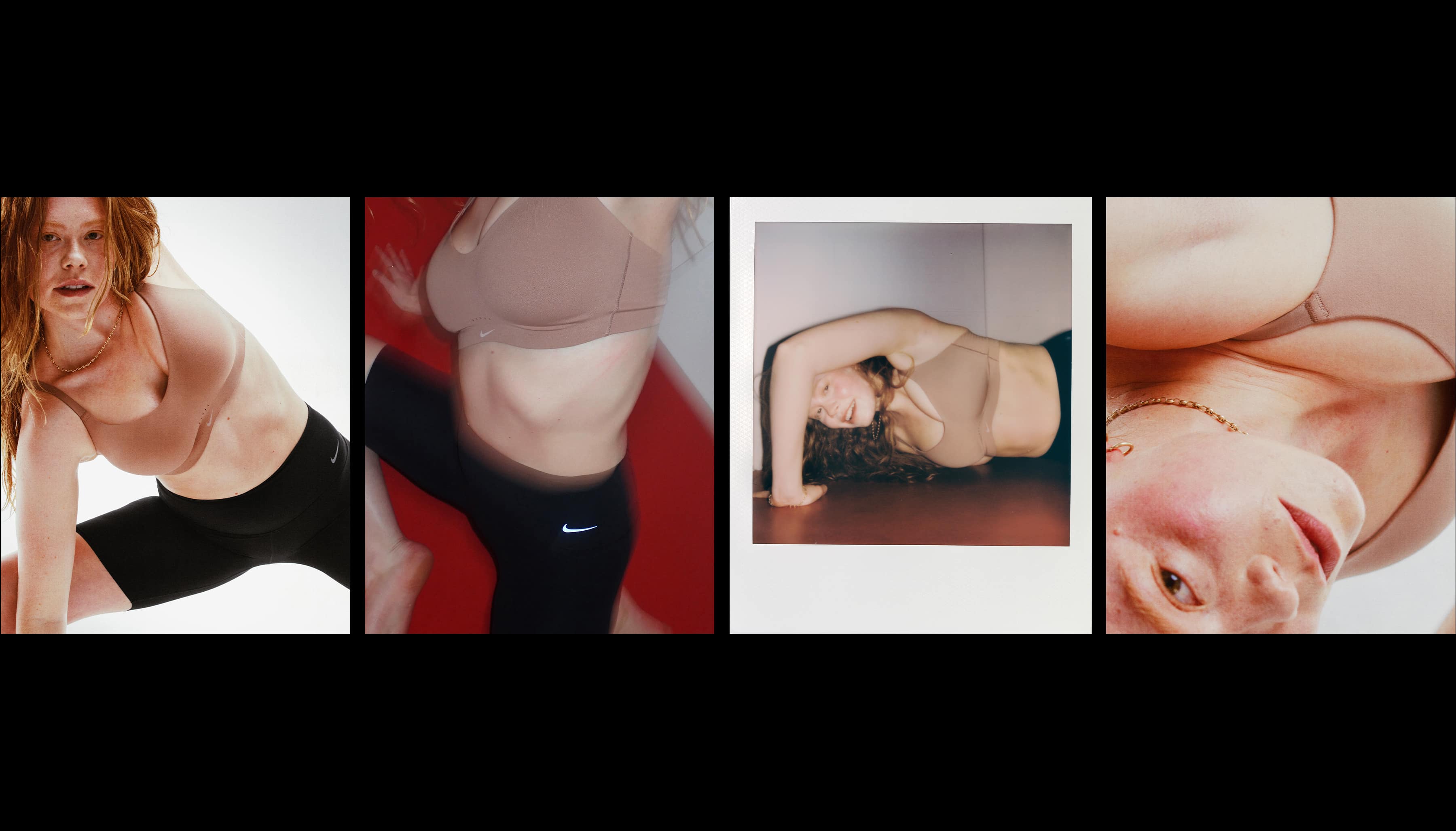
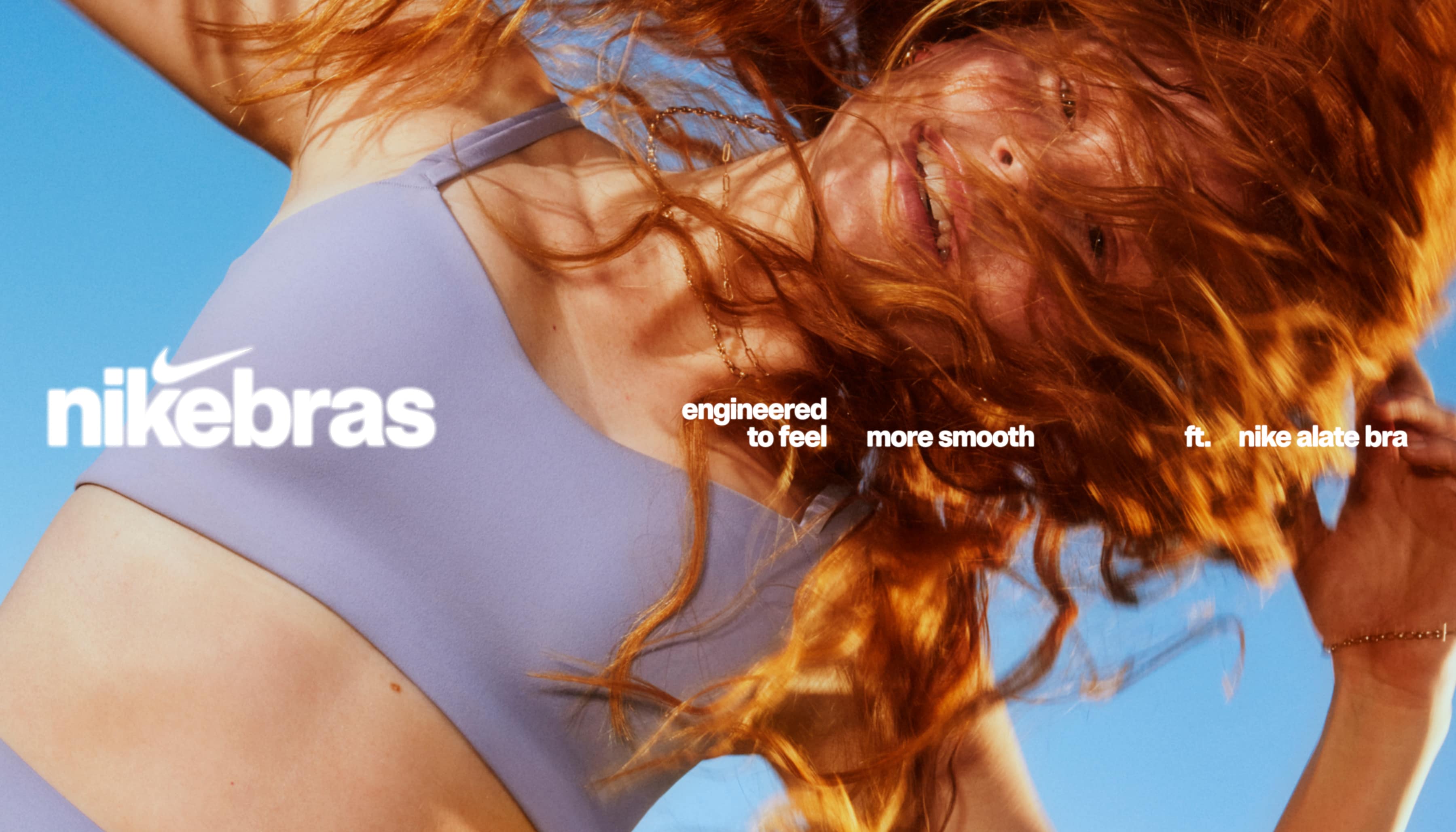
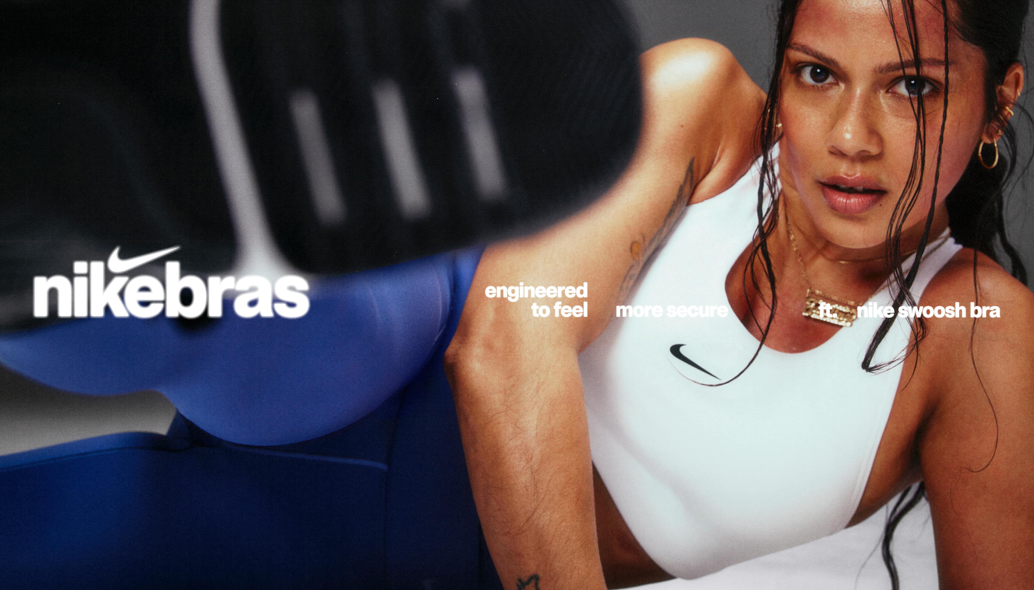
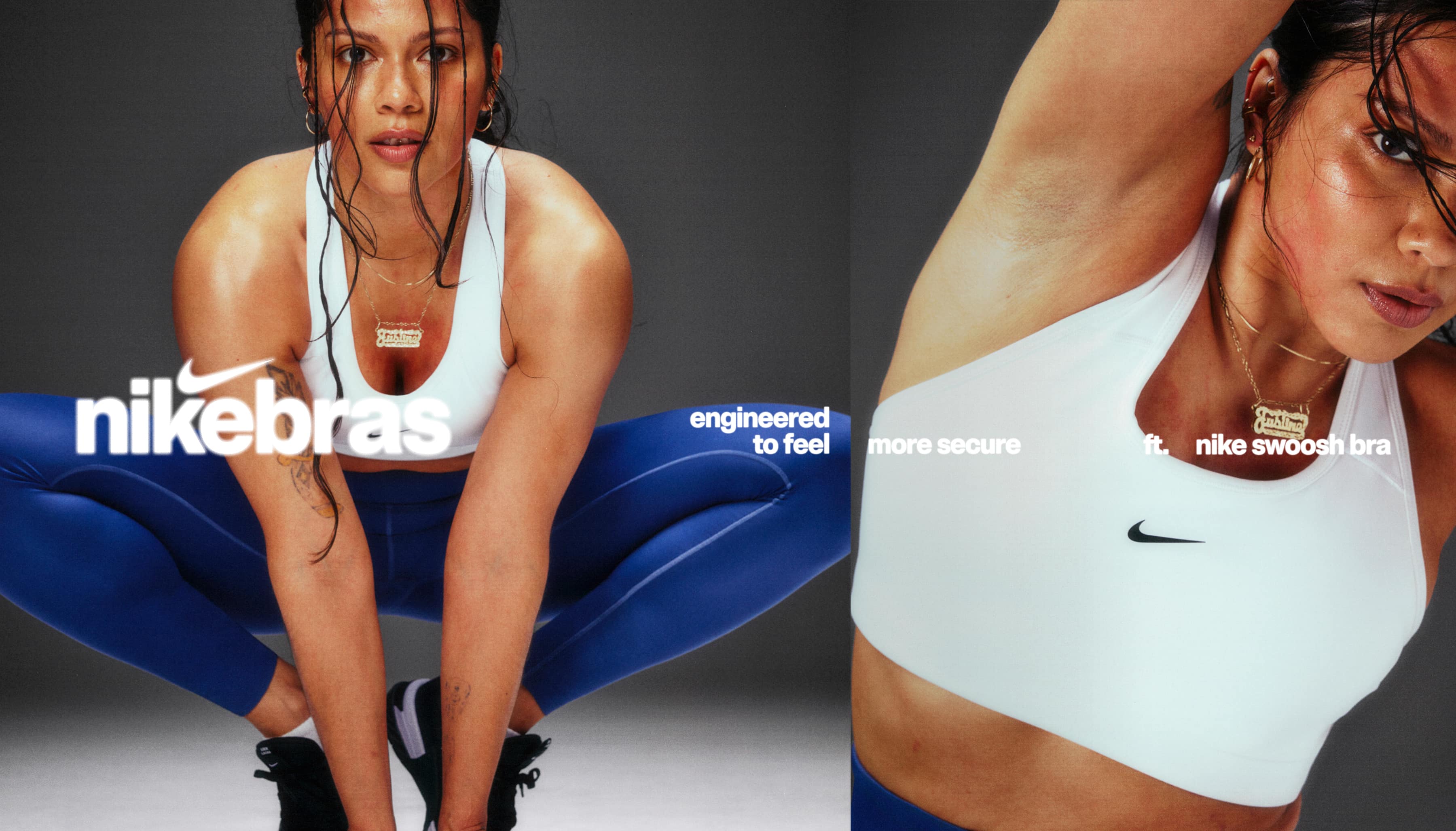
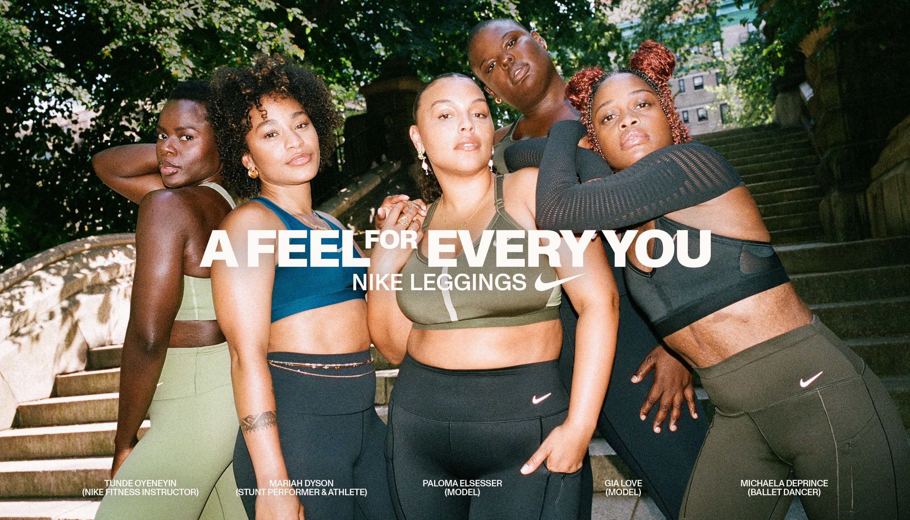
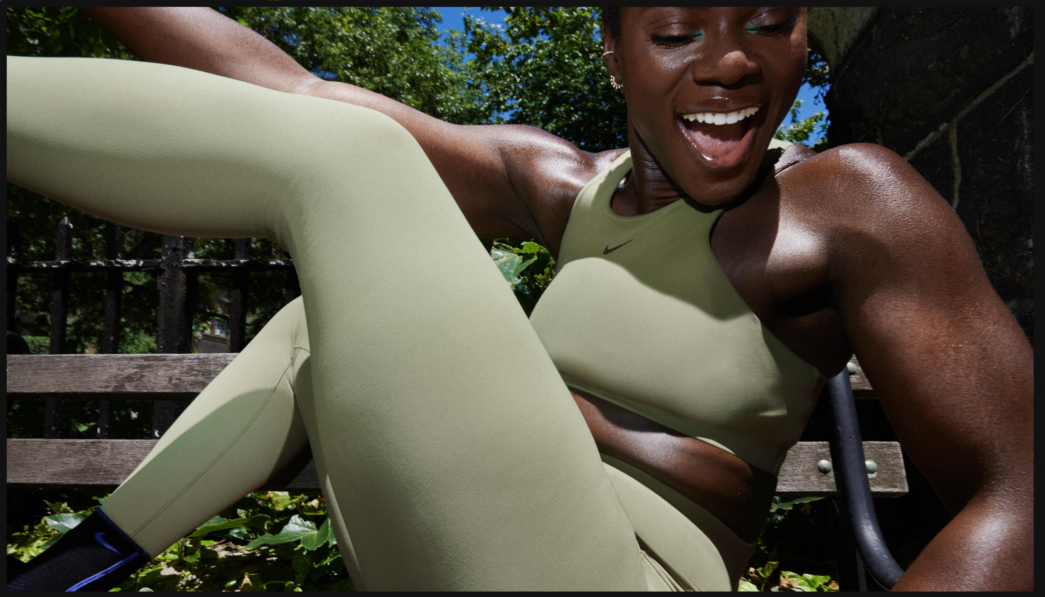
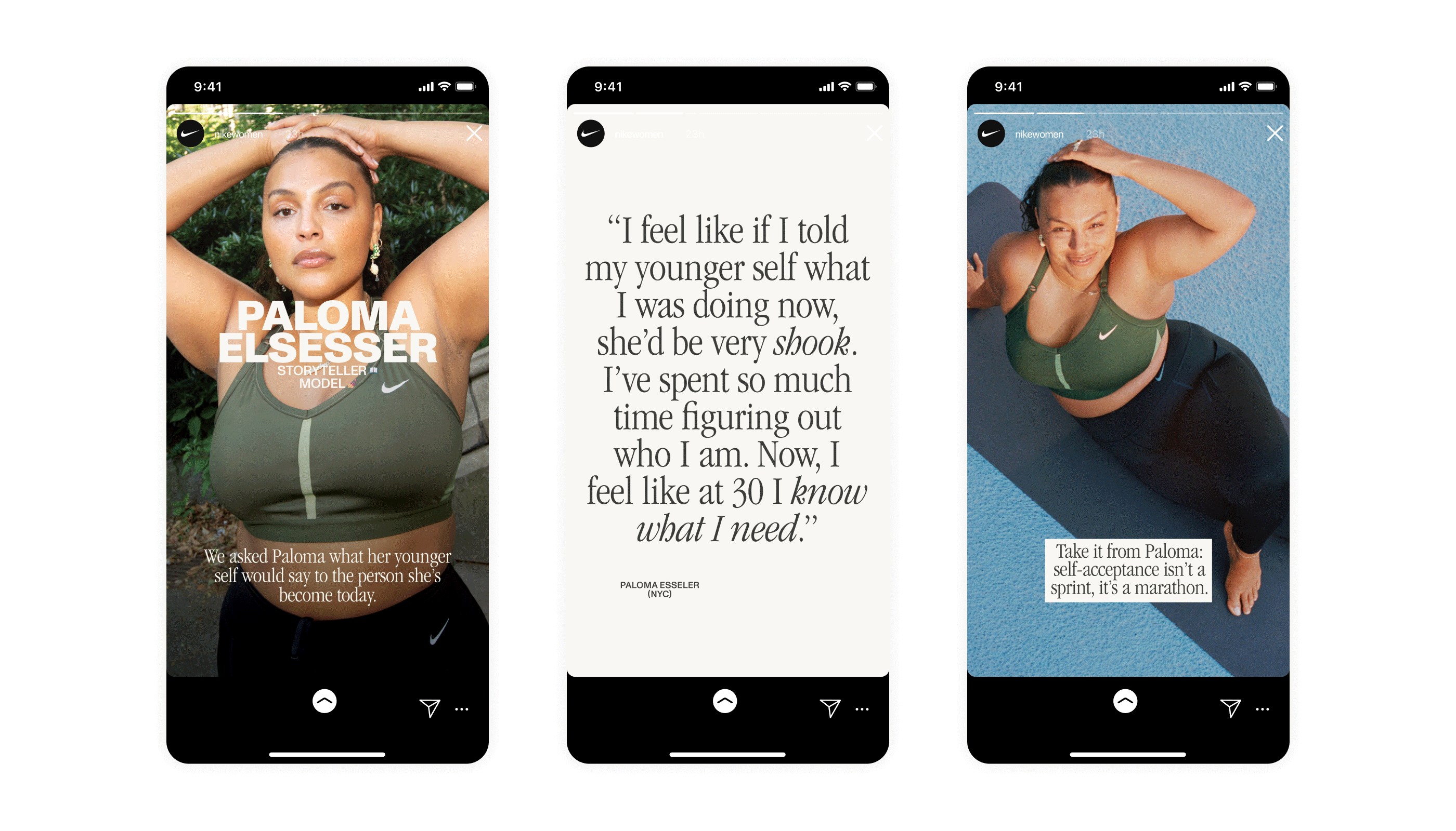
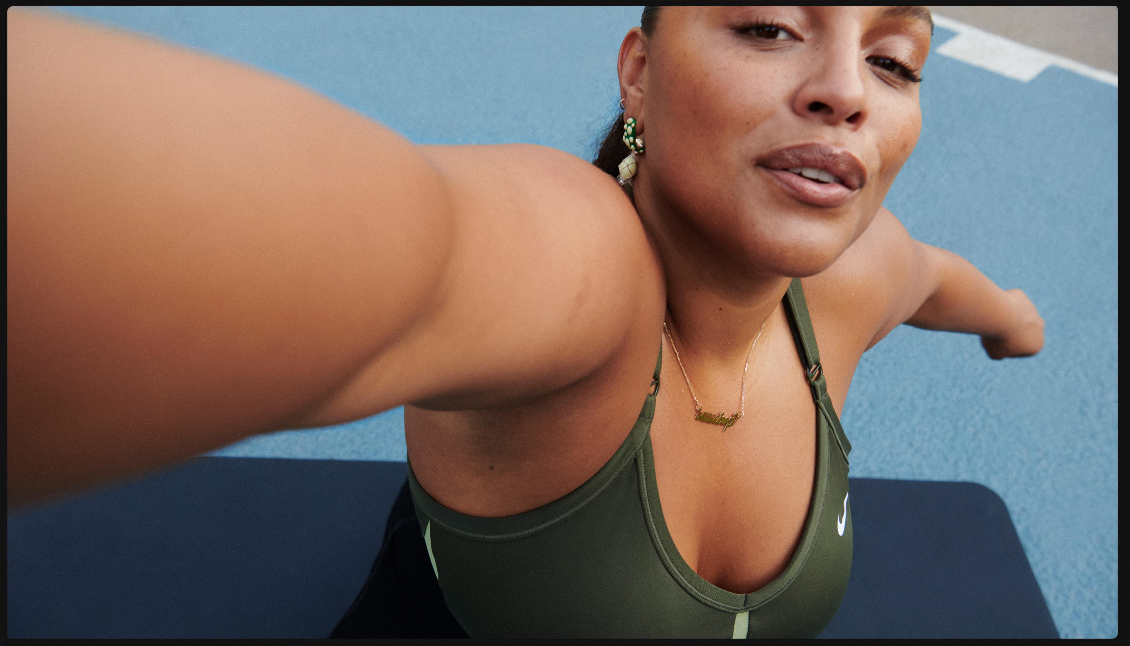
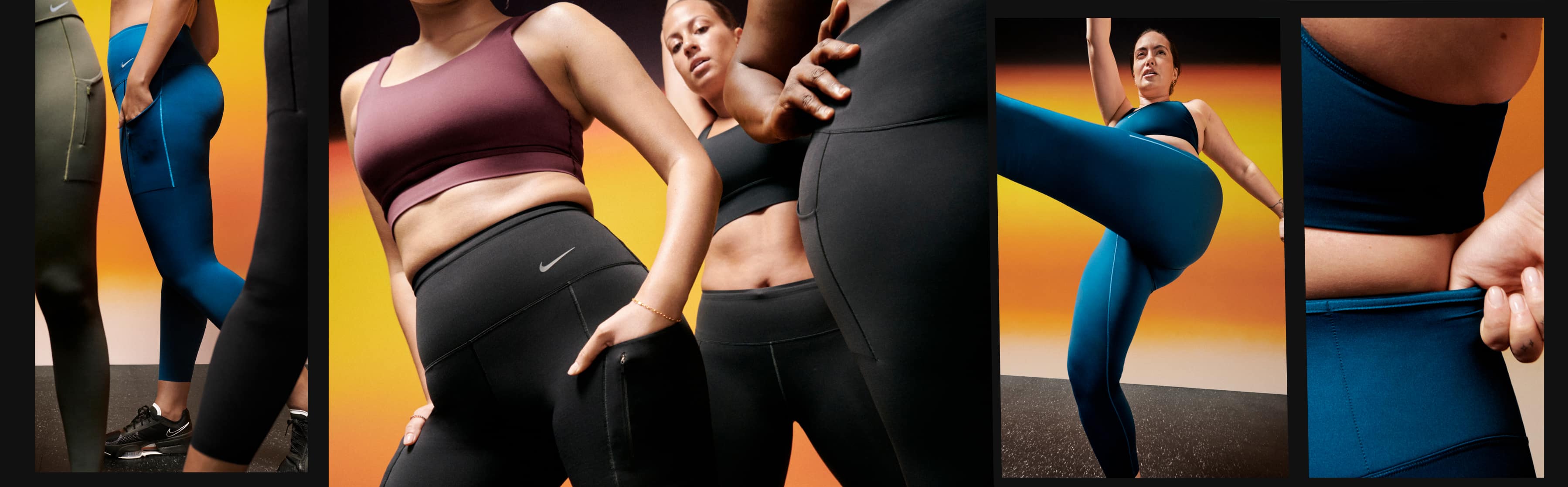
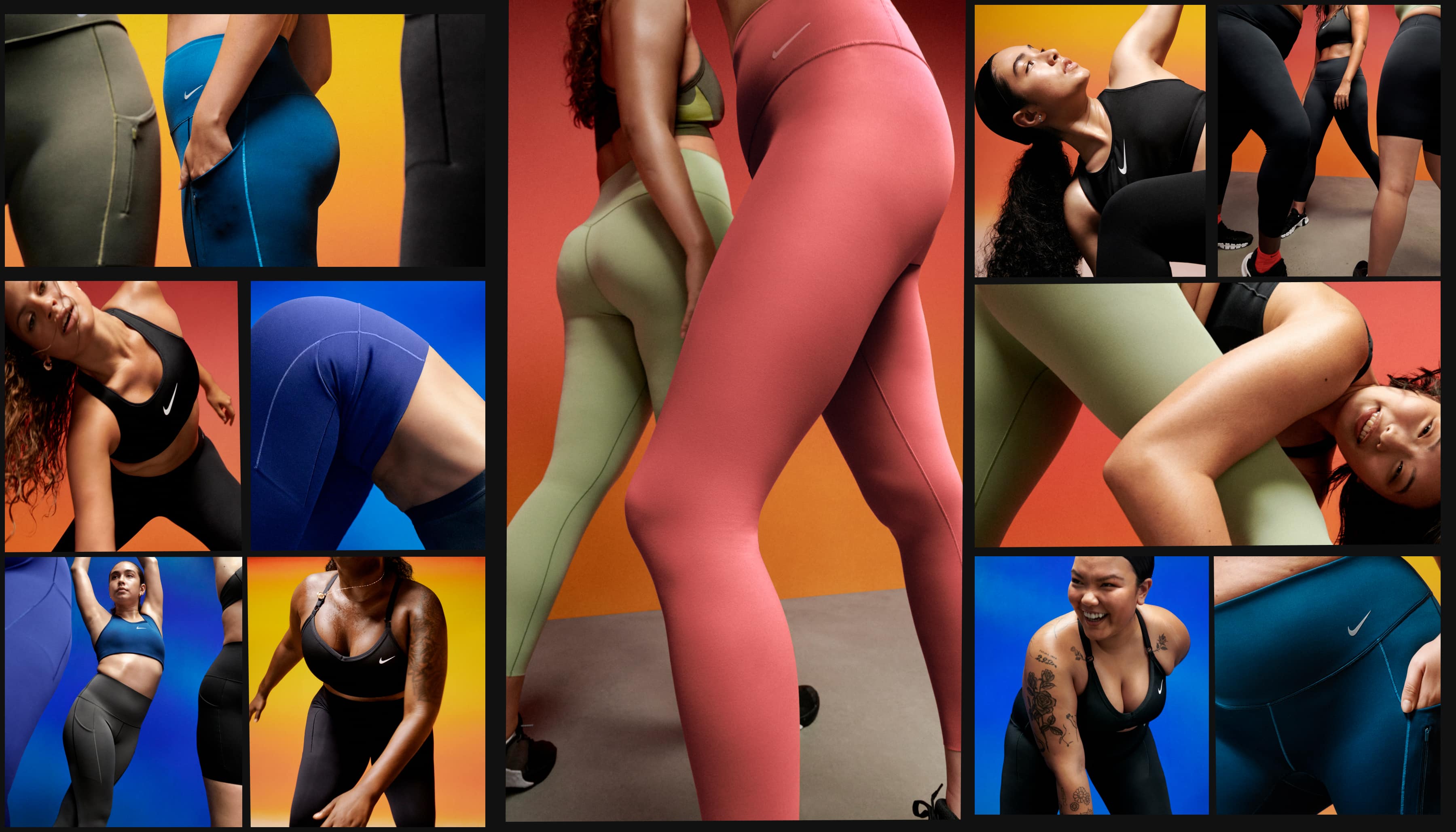
Nike Bras & Leggings
- Hero Photography: Vitali Gelwich
- Organic Capture: Maya Spangler
- Hero DP: James Beattie & Andy Iere Kim
- Hair: Amidat Giwa & Anna Im
- Styling: Hanna Kelifa
- Makeup: Rebecca Wordingham & Suyeon Park
- Set Design: Phoebe Shakespeare & Woojung
- Motion Editing: Mah Ferraz & Joseph Perry
- Music: Raphaël Ajuelos
- Creative Direction: Tricia Chamberlain
- Art Direction: Allison Kerst & Claire Pedersen
- Design: Lulubi Garcia
- Narrative Direction: Amie Champagne
- Narrative / Writing: Olivia Khoury, Matt Jonathan & Sabrina Hunt
- Year: 2024
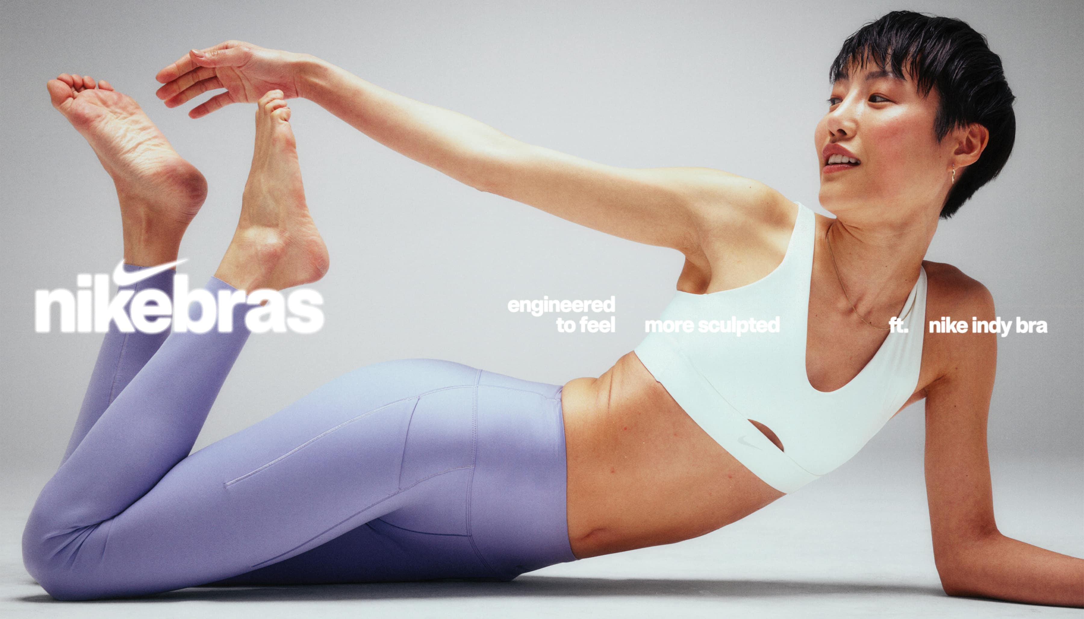
This season's bras and leggings campaign is a celebration of the experience and sensation that comes with every touch. With the introduction of the Zenvy Collection, we emphasize the softness and enduring comfort of our products, inviting wearers to discover moments of connection—be it feeling the fabric against their skin or embracing the power within through movement. Through a blend of still and dynamic diptychs, we encapsulate the duality of stillness and wildness, the rhythm of inhales and exhales, and the transformative journey of sweat and release. It's more than just apparel; it's about finding that perfect fit, connecting deeply with one's movements, and embracing the journey. Highlighting the strength of a global collective, the campaign underscores the power of our statement product—crafted for her, by Nike.
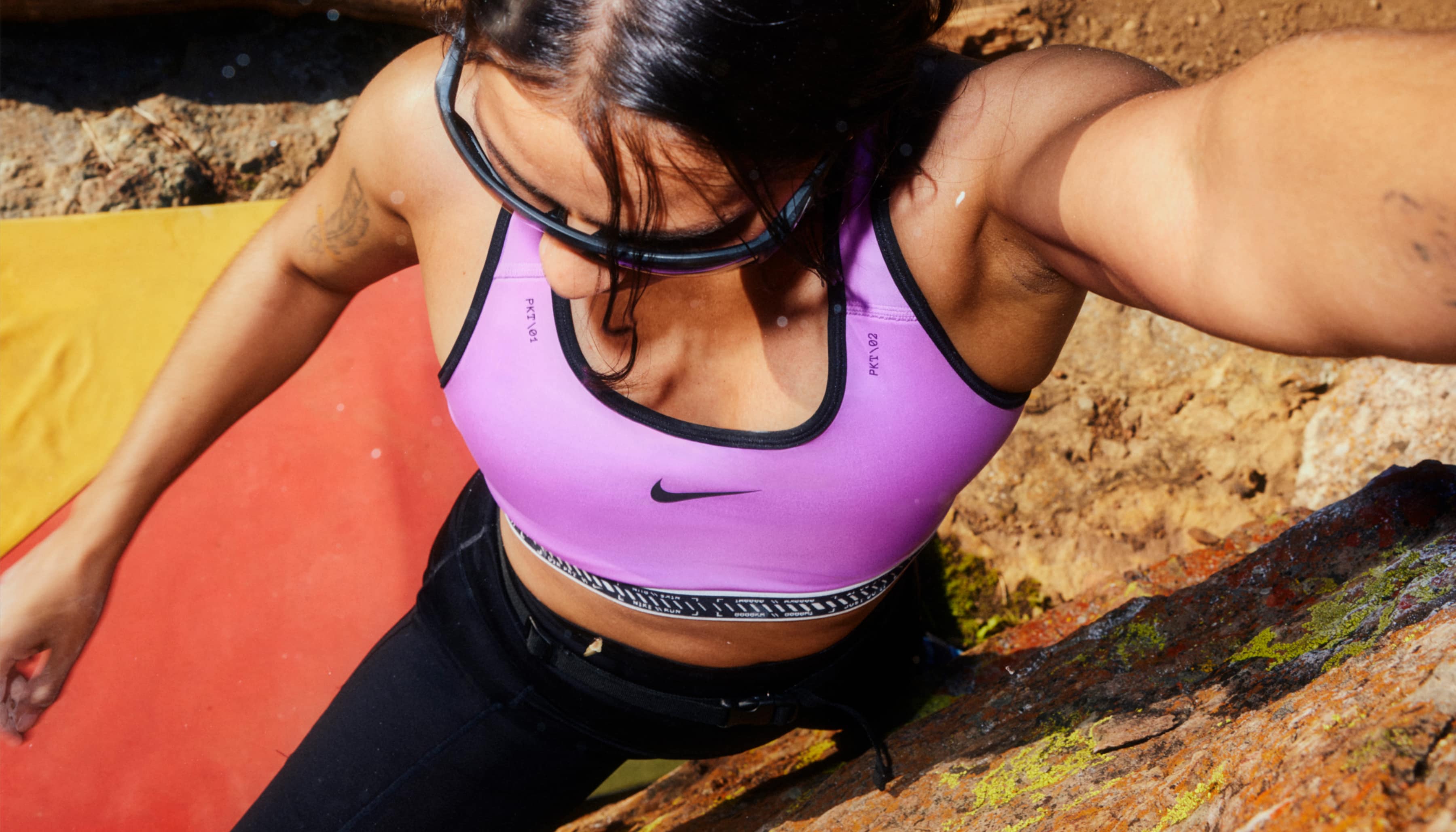
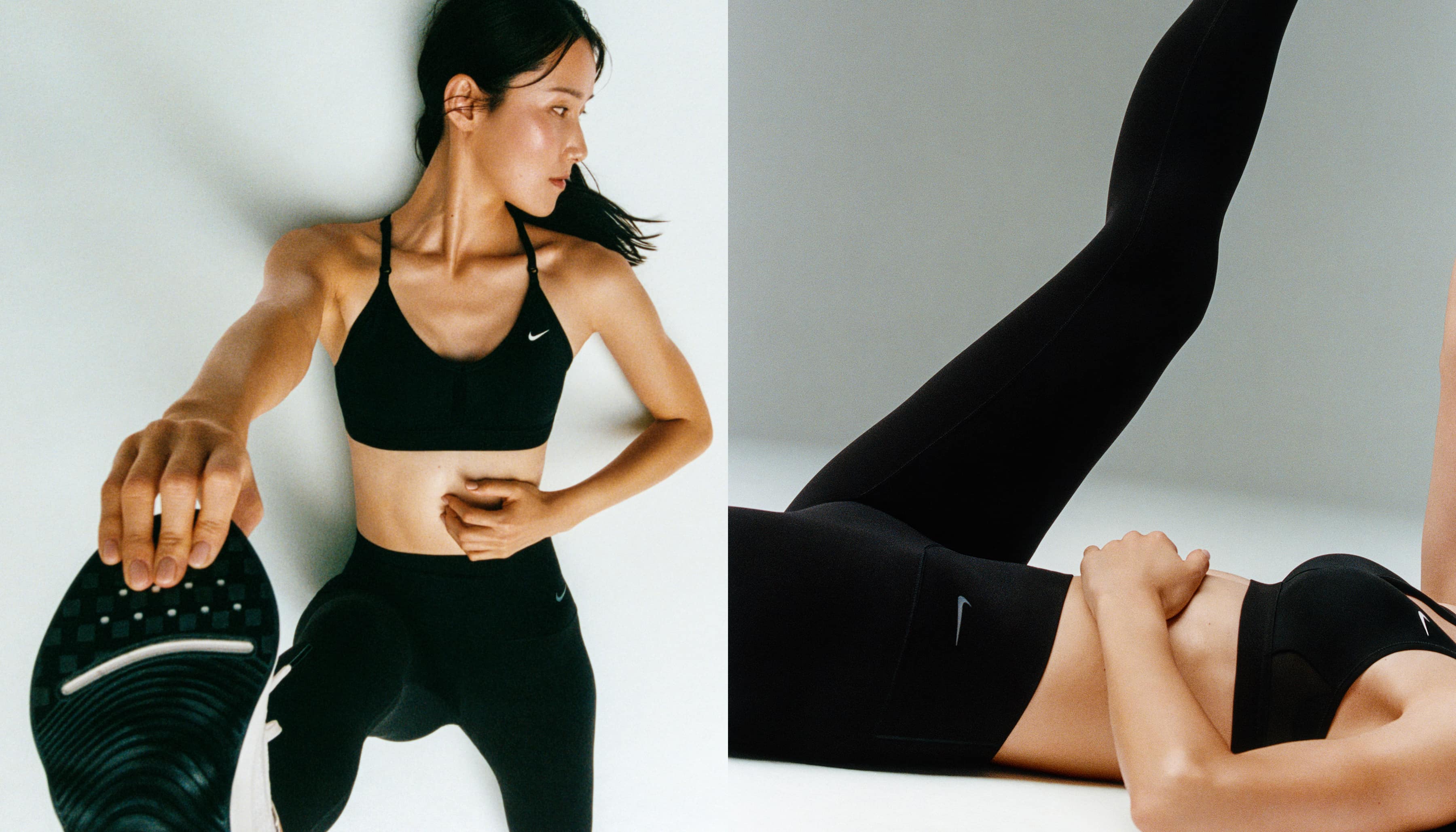
Nike Bras
- Photography: Emily Lipson & OK McCausland
- DP: Jackie Bao & Bob Hoste
- Stylist: Danasia Sutton
- Music: Raphaël Ajuelos & Kevin P Keenan
- Motion Editing: Anthony Miralles / Slips Studios & Joseph Perry
- Hair & Makeup: Rachel Lee Wright & Sophie Haig
- Creative Director: Tricia Chamberlain
- Art Directors: Emily Lemmer, Claire Pedersen & Miyu Shirotsuka
- Narrative / Writing: Brittnee Gregory & Topacio Beerhalter
- Design: Jennifer Hook & Genevieve Poblano
- Year: 2023
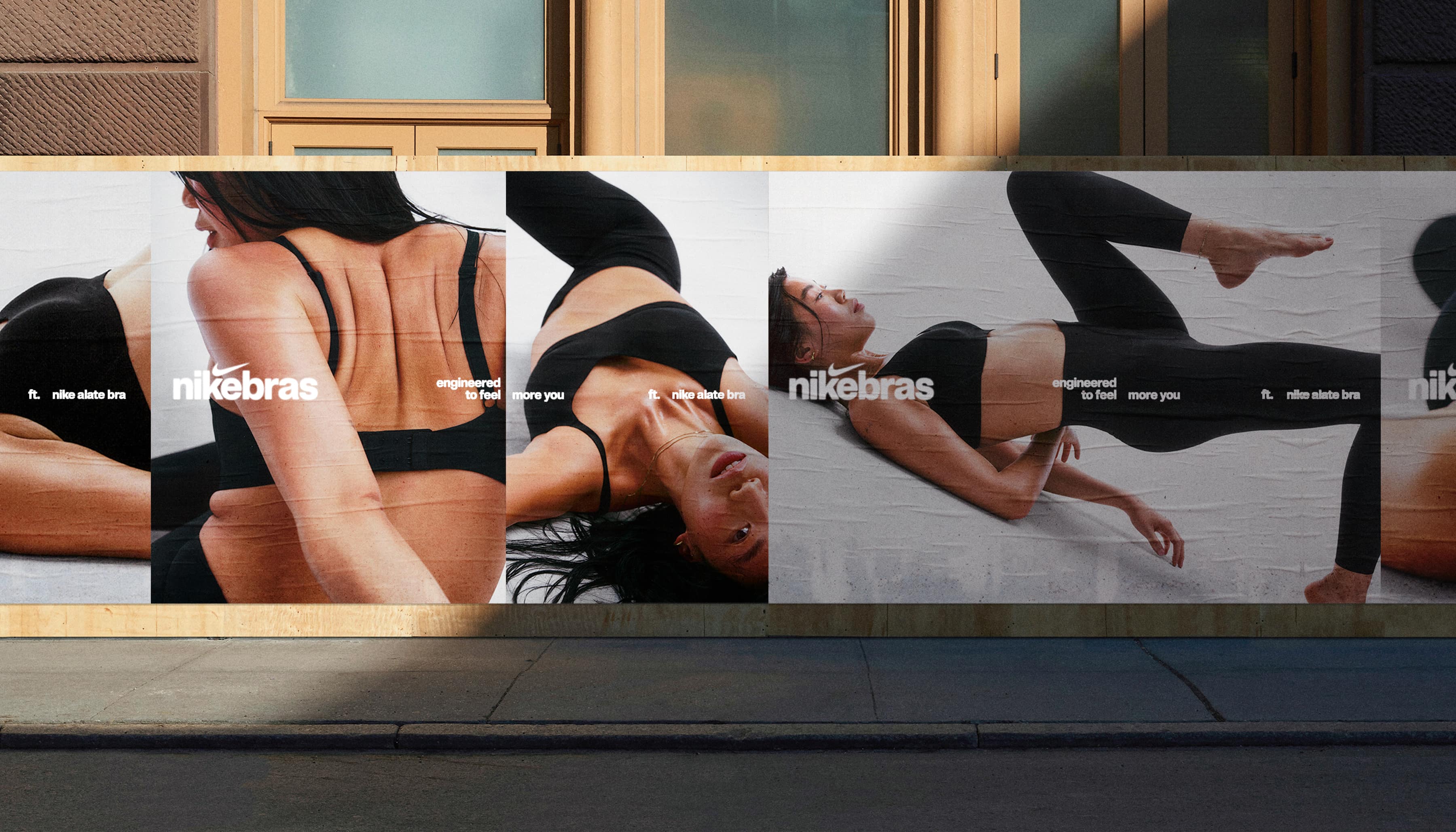
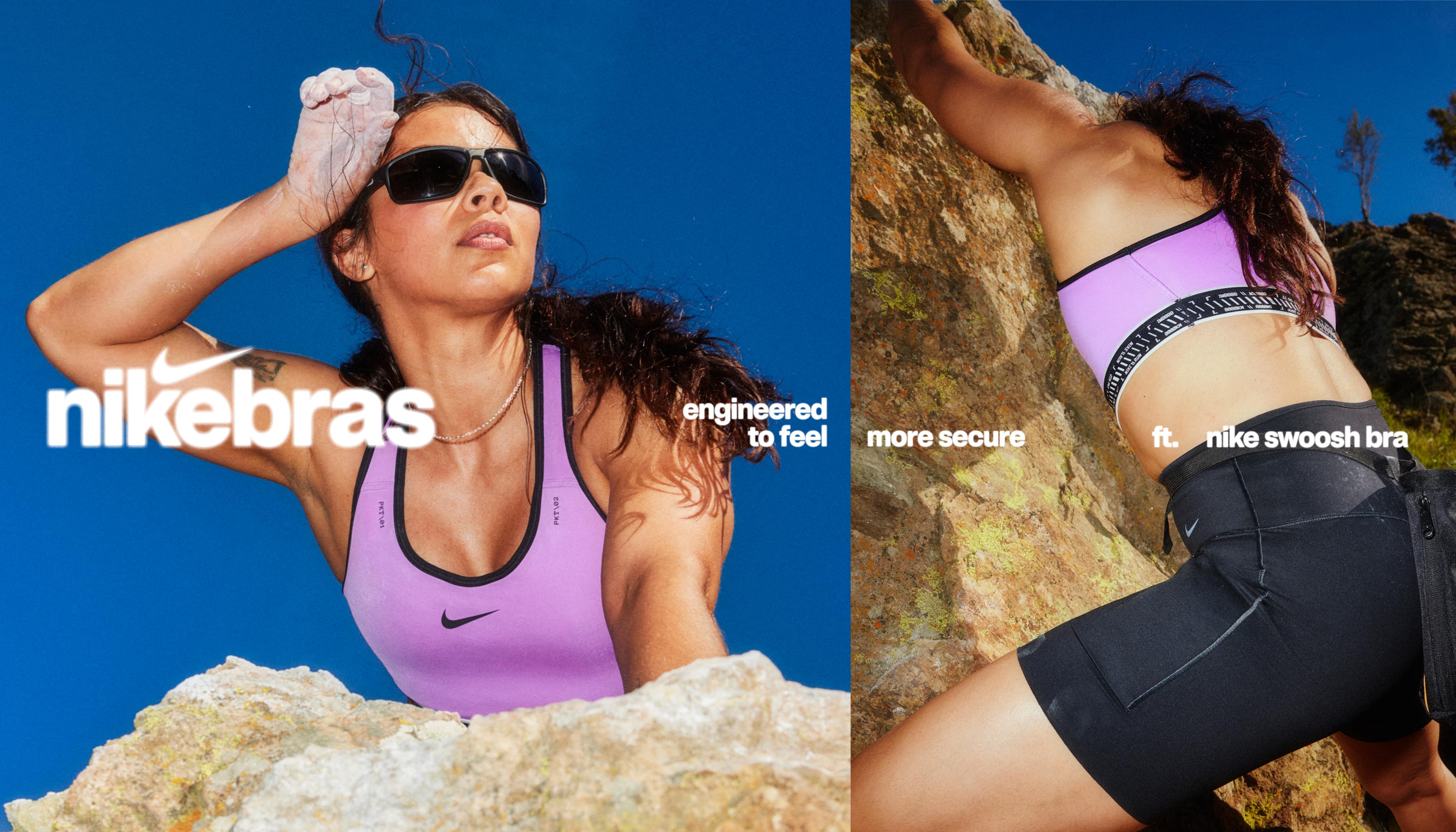
Did you know that 8 out of 10 women are wearing the wrong bra size? In 2023, we undertook the task of revitalizing Nike's line of sports bras. Our campaign was meticulously crafted to guide women in discovering the perfect bra tailored to their needs and preferences. The tagline we developed, "Engineered to Feel More You," embodies Nike's commitment to providing innovative solutions, empowering individuals to achieve their personal best. As part of our campaign's evolution, we eliminated the term “sports” from the product name, rebranding as simply 'Nike Bras.' Our objective was to motivate women to determine their correct bra size and recognize that Nike's collection offers unparalleled support, whether they're participating in sports or everyday activities. Our product line is meticulously engineered for every activity she might choose. We showcased the collection through a blend of on-location and in-studio photography, capturing the essence and versatility of each product.
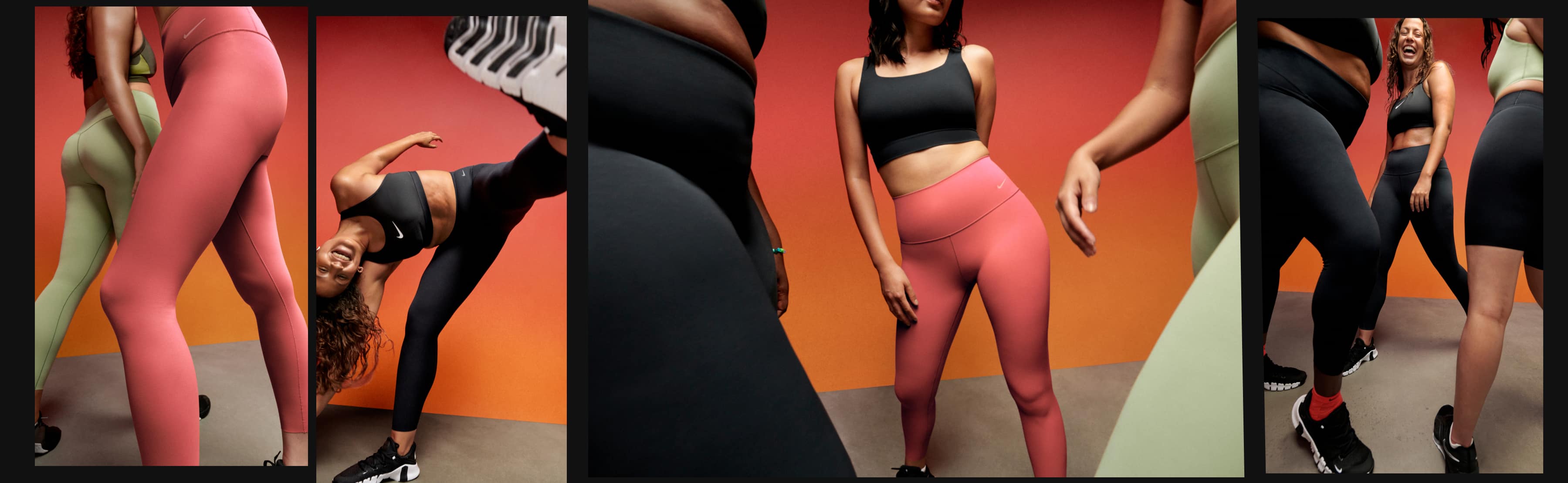
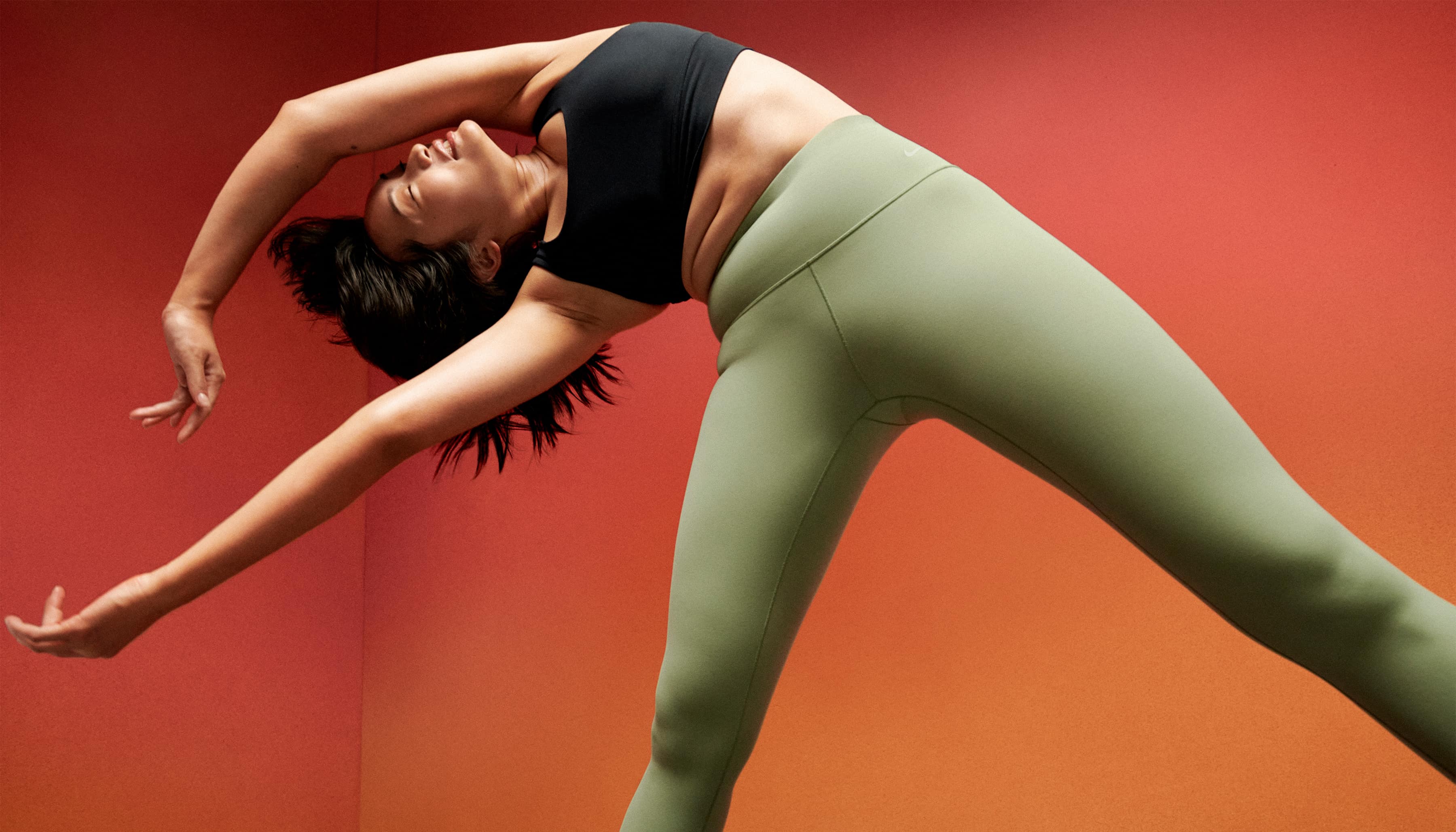
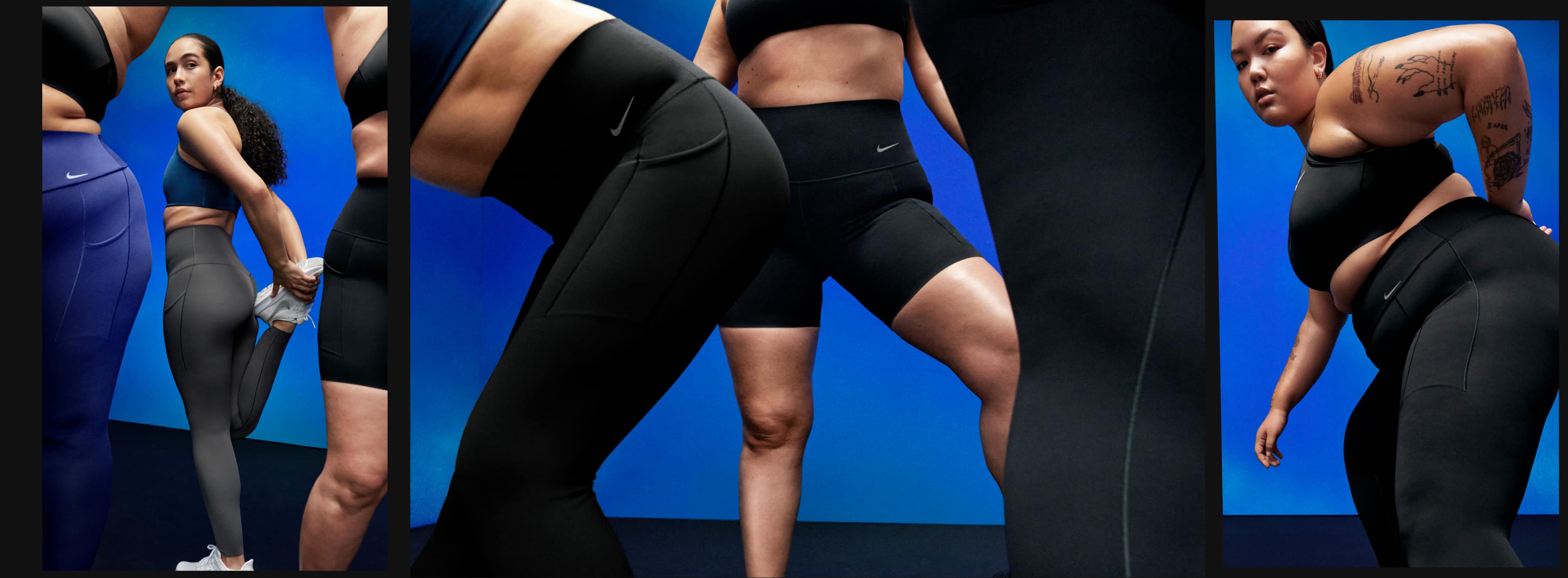
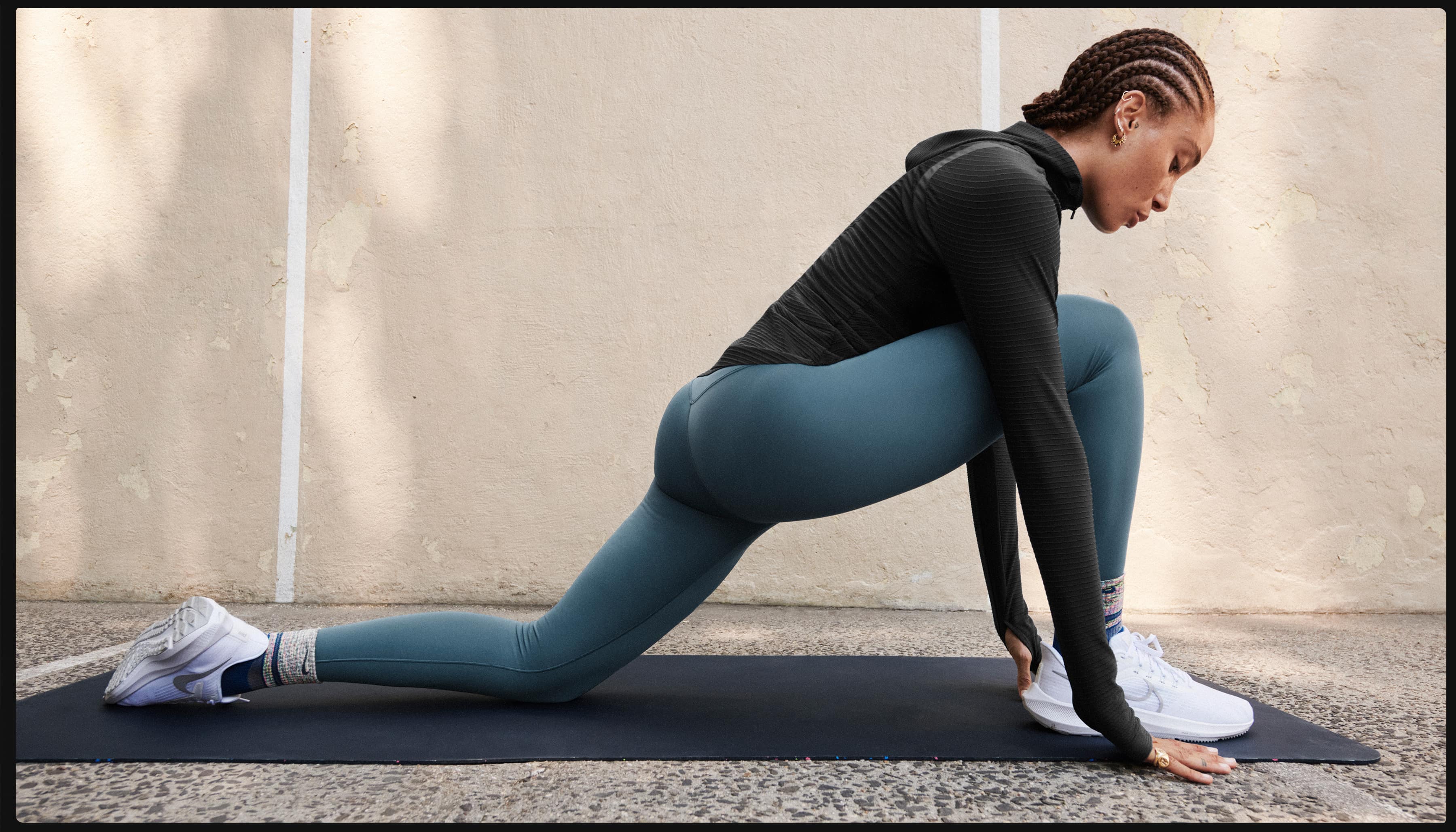
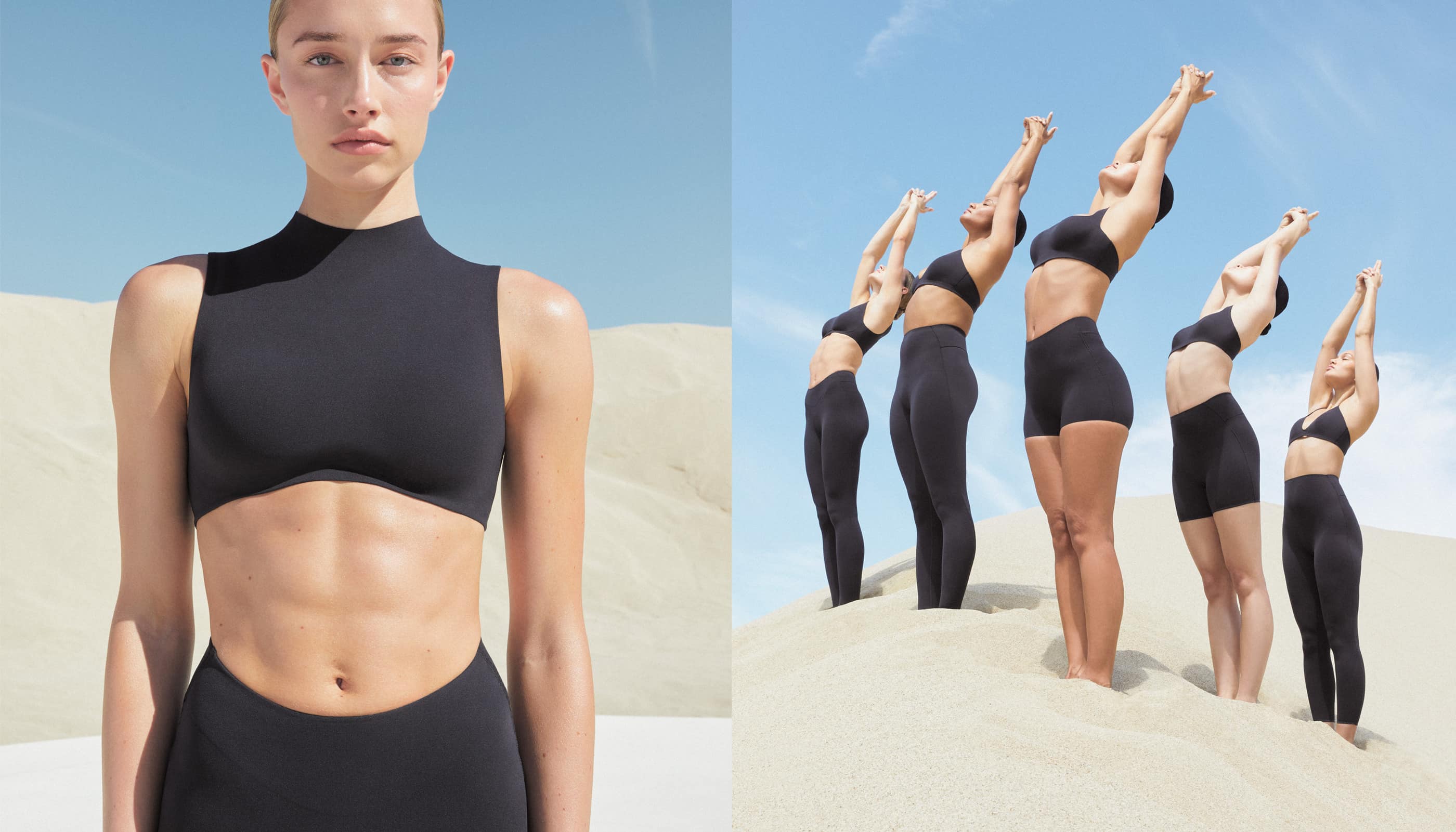
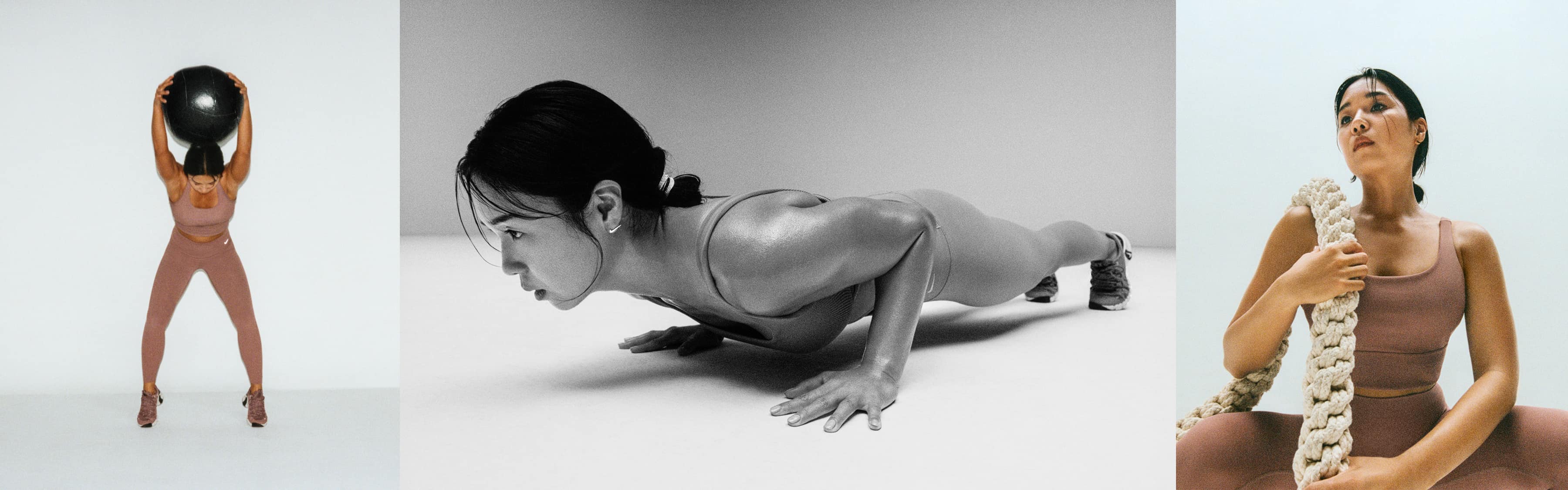
Nike Leggings
- Photography: Zora Sicher & OK McCausland
- Cinematographer & Editor: Chaio Chen
- Stylist: Solange Franklin
- Hair: Latisha Chong
- Makeup: Zenia Jaeger
- Set Designer: Nat Hoffman
- Design: Mouthwash
- Creative Direction: Tricia Chamberlain
- Art Direction: Claire Pedersen, Diana Albrecht & Miyu Shirotusuka
- Narrative & Strategy: Gaby Tama
- Writing: Topaccio Beerhalter
- Production: Lola
- Year: 2023
Nike revamped their premium leggings line in 2023 by addressing common issues such as pilling, loose threads, and inadequate pockets. We developed a campaign with the tagline "A Feel For Every You" to showcase the comfort, self-expression, and choice these leggings offer for every aspect of an athlete's life. Our creative approach was to build a "leggingsverse" consisting of three visually distinct worlds based on the sensations of each legging. As soon as the consumer puts on the leggings, they are transported to this world, allowing them to tap into their athlete mindset and experience a zoned-in feeling. The consumer can explore the unique sensations and support each legging offers. Our aim was to inspire the consumer to embrace their own energy, discover new possibilities, and be unapologetic in their pursuit of movement.
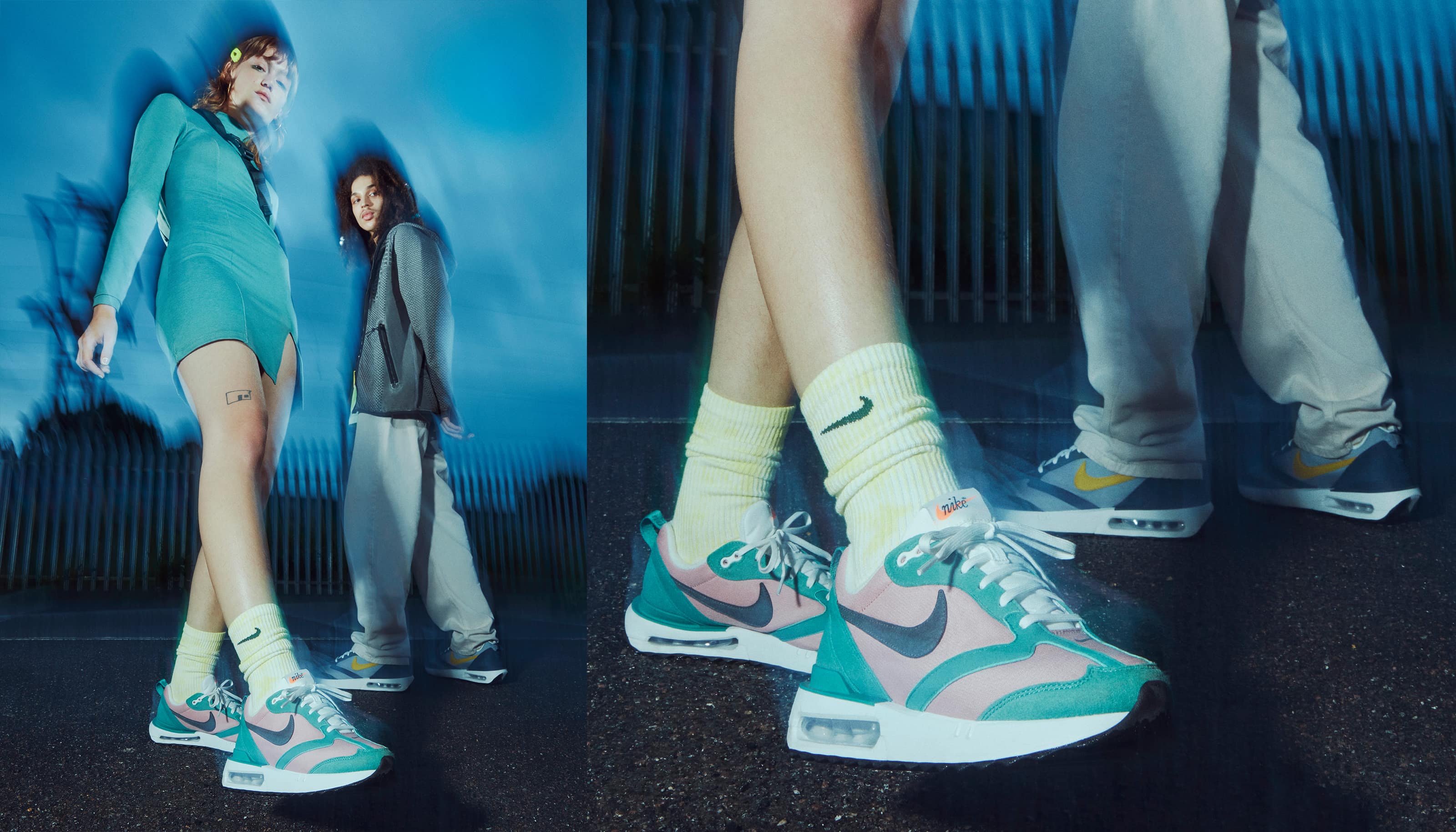
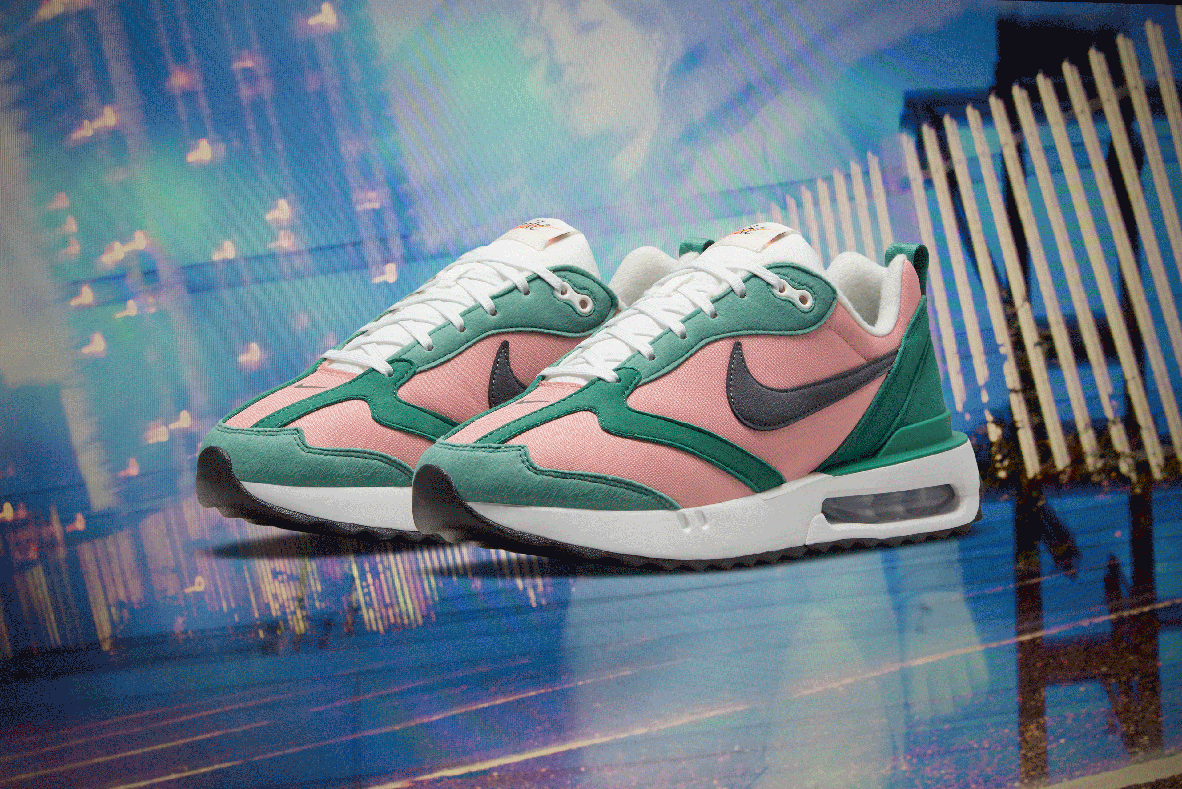
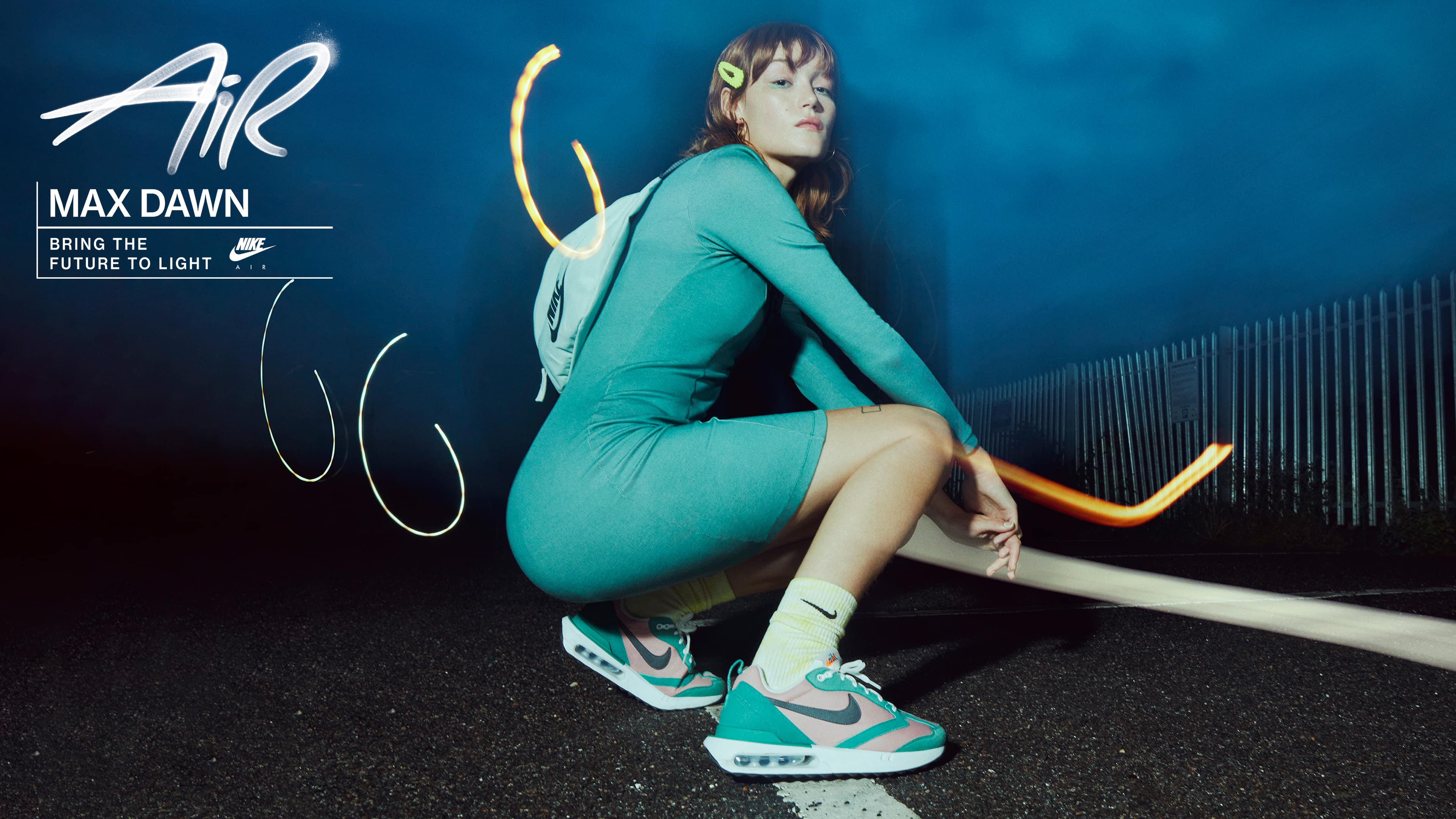
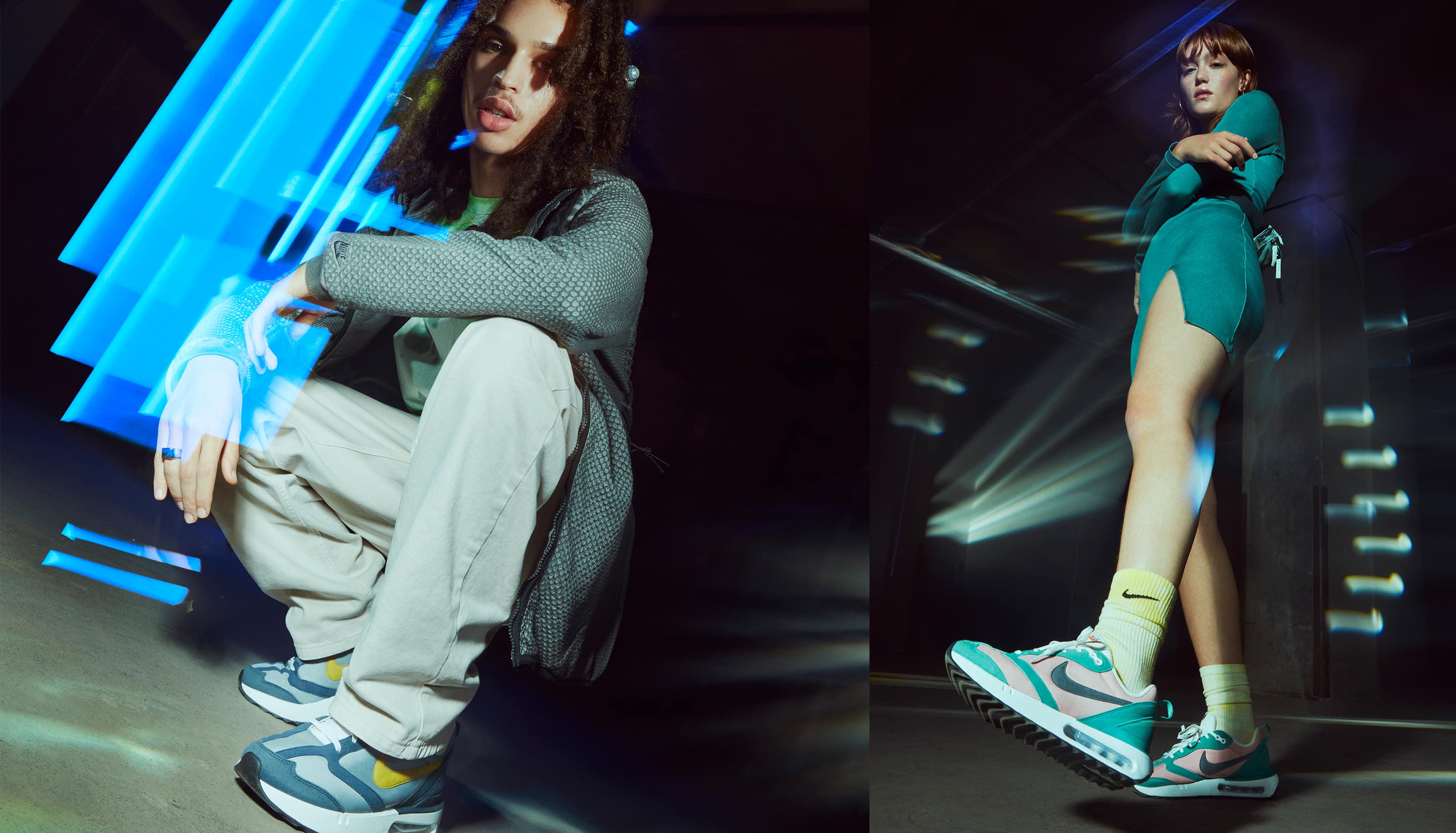
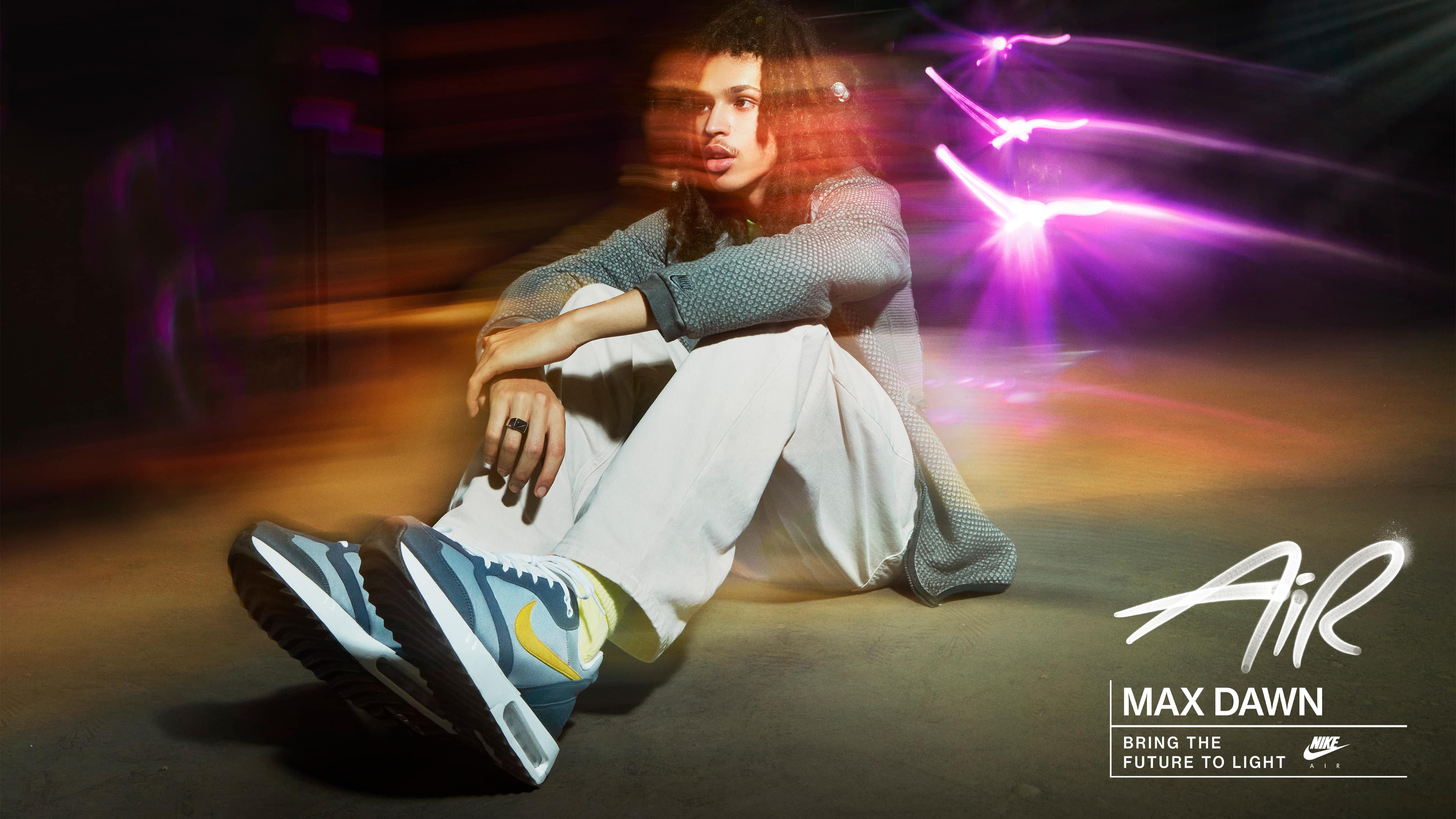
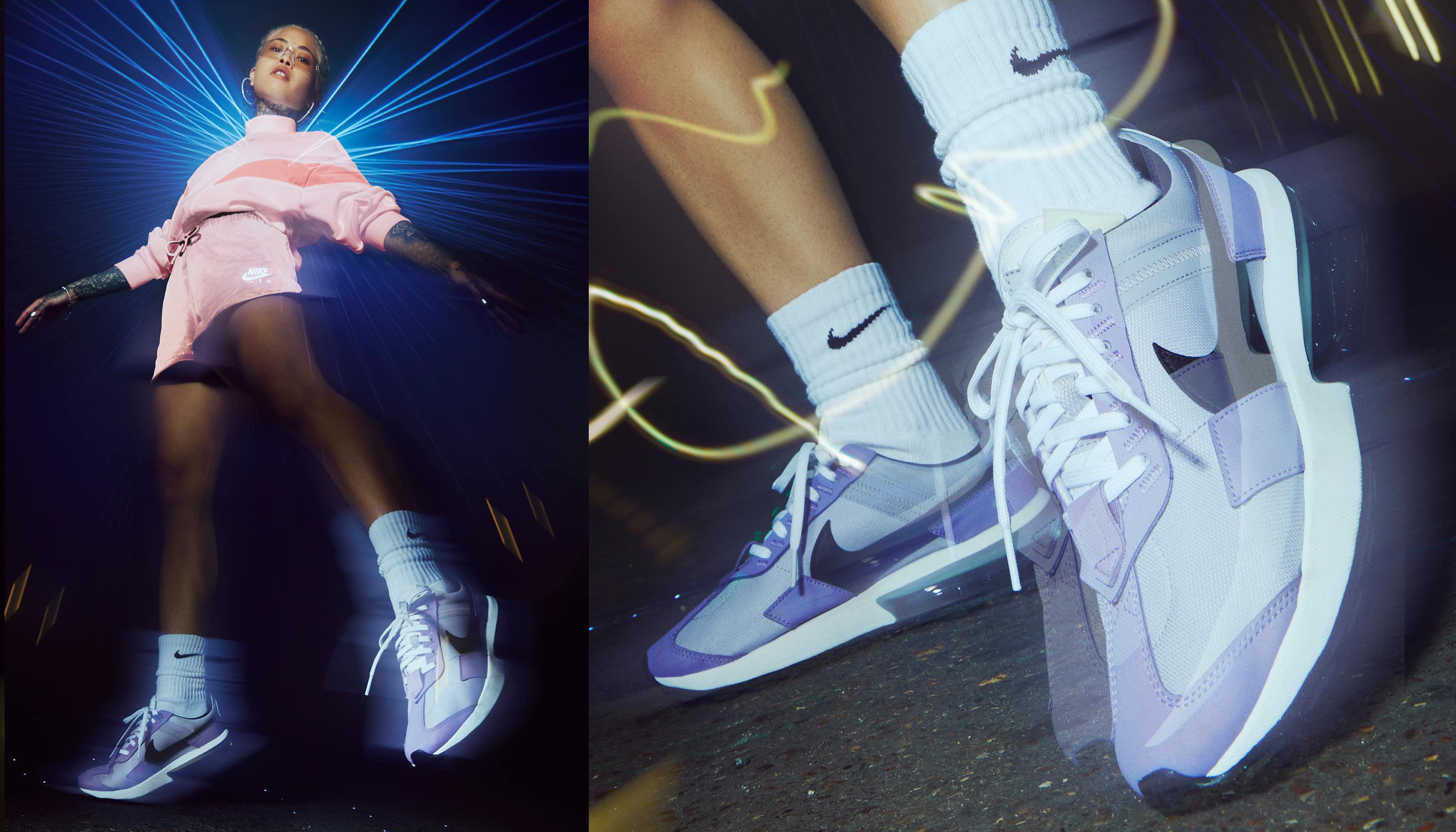
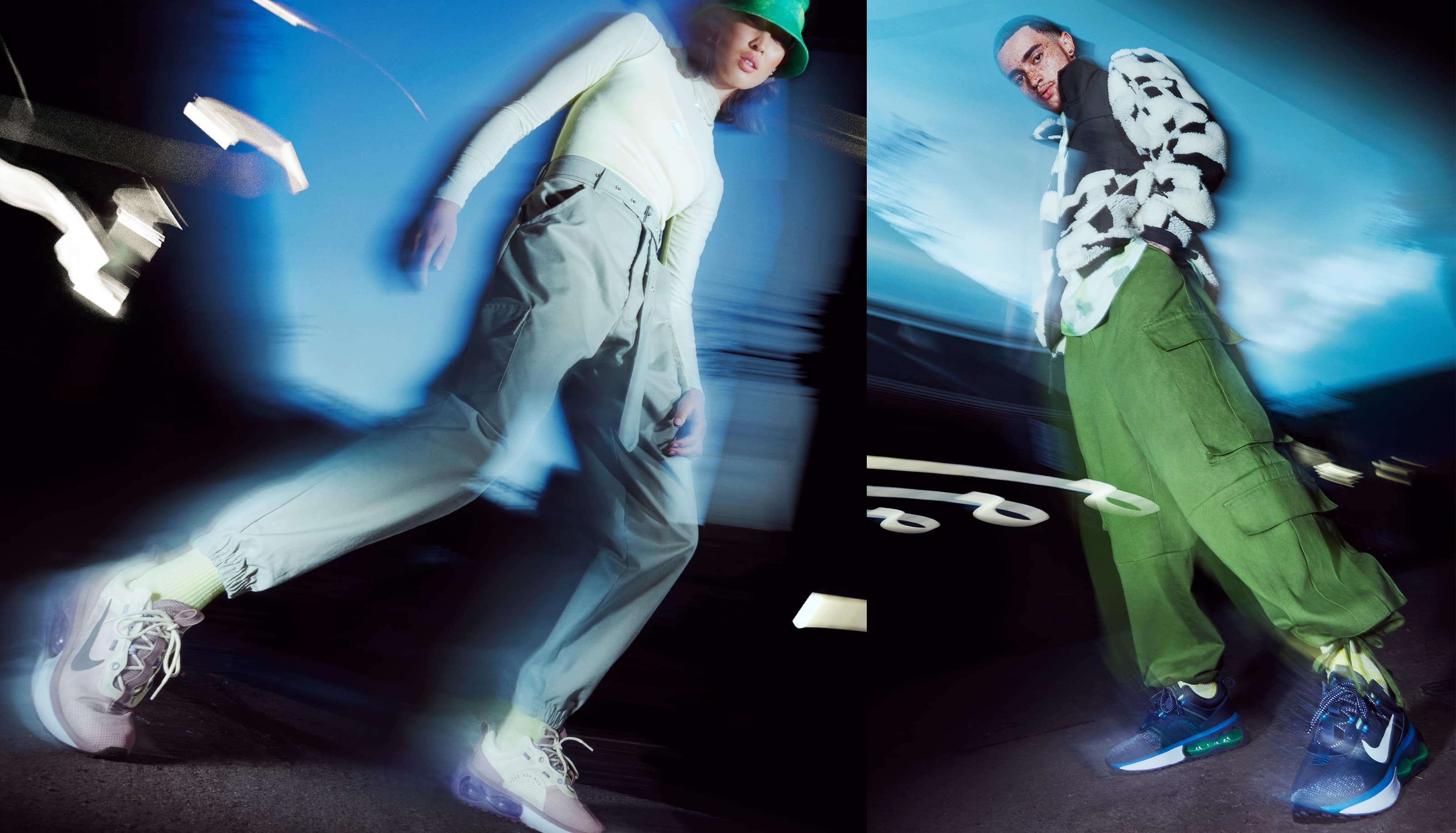
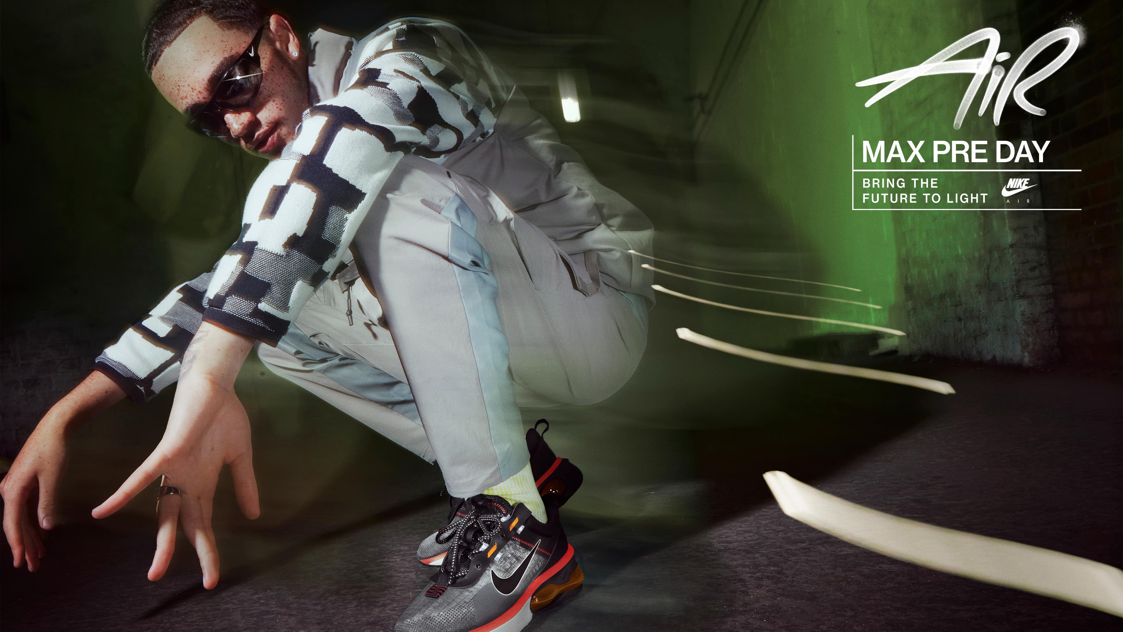
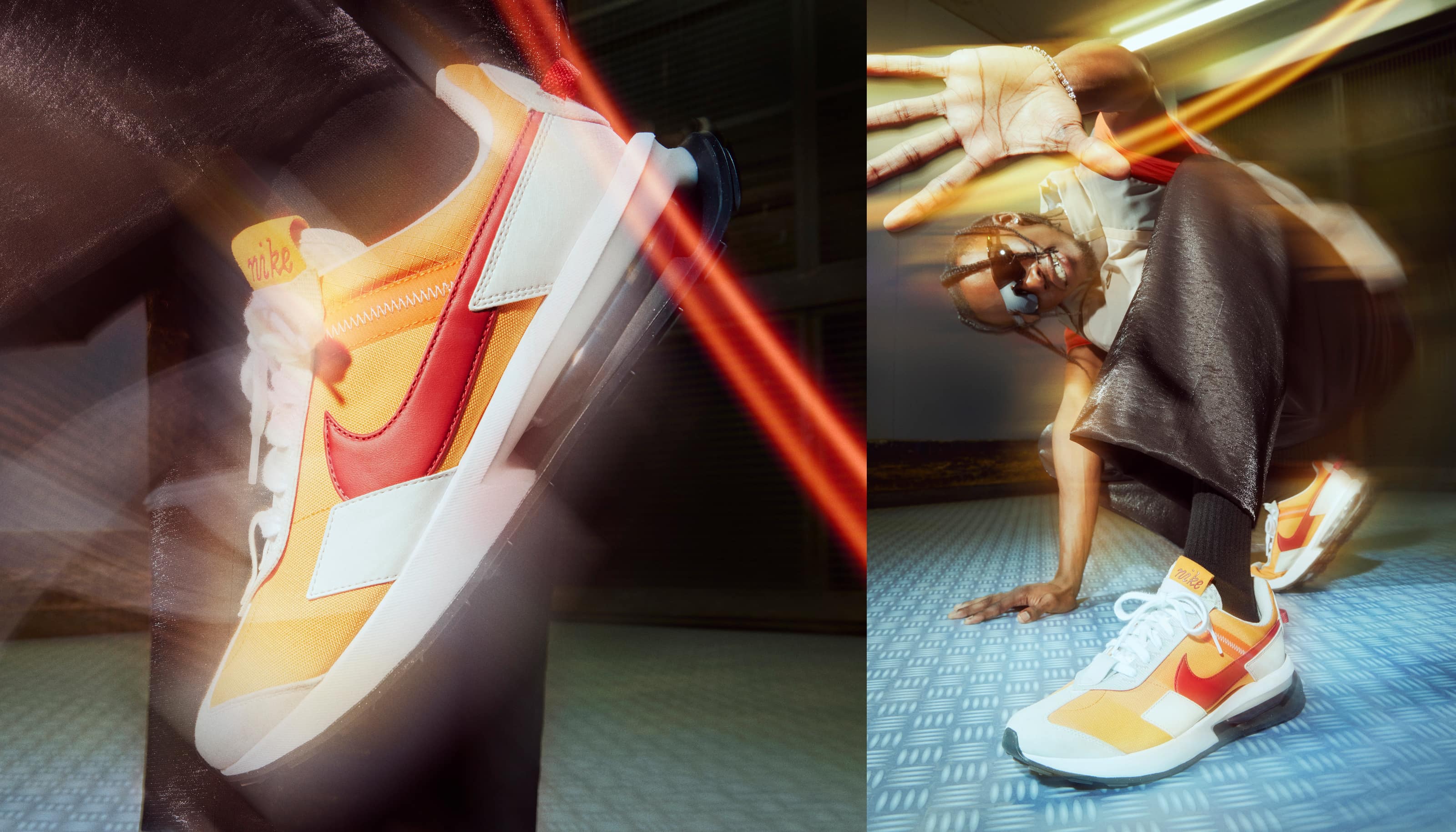
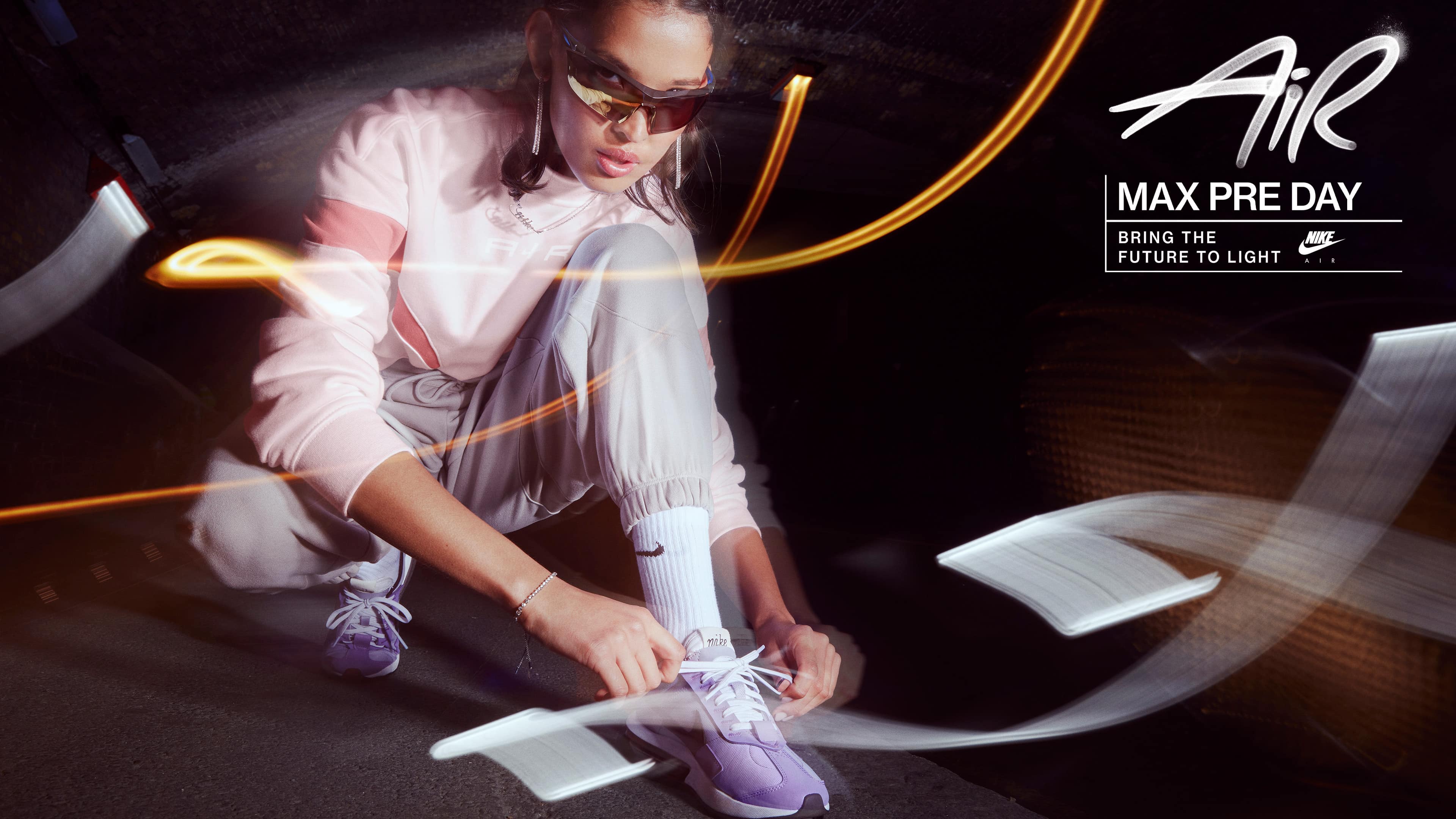
Nike Air Max
- Photography: Aidan Zamiri
- Editor: Ross Constable
- Art Direction: Claire Pedersen & Riley Hoke
- Creative Direction: Claire Kang & Derrick Lee
- Post-Production Design: Clayborne Bujorian
- Retouching: Touch Digital
- Production: Rosco London
- Music: Year0001
- Year: 2021
The 2021 Holiday Air Max campaign is a true homage to the emerging generation of sneakerheads. Our visually stunning concept perfectly captures the boundless energy and self-expression of this new wave. We have utilized a double exposure technique in our imagery that captures the essence of life in motion, revealing new elements and textures of the city with every step. Through our 'In Your Face' angles, we showcase the intricate design details of our Air products, infusing them with a vibrant and youthful spirit that is irresistible.
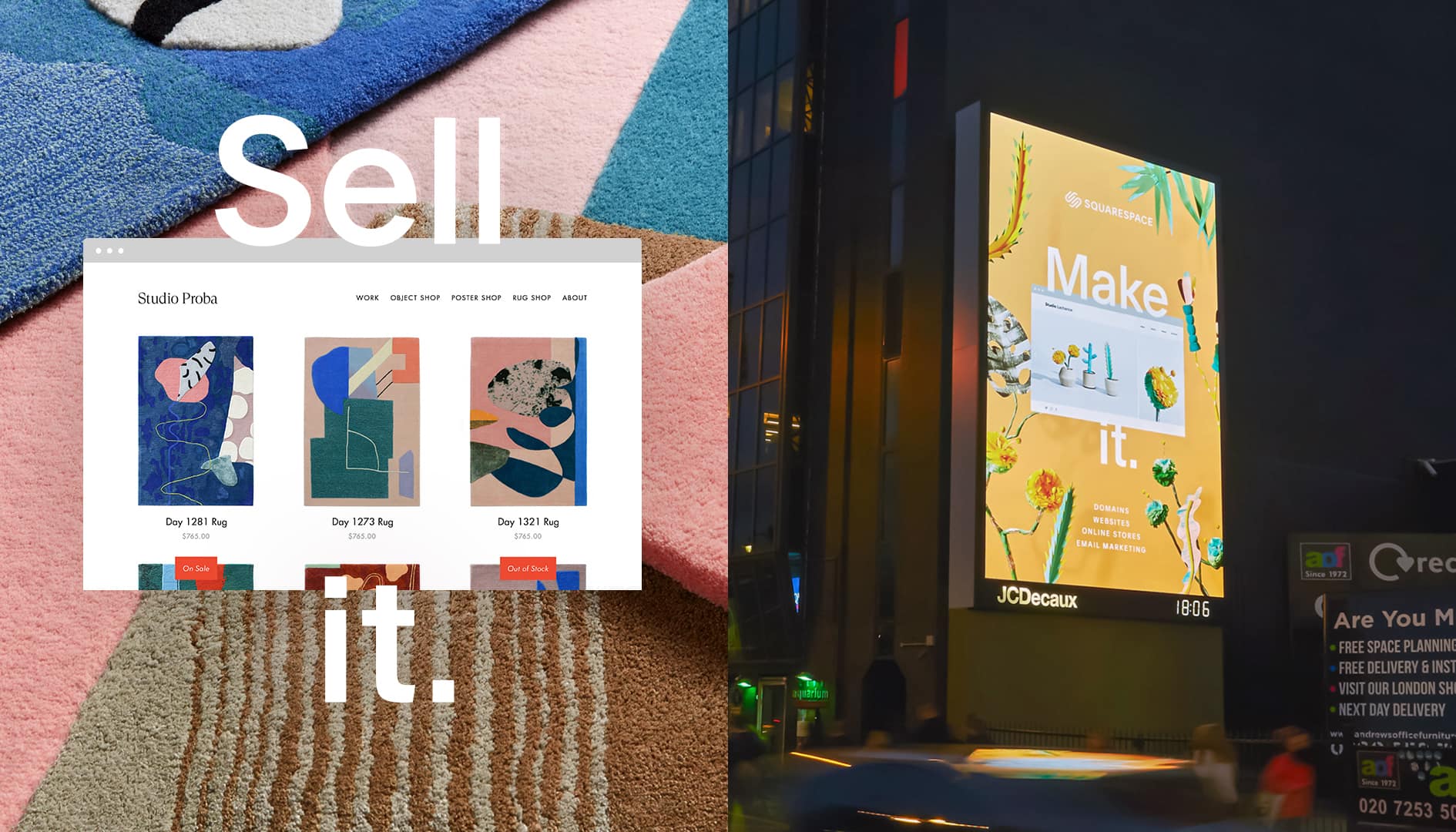
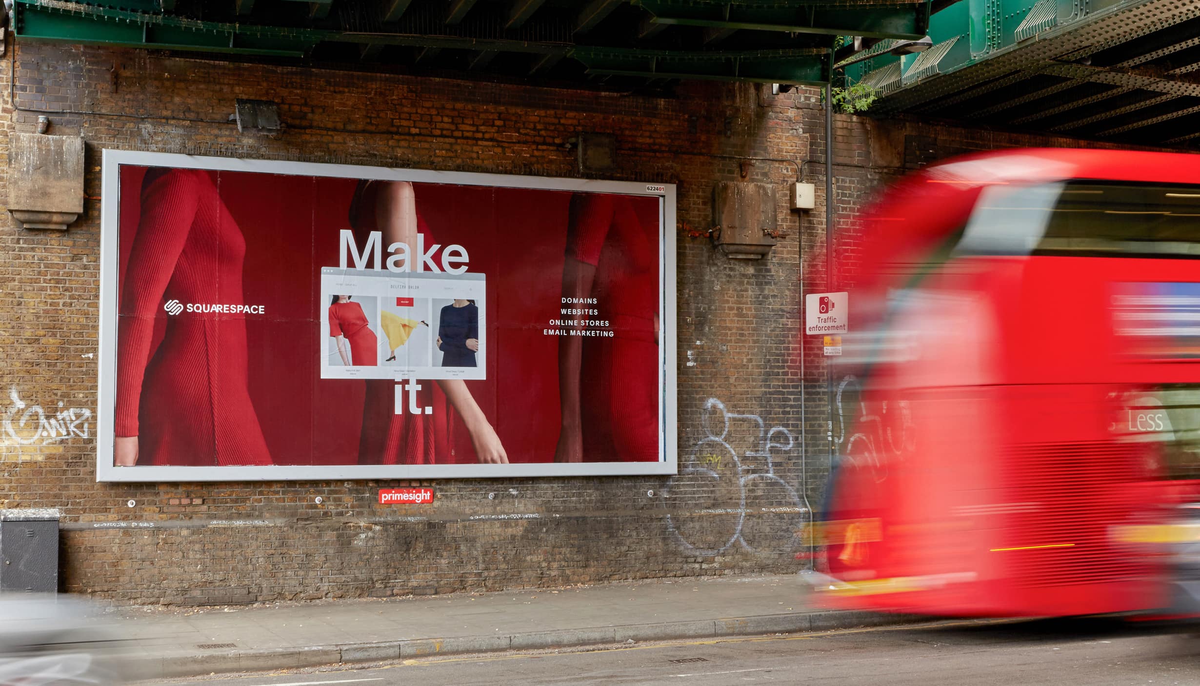
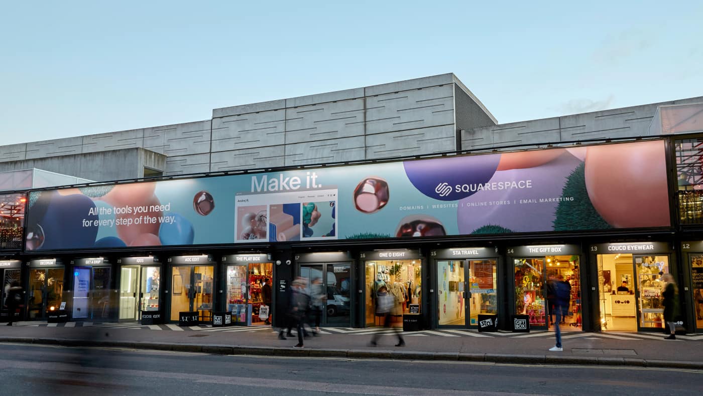
All In One
- Company: Squarespace
- Art Direction: Mathieu Zarbatany
- Design: Claire Pedersen, Kyungwang, McLane Tetiel, Louis Gonzales
- Year: 2018
Whatever your idea needs, Squarespace offers all the tools to turn it into something great. There’s an easy feature for every step in the creative process, whether you’re naming, building or sharing. It’s simple and intuitive, creative and fun. No matter the person, business or product, Squarespace is here to help you transform your idea into an enterprise.
Dream it. Name it. Build it. Sell it. Grow it. Shout it.
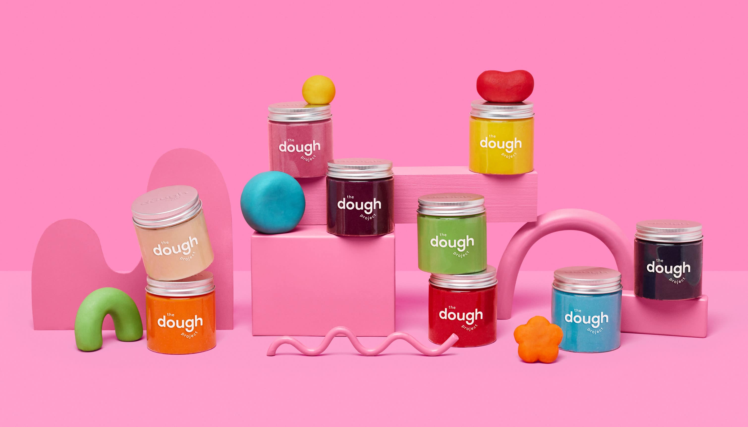
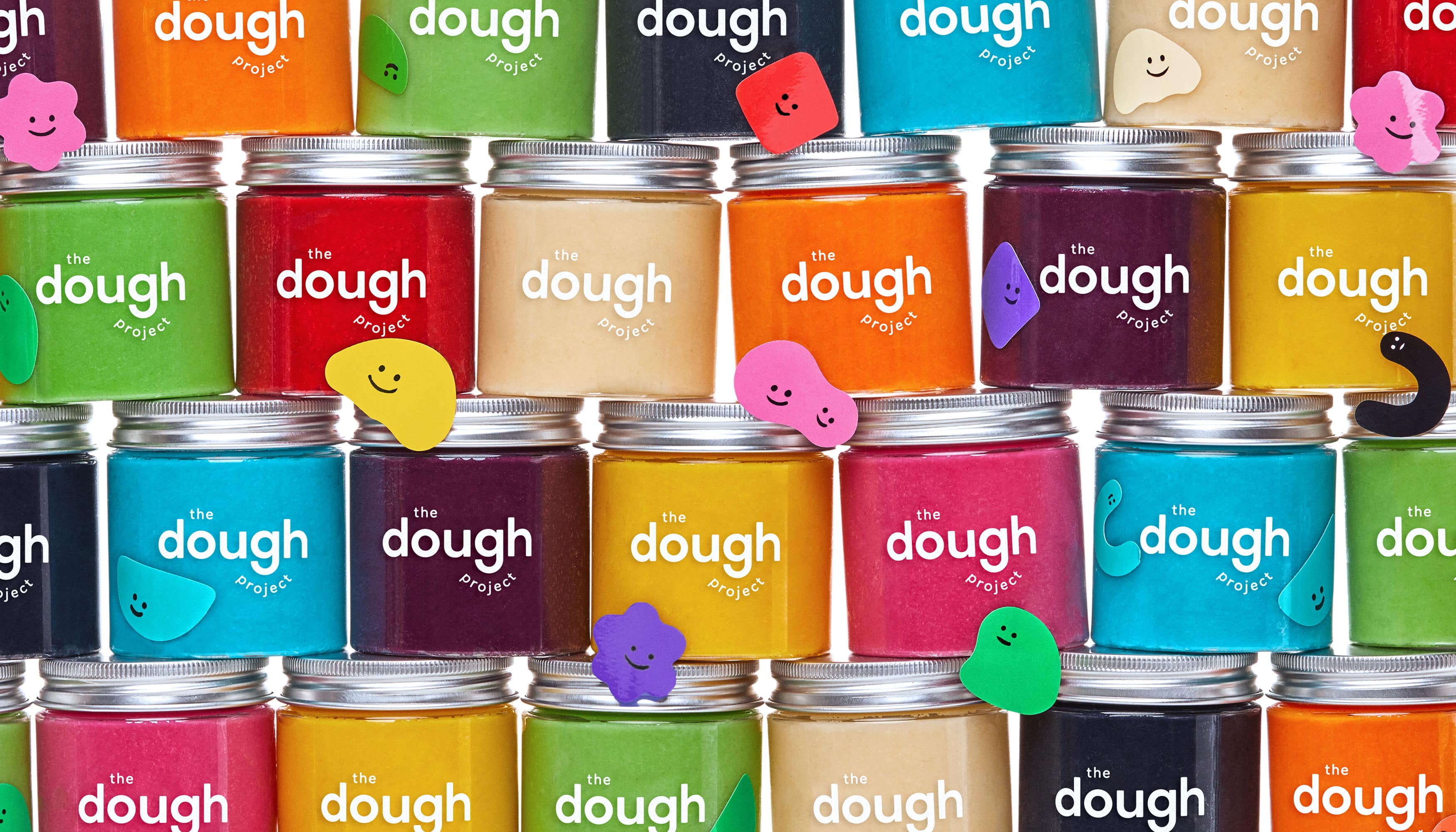
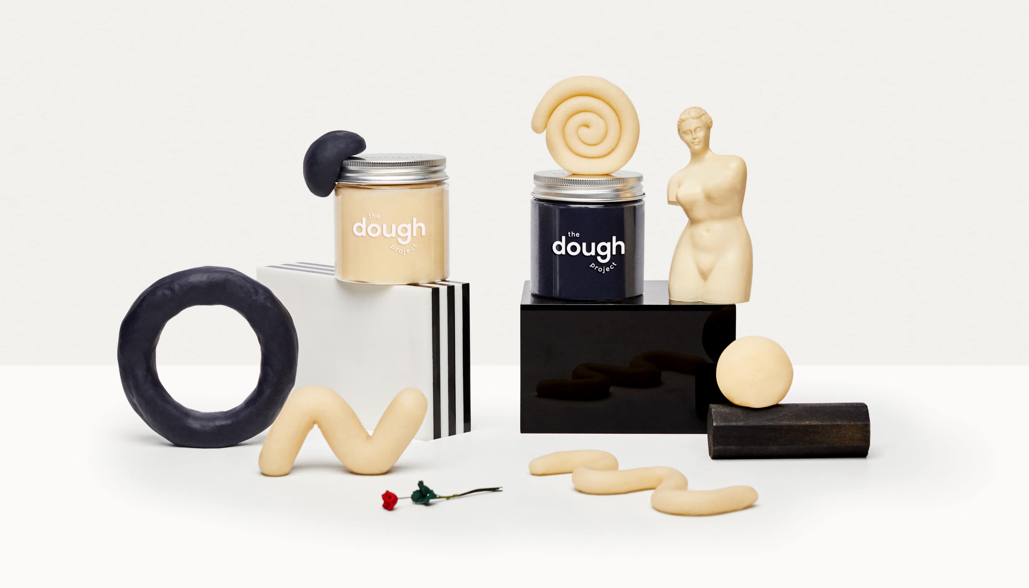
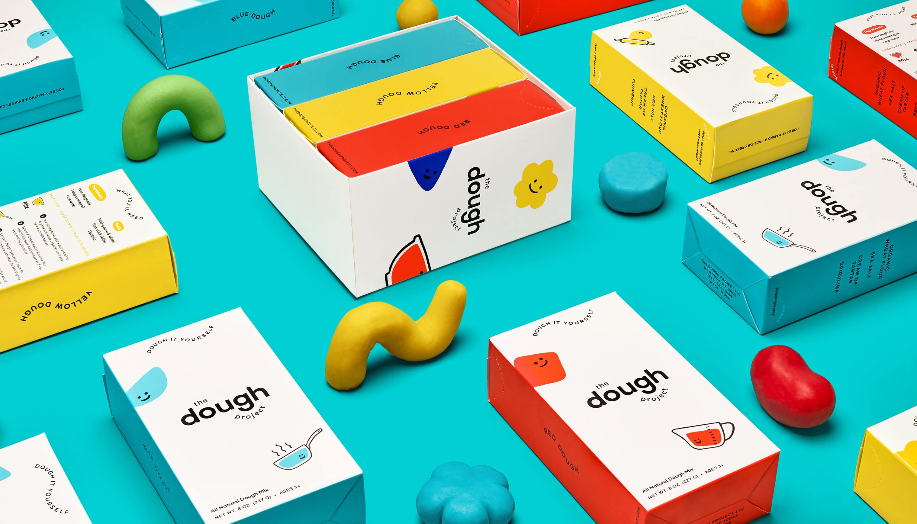
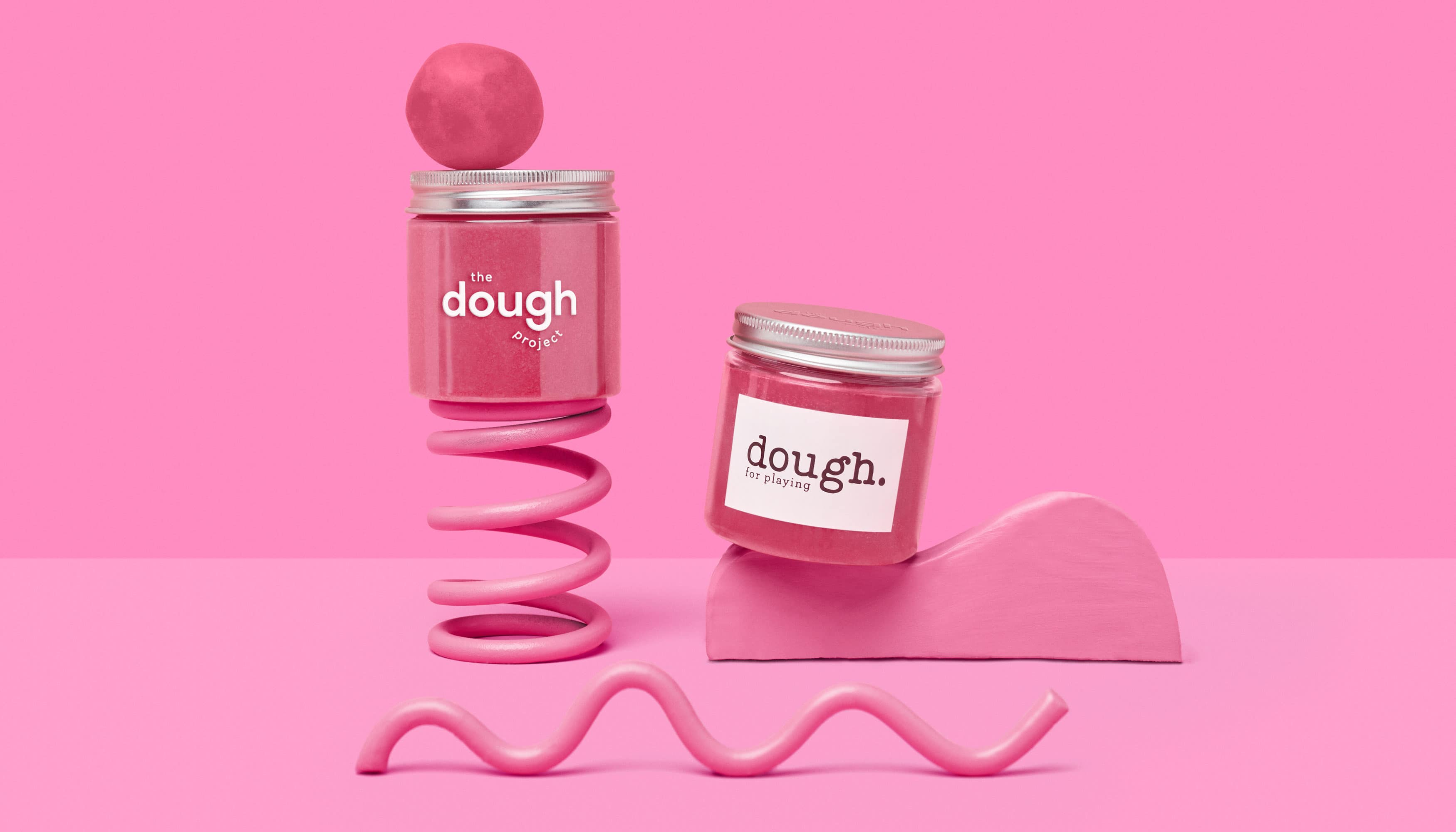
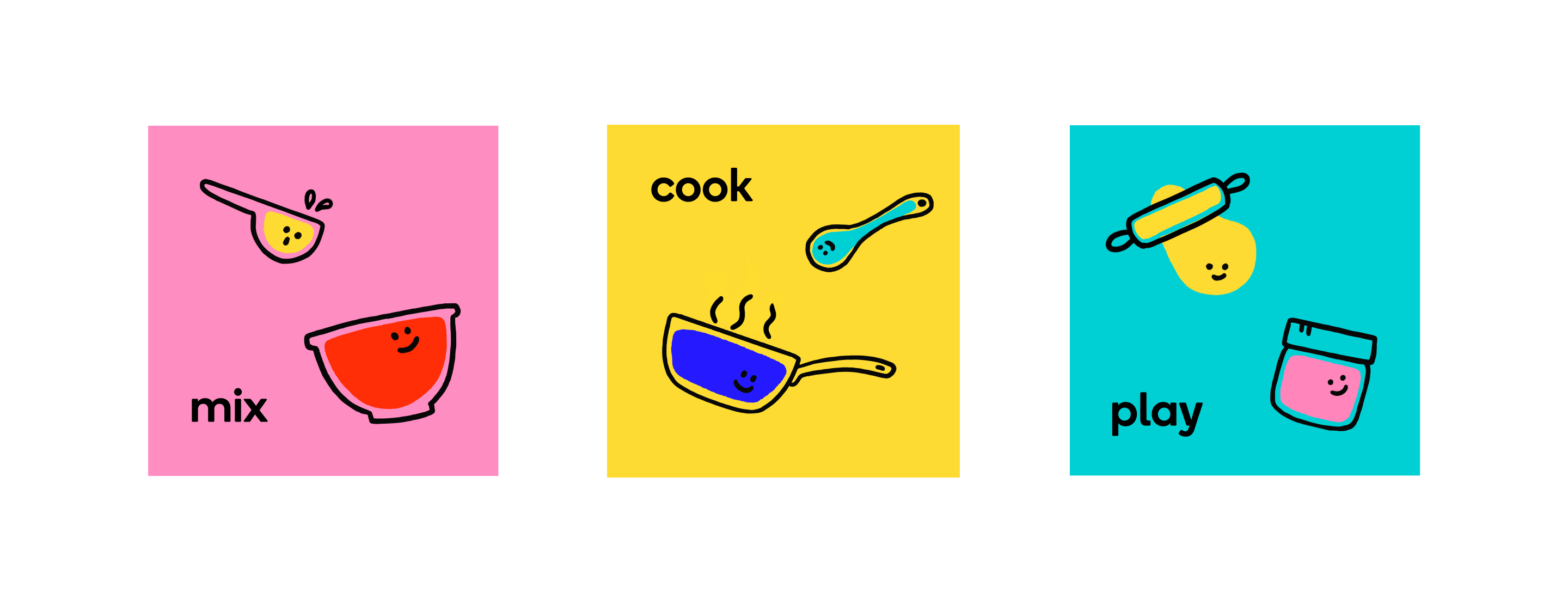
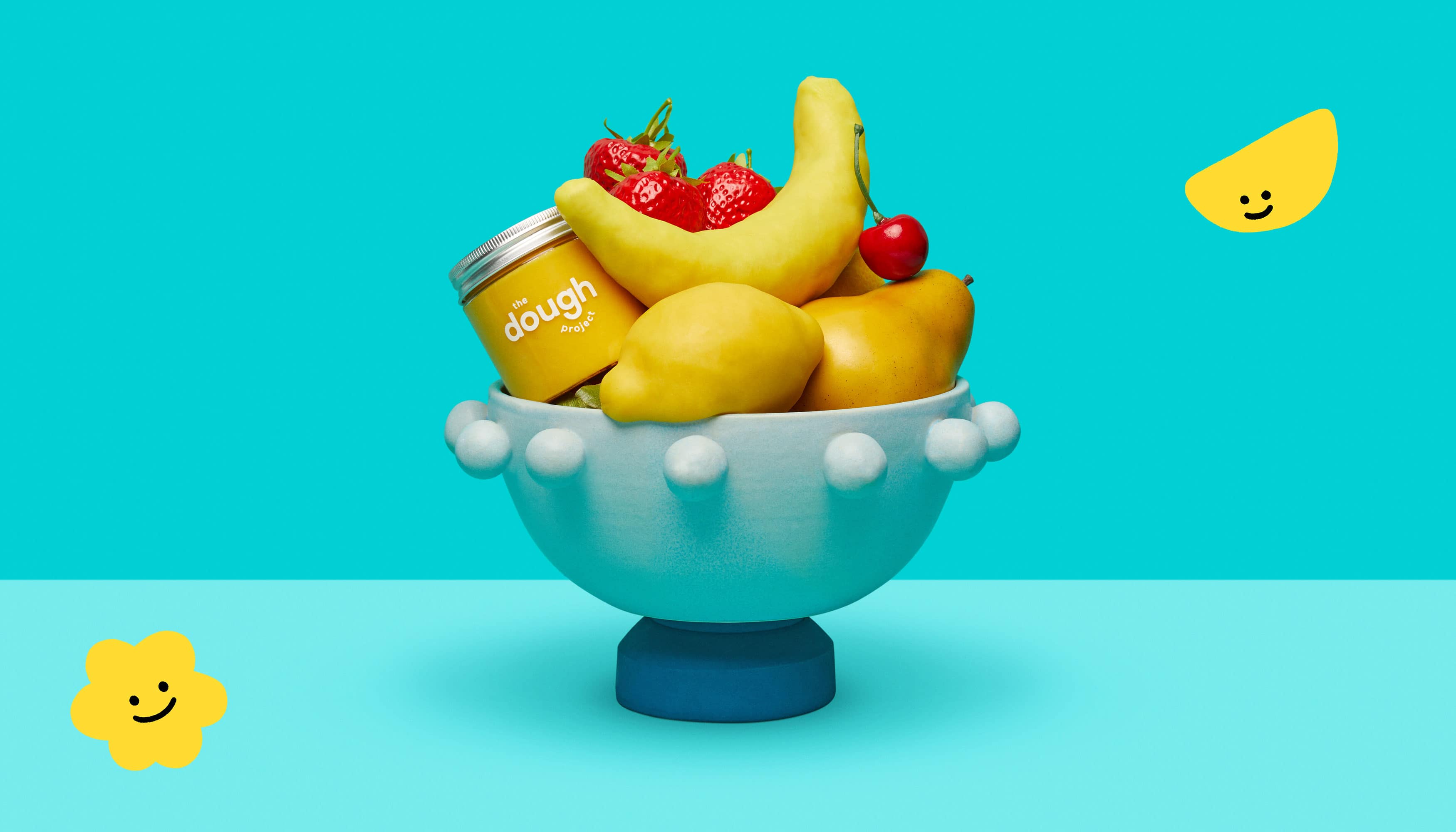
The Dough Project
- Company: Communal Creative
- Photography: Alistair Matthews
- Art Direction: Claire Pedersen
- Illustrations & Animations: Yejee Pae
- Year: 2020
Founded by a schoolteacher, The Dough Project creates all-natural, plant-based play dough that kids can make at home. We updated the branding to celebrate the vibrant, veggie-powered colors of the dough and the idea of endless creation. The Dough Project believes that all the shapes we make are beautiful. To bring this idea to life, we created linear illustrations that personify the dough, as well as loose, blobby shapes that can be molded into myriad forms. The result is a fresh and playful identity that inspires kids and parents alike.
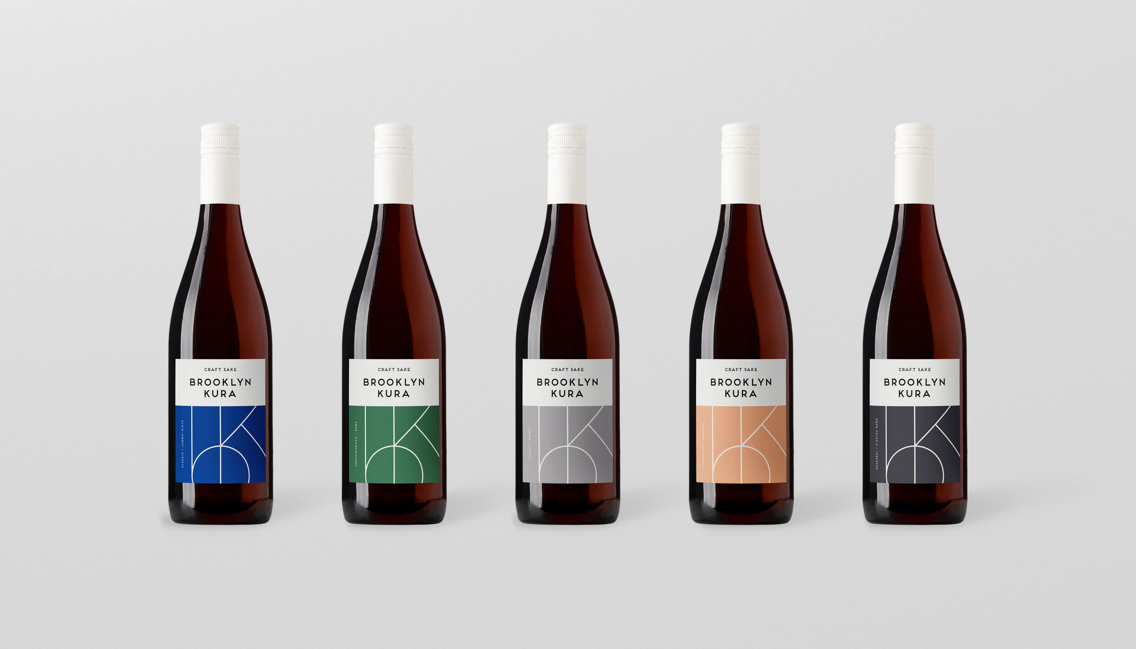
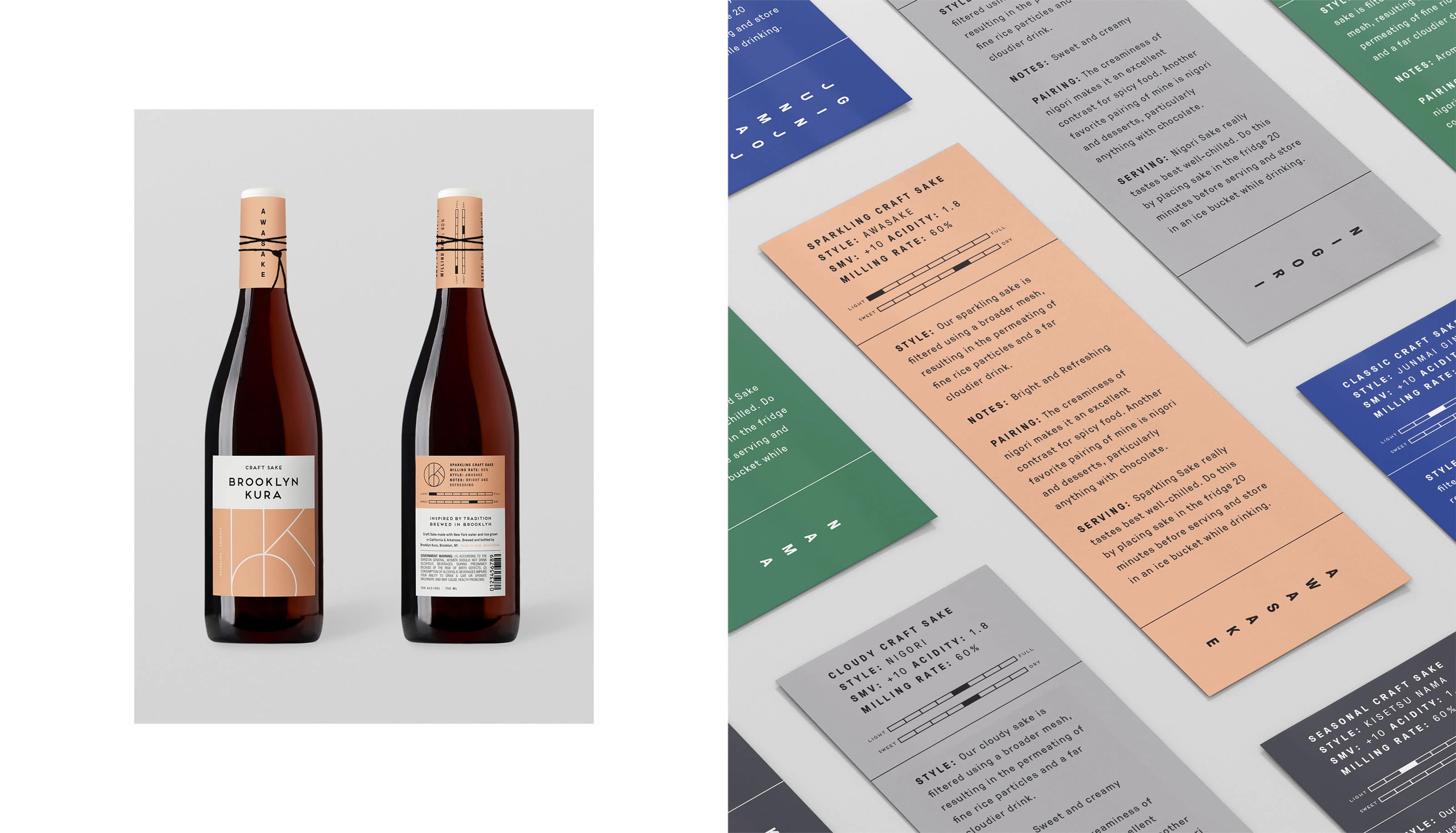
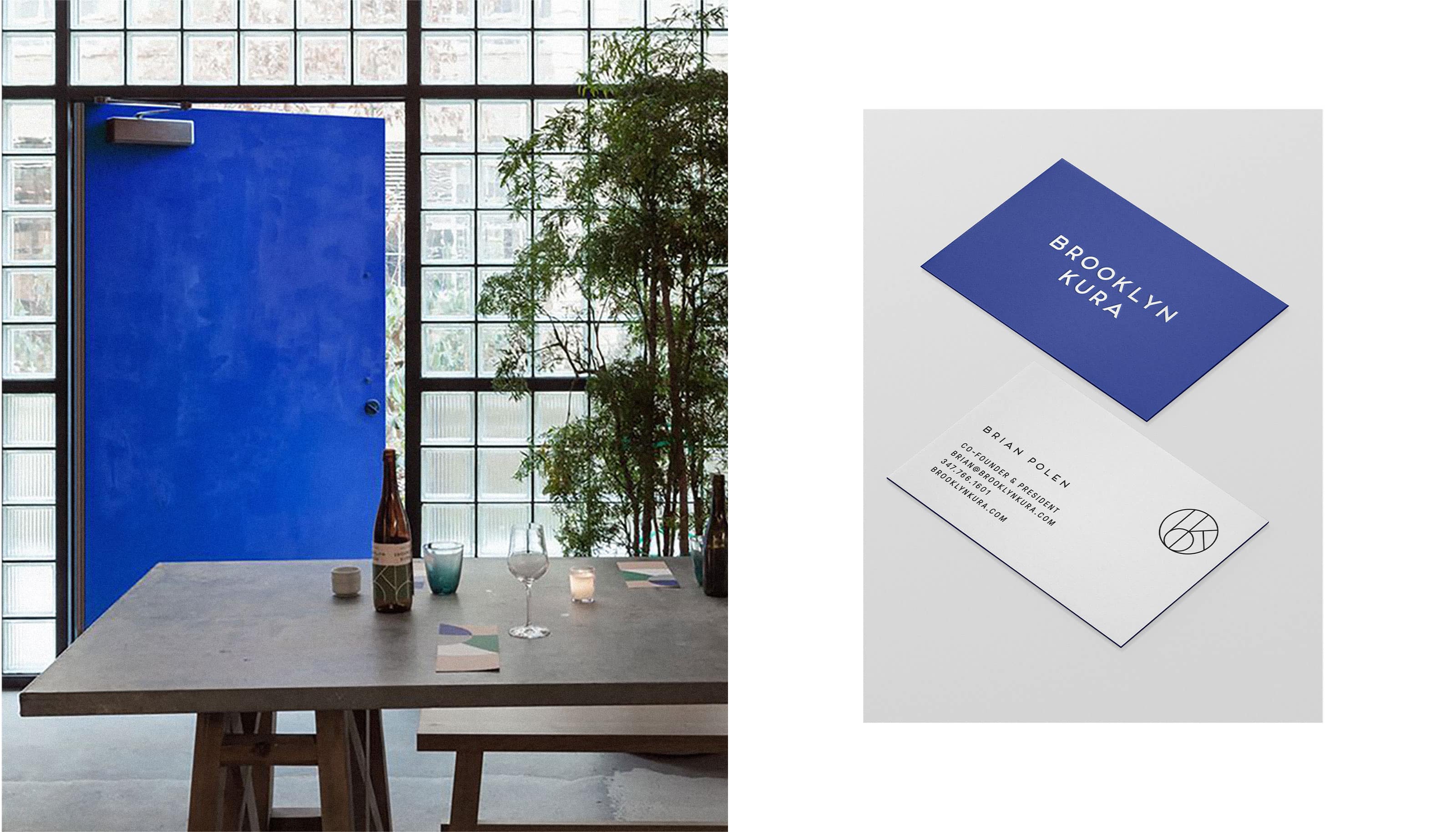
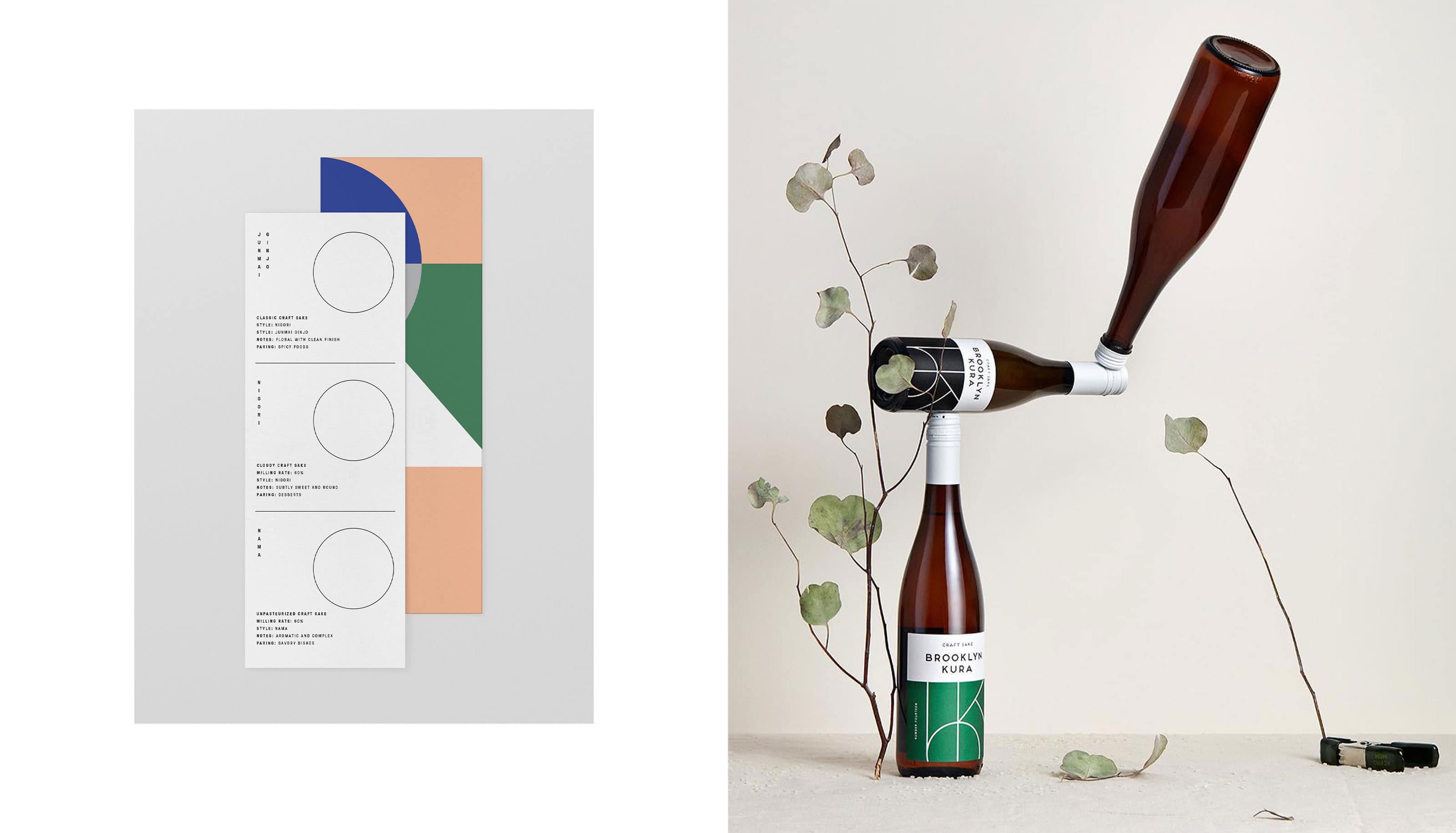
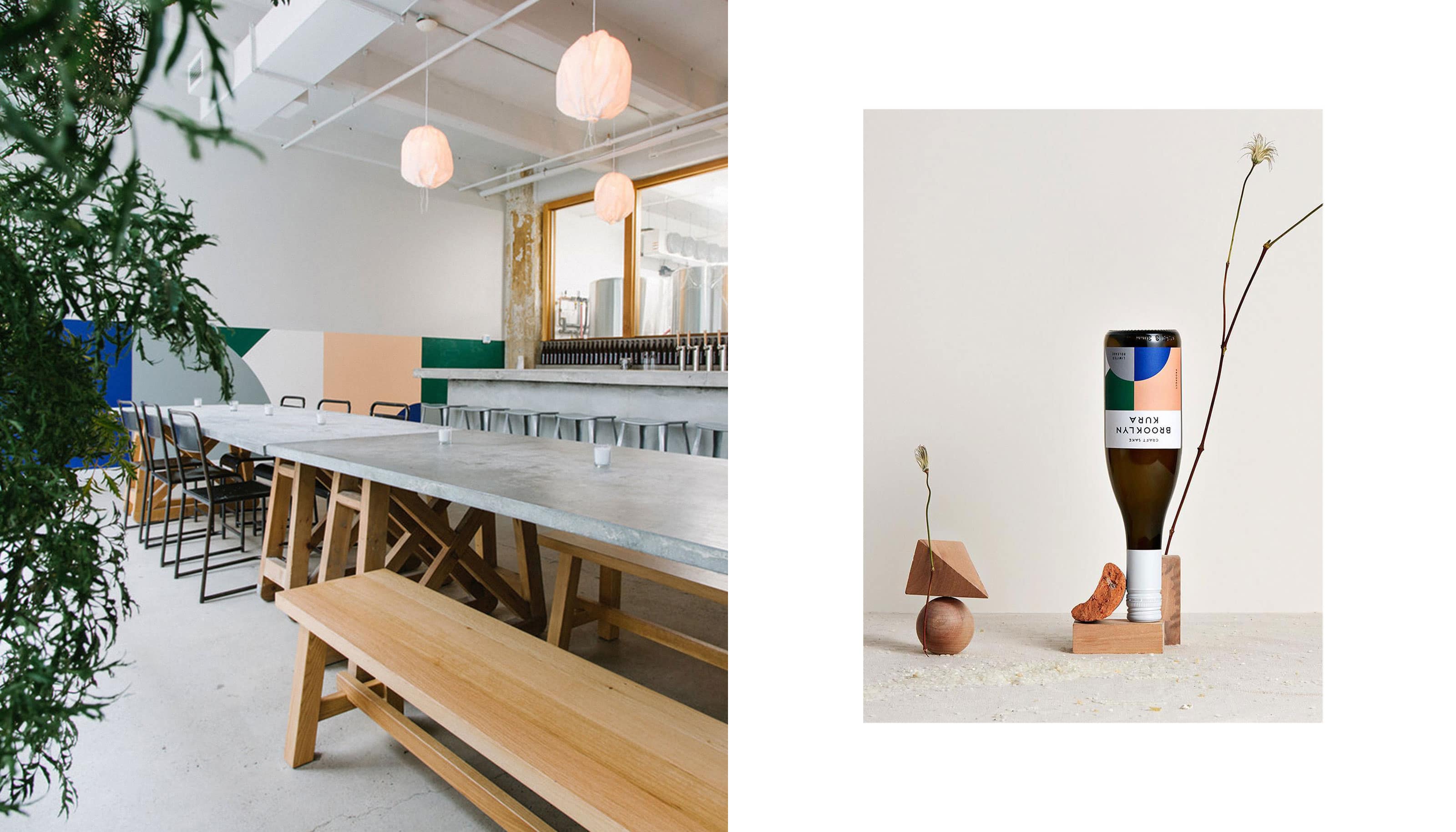
Brooklyn Kura
- Company: LMNOP
- Interior Design: Carpenter + Mason
- Art Direction: Leigh Nelson
- Year: 2017
Brooklyn Kura is NYC’s first-ever sake brewery. They represent the new wave of American craft sake, using American ingredients to make the traditional Japanese rice wine. They challenged us to rethink their packaging and help build out their brand system for their launch. We took a lot of inspiration from the simplicity of their tasting room designed by our friends at Carpenter + Mason. Overall, we wanted this brand to feel elevated and pay respect to a Japanese aesthetic while still feeling American.
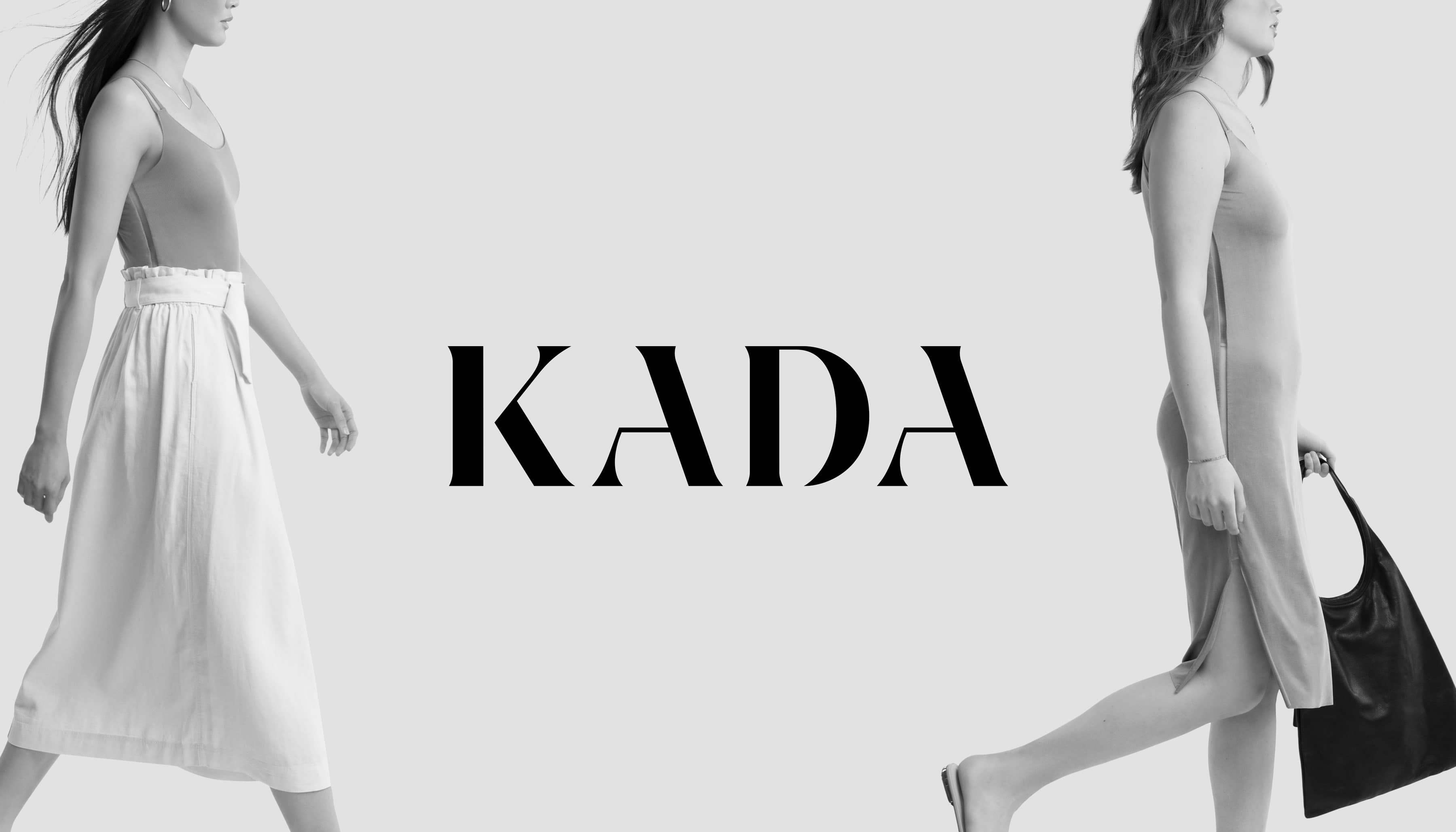
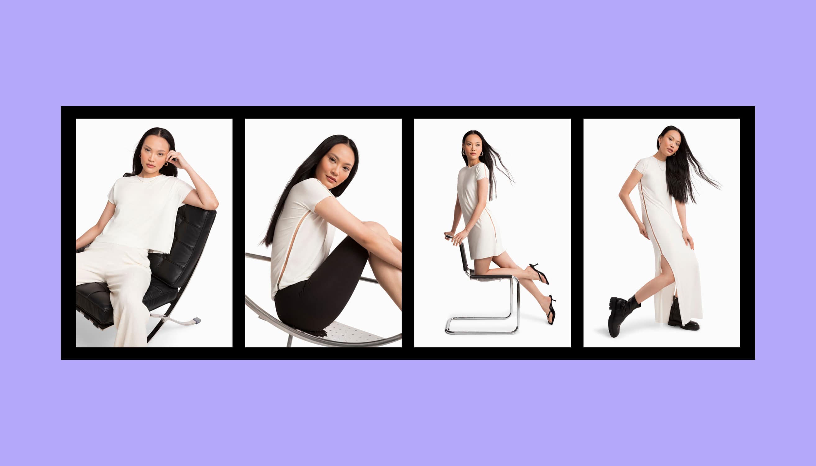
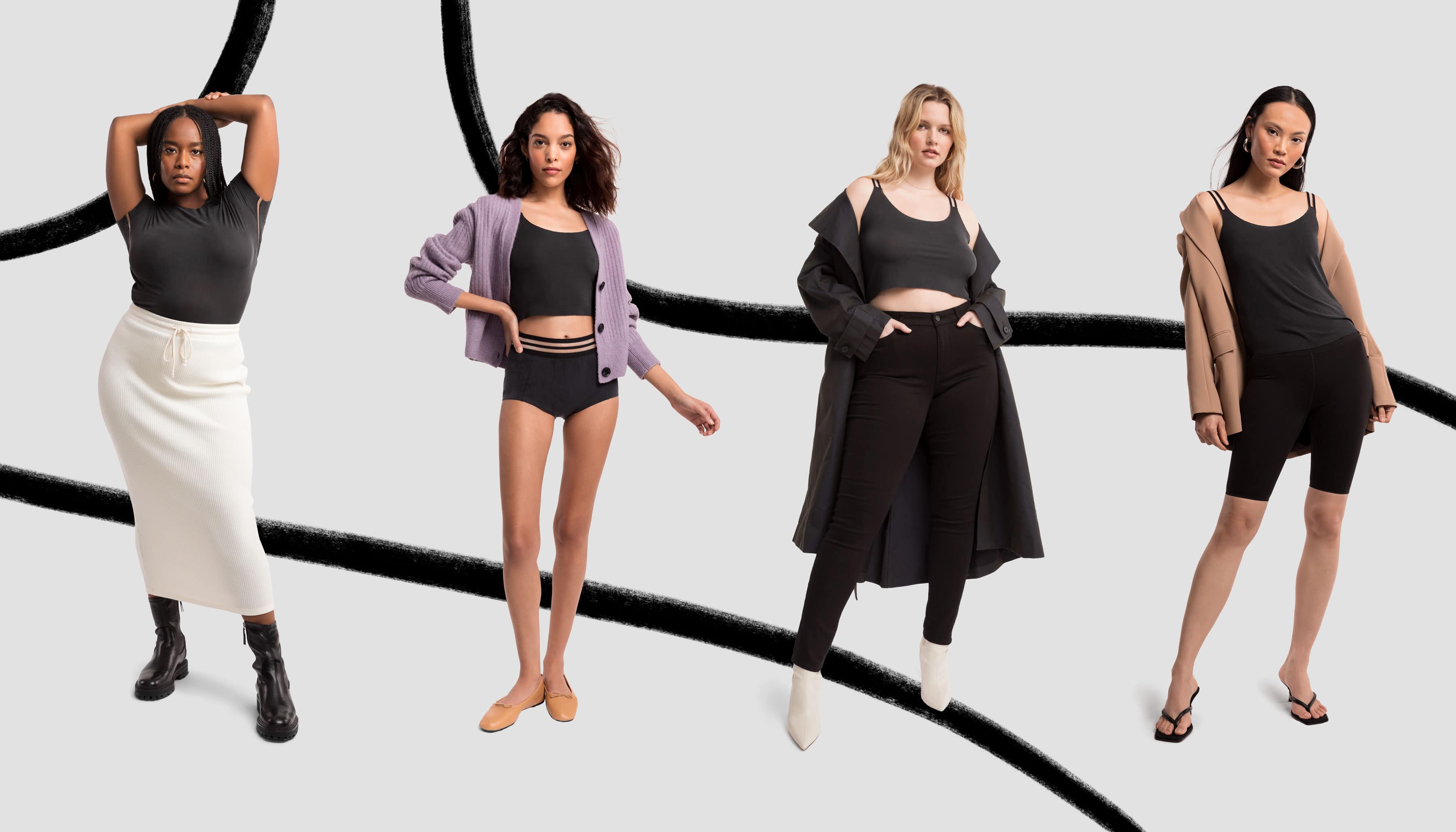
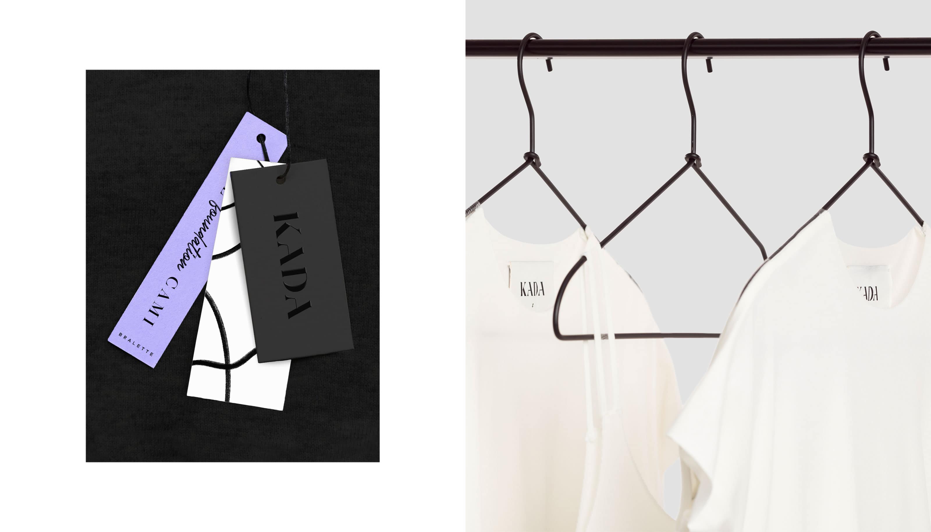
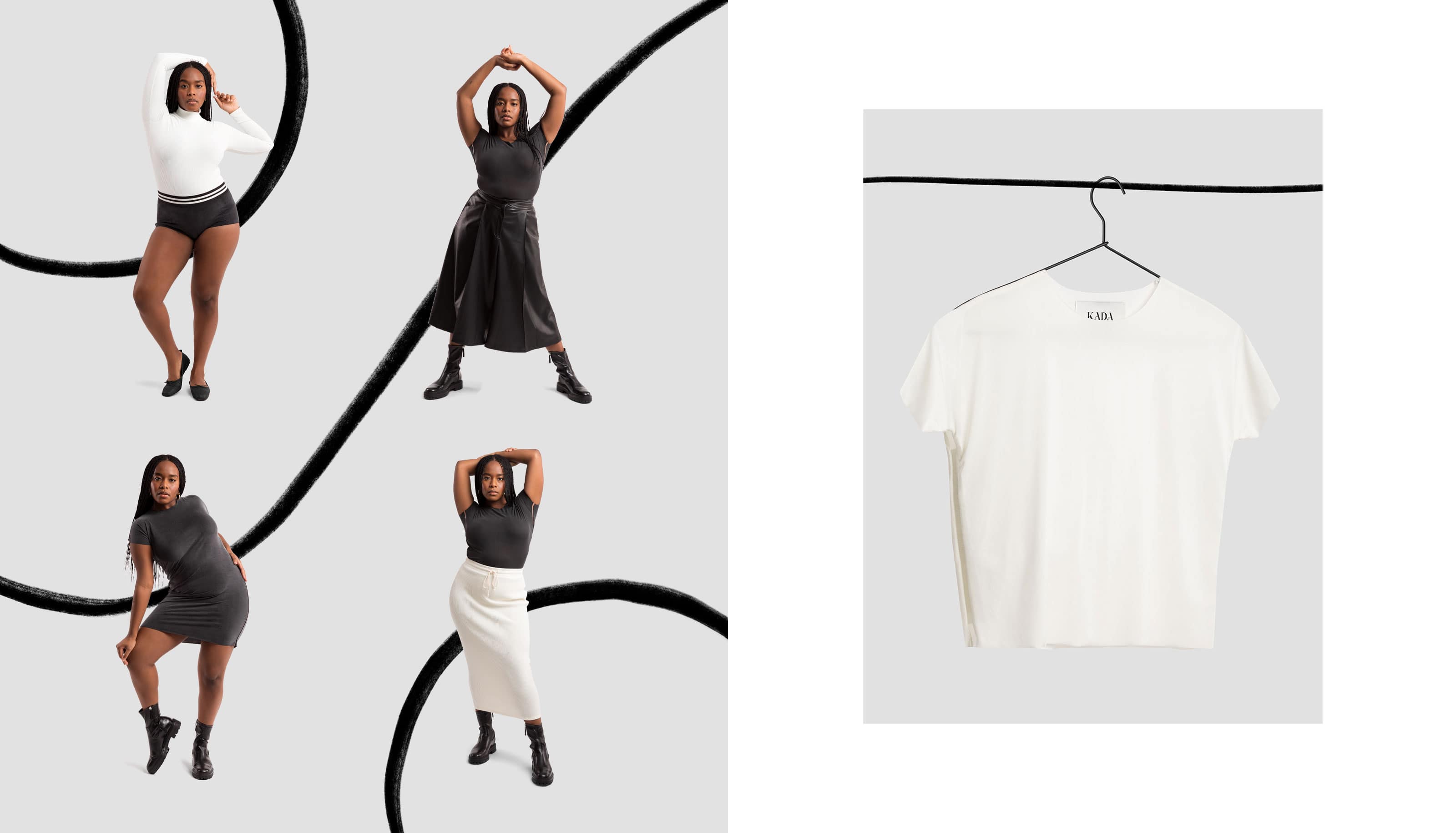
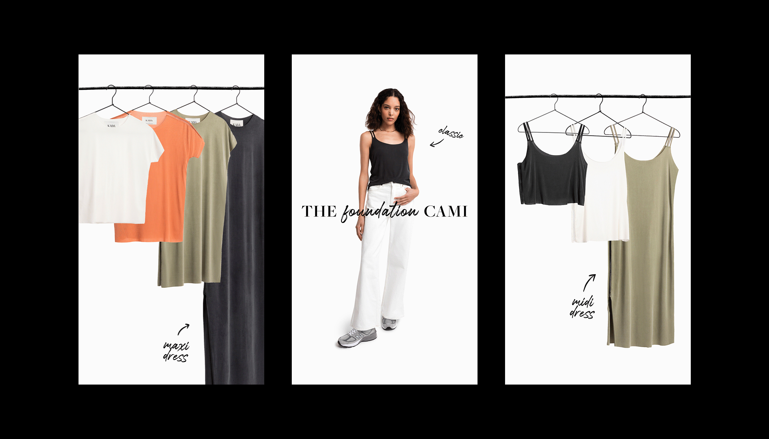
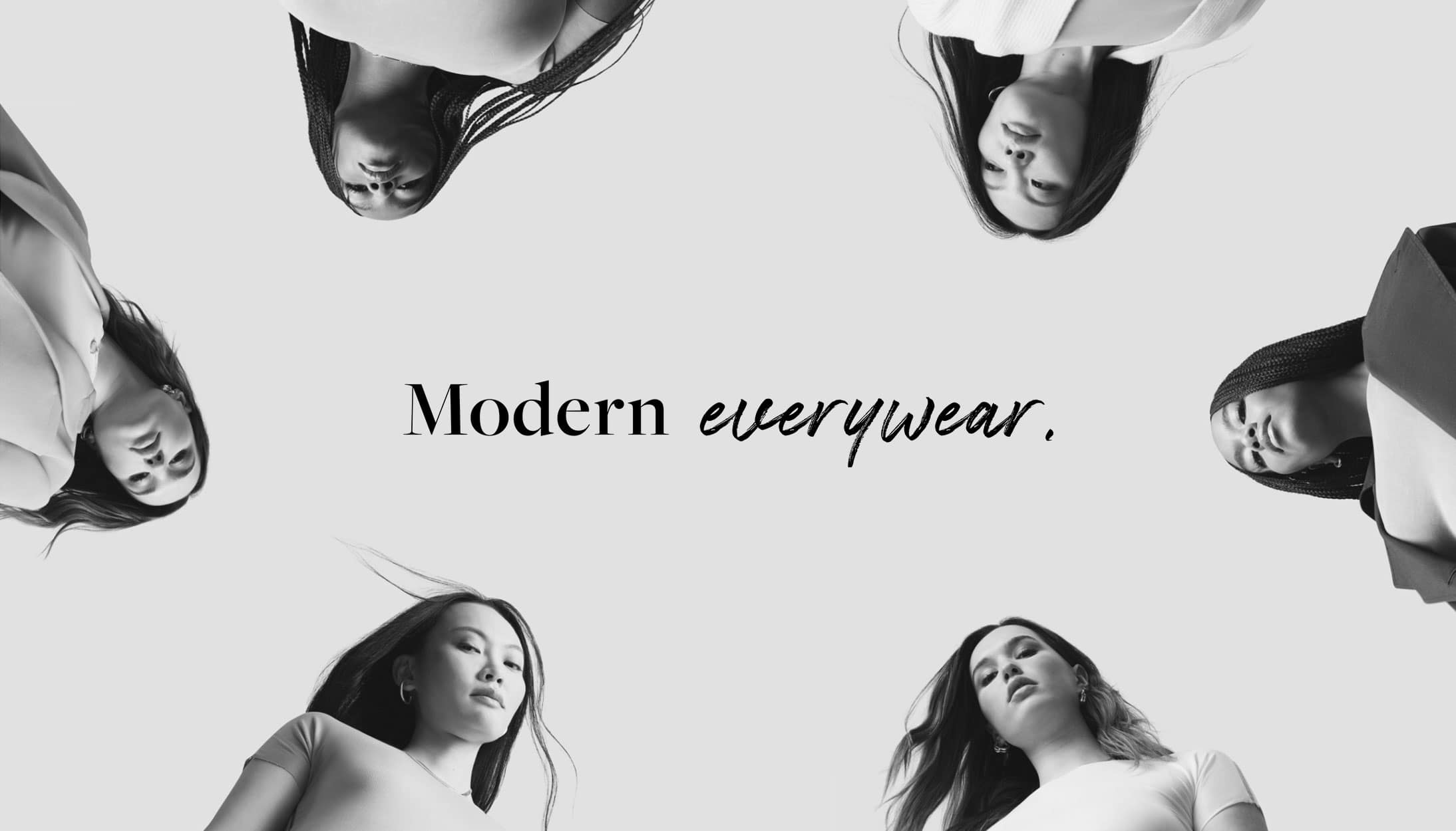
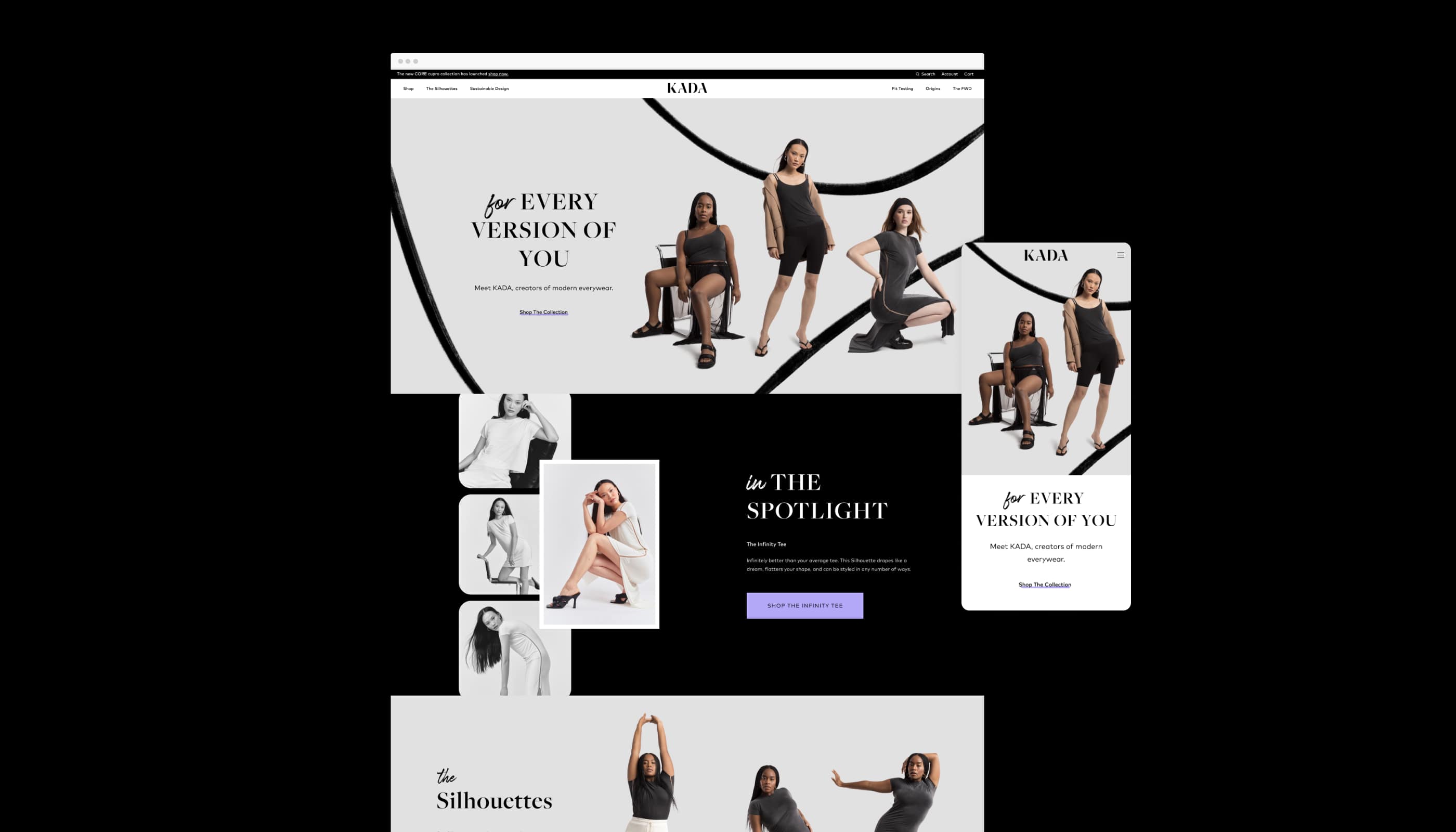
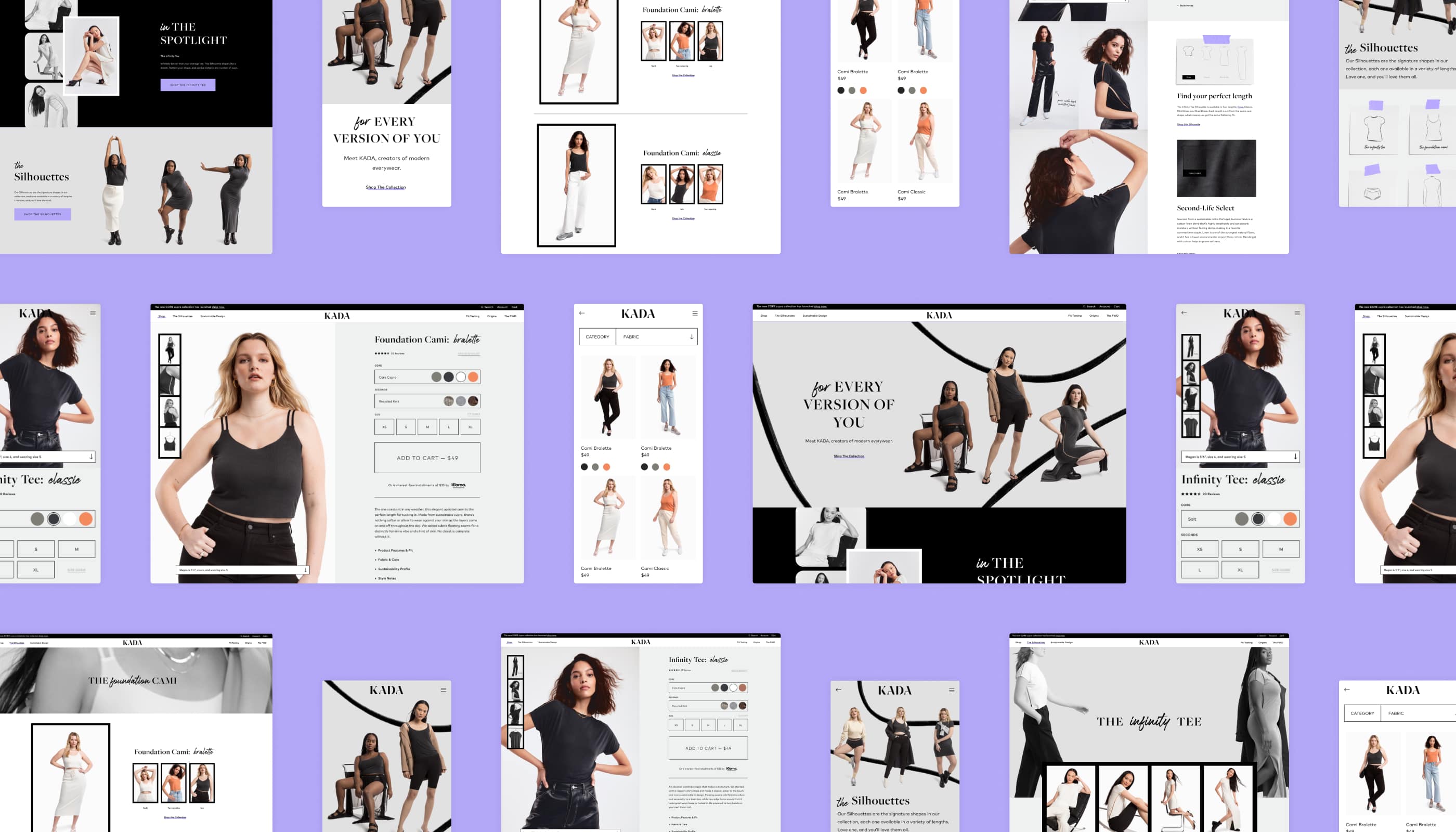
KADA
- Company: Communal Creative
- Photography: Grace Rivera
- Web Development: Progress Labs
- Stylist: Carolina Orrico
- Year: 2021
KADA is the female-founded fashion line that’s making sustainability the most stylish choice. Using a more efficient, less wasteful design process, KADA’s collection of elevated basics is designed to be worn today and ten years from now. We worked closely with the KADA team to craft a brand experience that celebrates KADA’s unique staying power, landing on the concept of personal growth and evolution over time. The result is a brand that celebrates the human capacity for change with a defiant tone and empowering feel, captured in the tagline, “Change into you.”
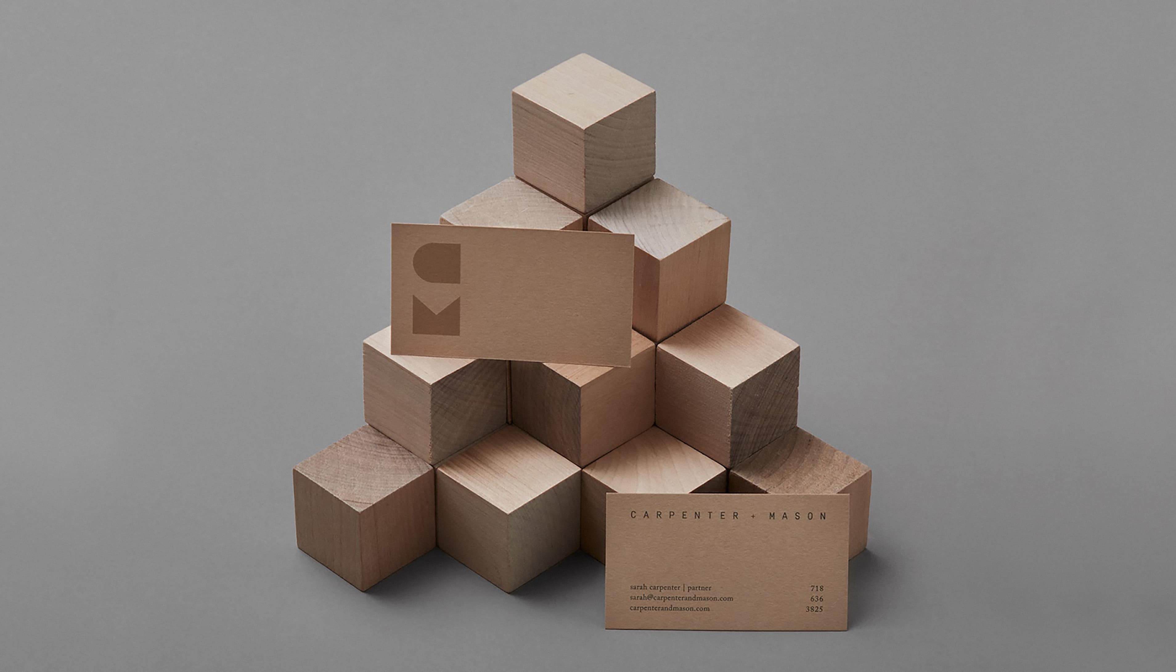
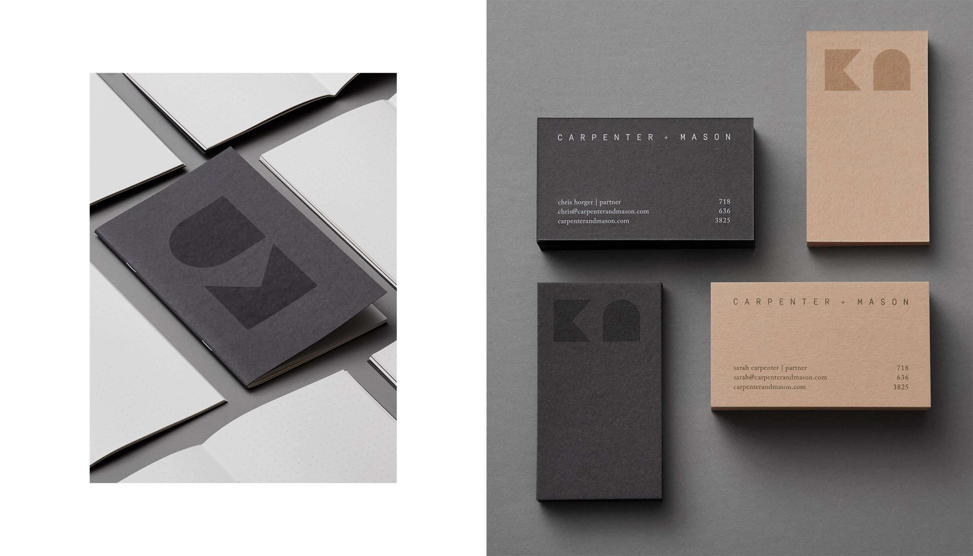
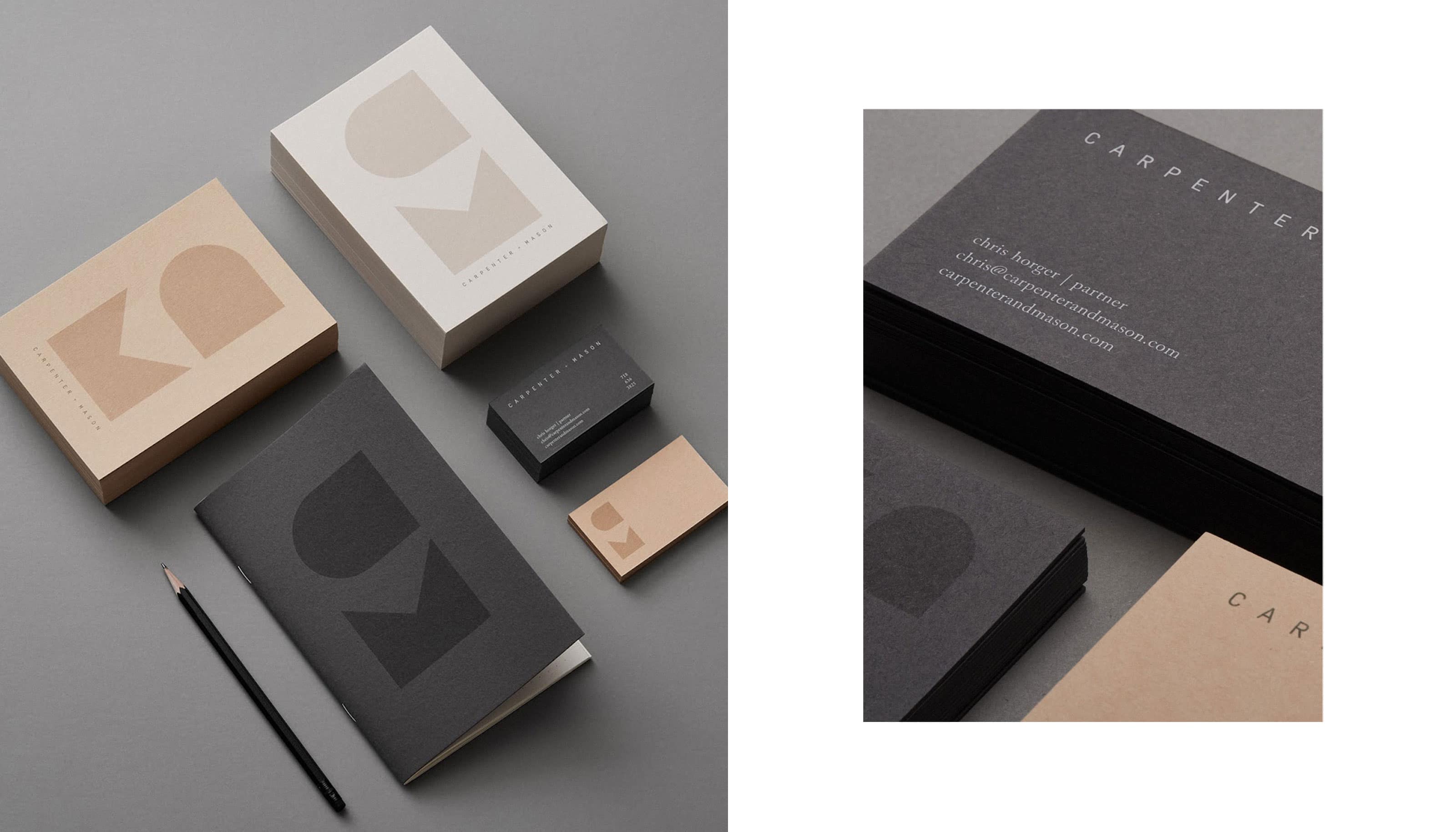
Carpenter + Mason
- Company: LMNOP
- Art Direction: Cari Sekendur
- Year: 2017
C+M is the work of husband and wife team Sarah Carpenter and Chris Horger. Their design philosophy is deeply influenced by their architecture backgrounds; they find inspiration in the celebration of honest materials, considered details and thoughtful construction. Their branding is inspired by the geometry of their work, we created a brand mark that is a combination of angular shapes forming the letters ‘C’ and ‘M’. The mark is paired with a minimalist logo and muted tones for a refined look and feel.
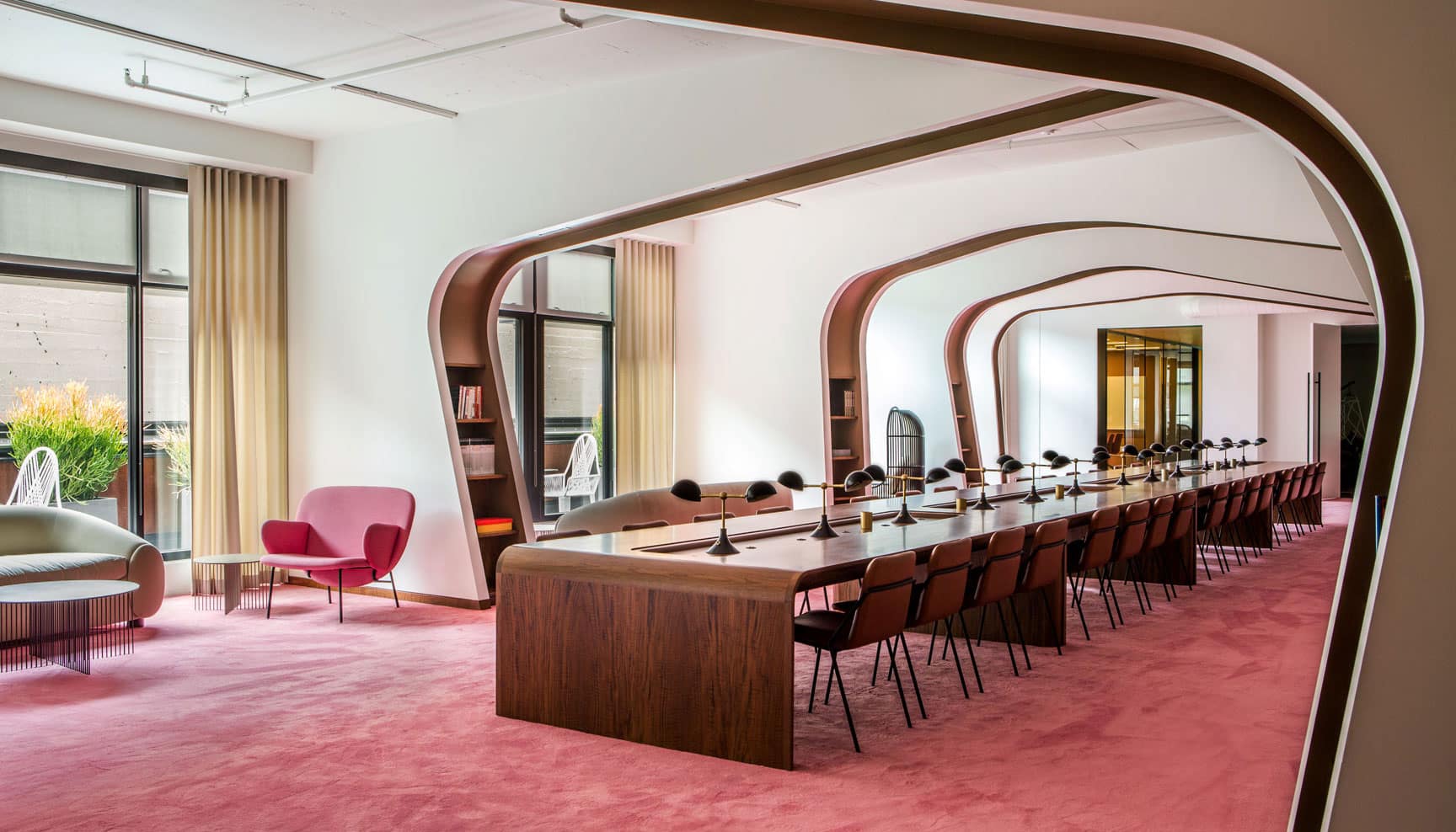
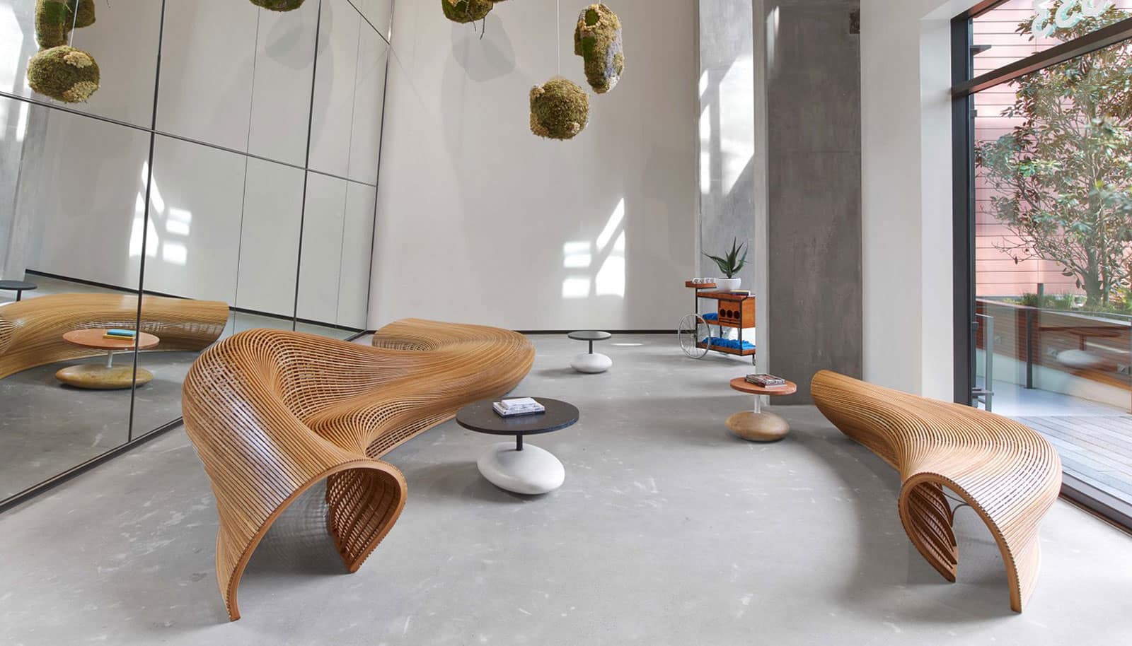
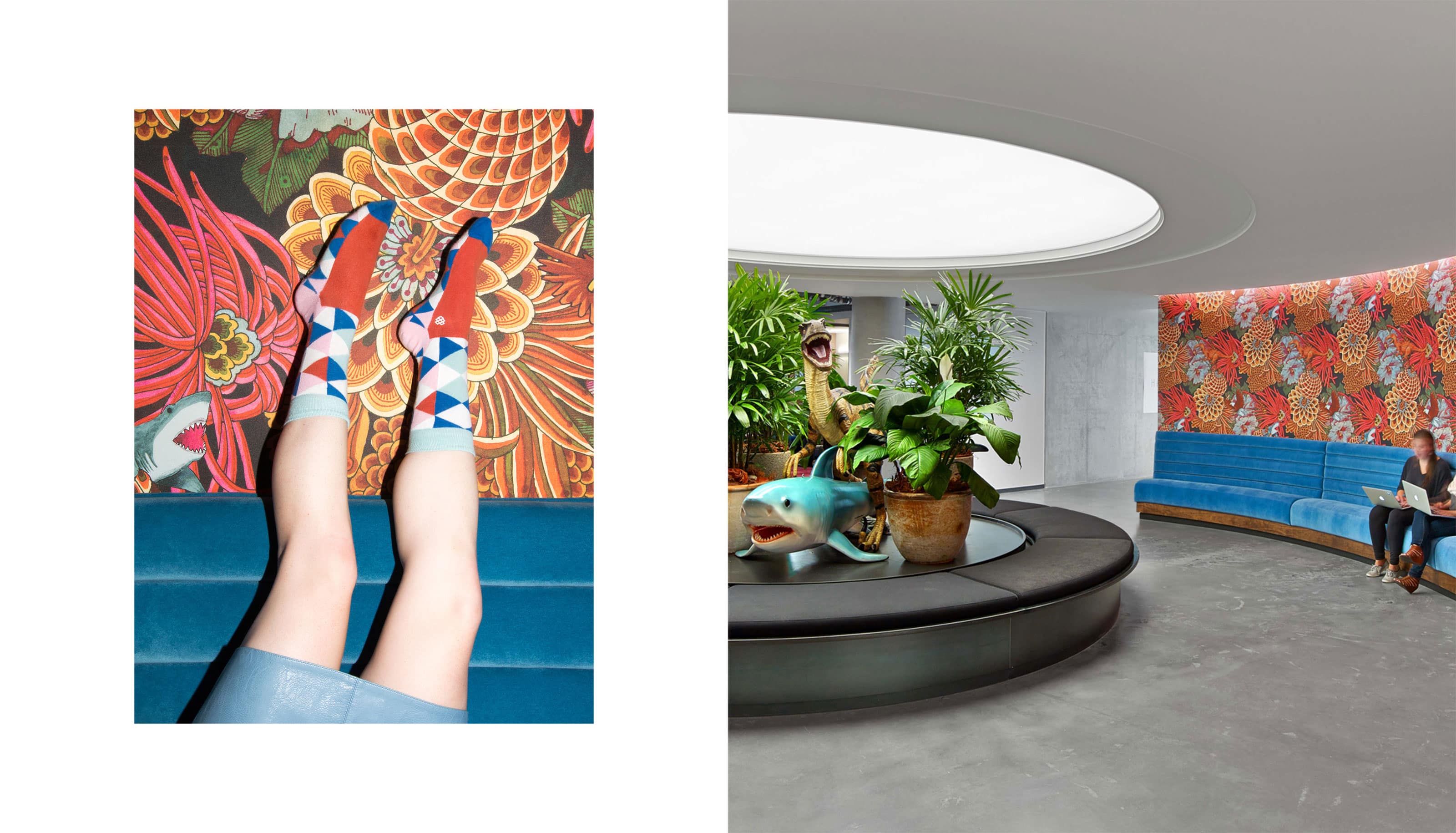
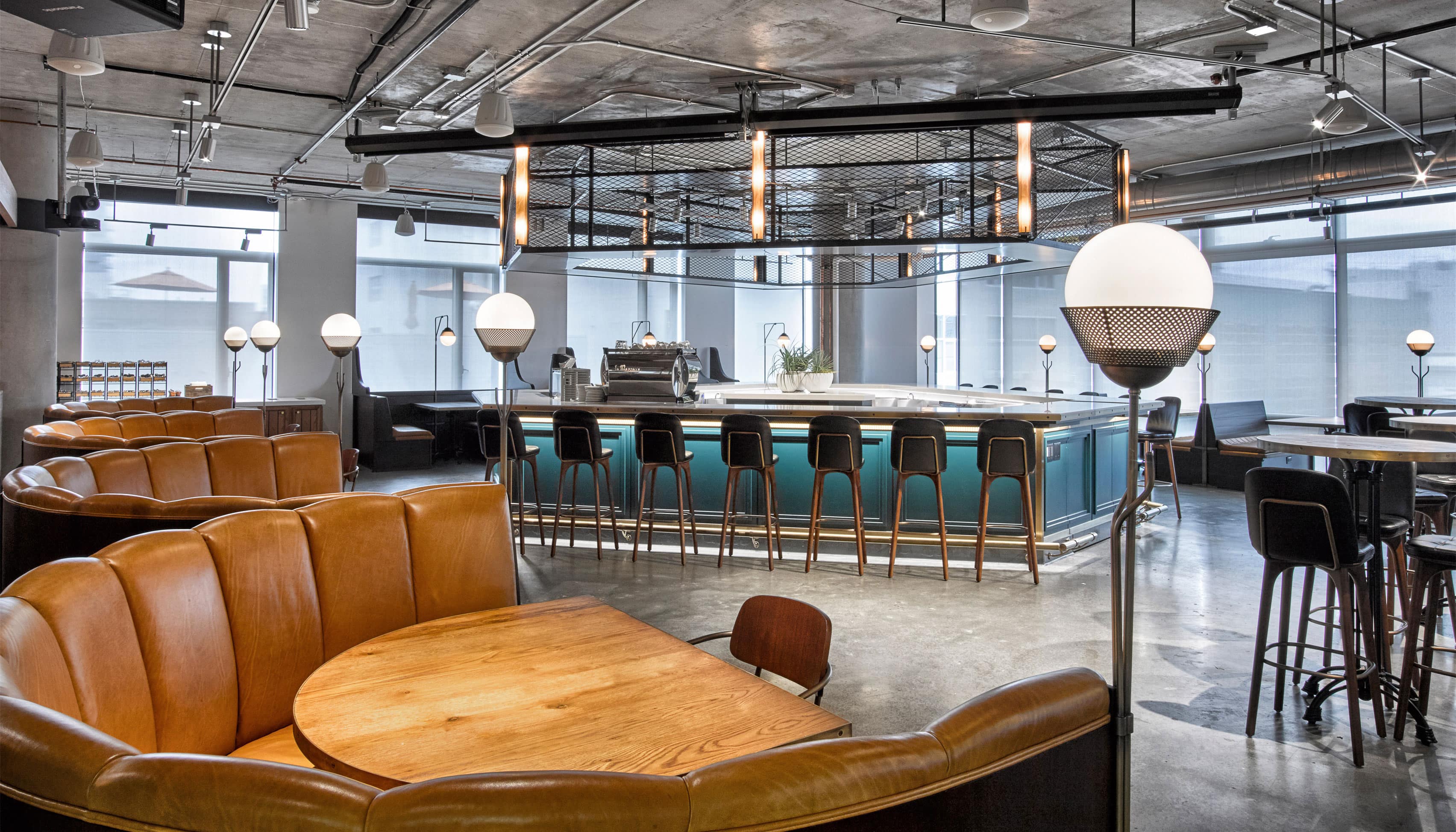
Dropbox
- Photography: Laure Joliet
- Architecture & Design: Rapt / AvroKO
- Year: 2016
No individual is productive in the same way. The new Dropbox HQ provides an array of options to work, living up to Dropbox’s “work anywhere” ethos. For a year I worked alongside Glara Ann, the Dropbox founders, and two incredible architecture and design studios in San Francisco; Rapt and AvroKO, to research, concept, and design Dropbox’s HQ in San Francisco.
Check out what Fast Company wrote about the new space!
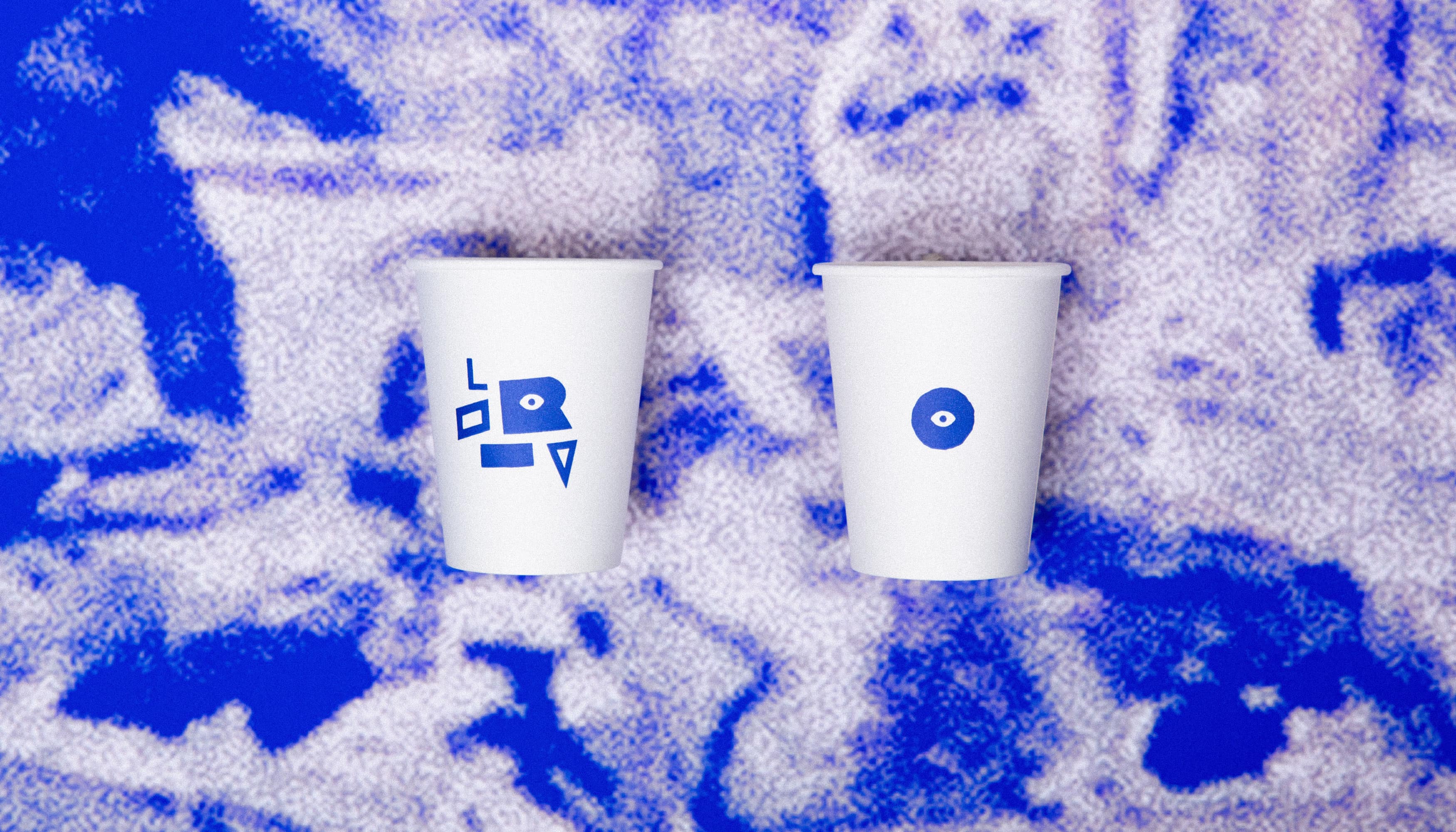
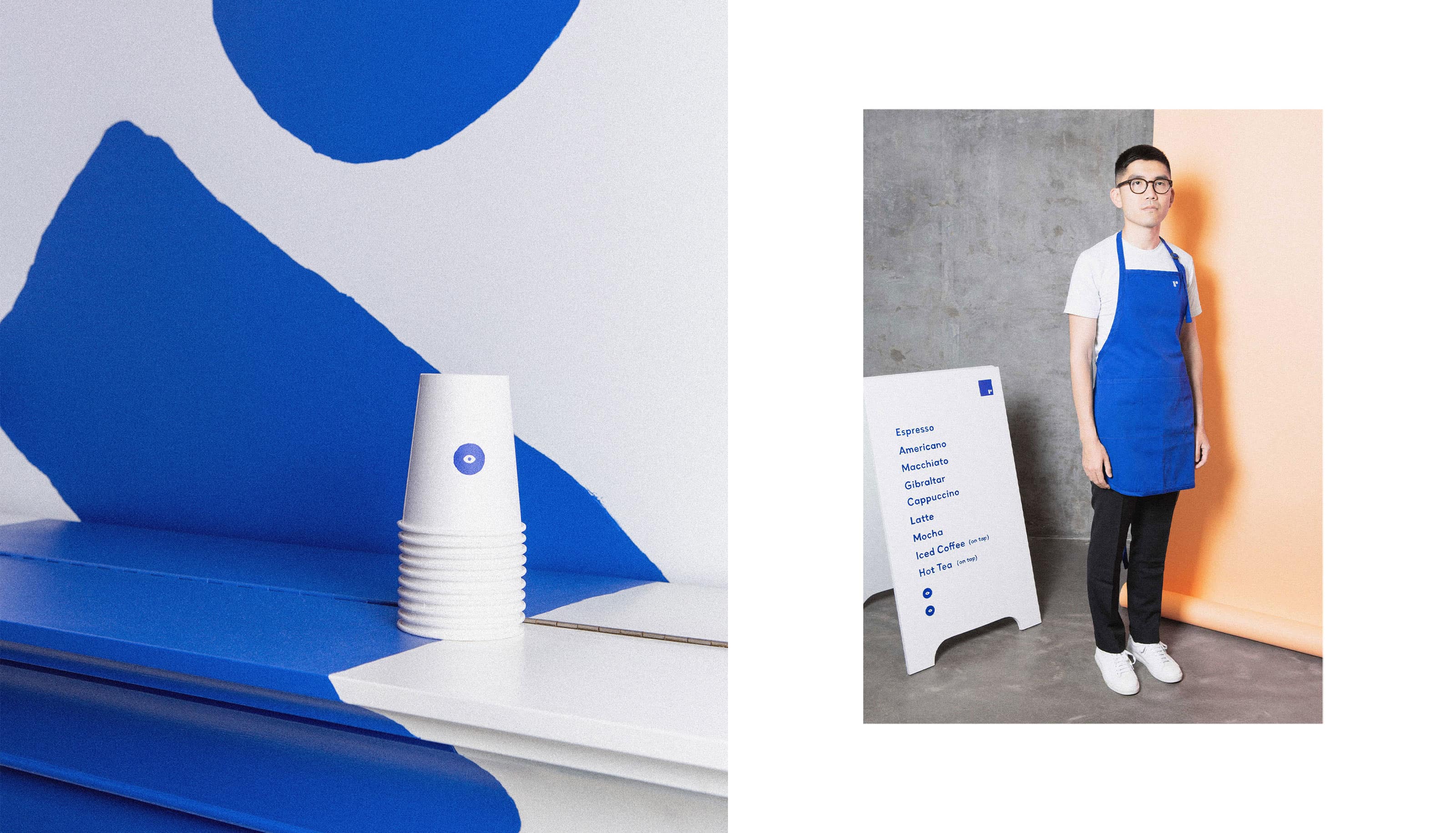
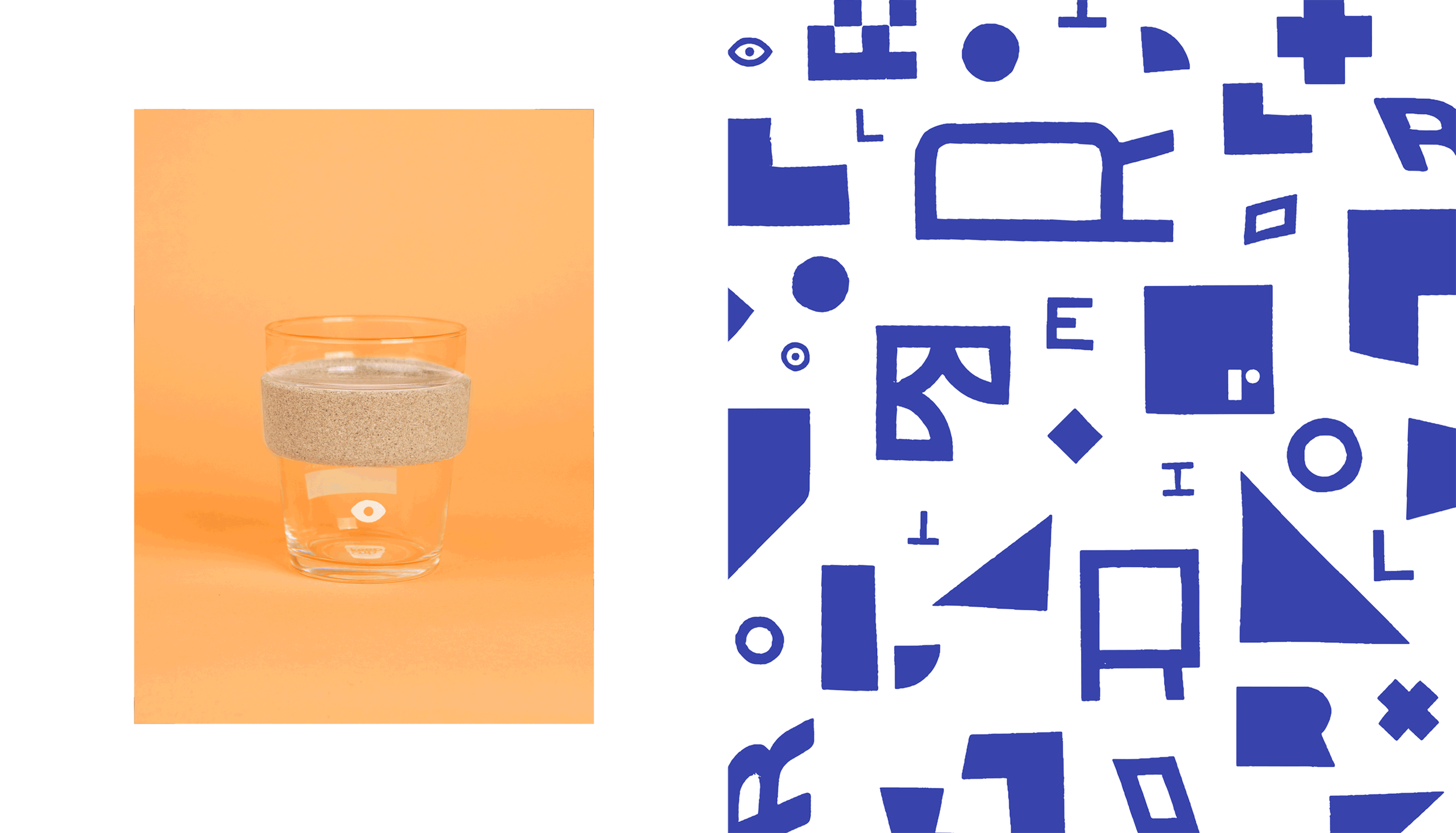
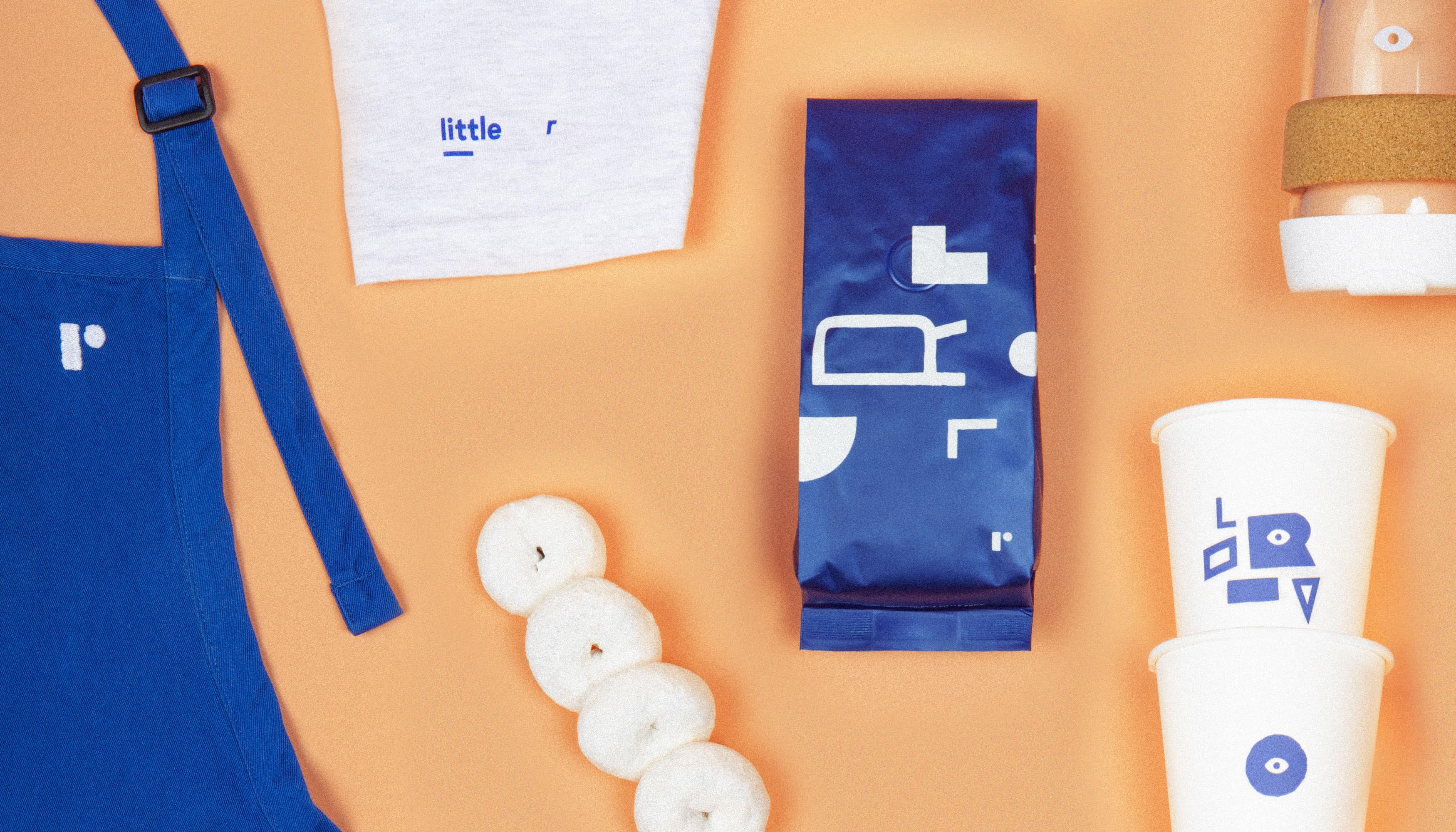
little-r
- Photography: Ashley Tarr
- Brand Identity, Packaging Design & Art Direction: Claire Pedersen
- Year: 2016
At Dropbox, we strove to create environments and spaces that make employees feel at home. With a new HQ came a new coffee shop that needed an identity. In true Dropbox tradition, we crowdsourced different names and collectively came up with Little-r. This name was not only unique to Dropbox, but also embodied what the space is used for. “Little-r” is a phrase commonly used at Dropbox to break a larger email conversation into a smaller discussion between two people. It's like leaving a party full of people to grab a coffee with a close friend.